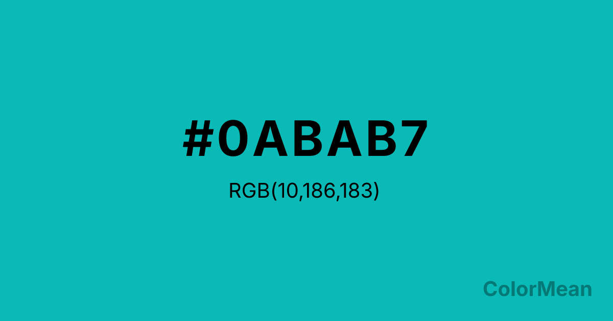
#0ABAB7 Color Information
#0ABAB7 RGB value is (10, 186, 183). The hex color red value is 10, green is 186, and blue is 183. Its HSL format shows a hue of 179°, saturation of 90 percent, and lightness of 38 percent. The CMYK process values are 95 percent, 0 percent, 2 percent, 27 percent.
#0ABAB7 Color Meaning
Color #0ABAB7 embodies calm elegance, refined clarity, and serene sophistication. #0ABAB7 medium turquoise-blue shade promotes calm confidence, creative clarity, and emotional balance. Color #0ABAB7 psychologically supports focus, tranquility, and aesthetic appreciation, making #0ABAB7 ideal for luxurious or restorative spaces. Culturally, color #0ABAB7 is iconic in Western design, associated with luxury, refinement, and delicate charm. Eastern symbolism links #0ABAB7 to clarity, healing, and renewal. Fengshui interprets #0ABAB7 soft turquoise as supportive of calming, flowing energy, enhancing both emotional and intellectual balance. Spiritually, color #0ABAB7 resonates with the Throat Chakra, fostering clear communication, self-expression, and calm emotional flow. Designers and artists use #0ABAB7 medium-bright tone in branding, interiors, and product design to convey elegance, serenity, and approachable sophistication.
Color Conversion
Convert #0ABAB7 across different color models and formats. These conversions help designers work seamlessly between digital and print media, ensuring this color maintains its intended appearance across RGB screens, CMYK printers, and HSL color manipulations.
RGB Values & CMYK Values
RGB Values
CMYK Values
Color Variations
#0ABAB7 harmonies come to life through carefully balanced shades, tints, and tones, giving this color depth and flexibility across light and dark variations. Shades add richness, tints bring an airy softness, and tones soften intensity, making it easy to pair in clean, modern palettes.
Color Harmonies
#0ABAB7 harmonies create beautiful relationships with other colors based on their position on the color wheel. Each harmony type offers unique design possibilities, enabling cohesive and visually appealing color schemes.
Analogous
Colors adjacent on the color wheel (30° apart)
Complementary
Colors opposite on the color wheel (180° apart)
Split Complementary
Three colors using one base hue and the two hues beside its opposite
Triadic
Three colors evenly spaced (120° apart)
Tetradic
Four colors forming a rectangle on the wheel
Square
Four colors evenly spaced (90° apart)
Double Split
Four colors formed from two base hues and the colors next to their opposites
Monochromatic
Variations of a single hue
Contrast Checker
(WCAG 2.1) Test #0ABAB7 for accessibility compliance against white and black backgrounds. Proper contrast ensures this color remains readable and usable for all audiences, meeting WCAG 2.1 standards for both normal and large text applications.
Sample Text
This is how your text will look with these colors.
Large Text (18pt+)
Normal Text
UI Components
Color Blindness Simulator
See how #0ABAB7 appears to people with different types of color vision deficiencies. These simulations help create more inclusive designs that consider how this color is perceived across various visual abilities.
Normal Vision
protanopia
Note: These simulations are approximations. Actual color vision deficiency varies by individual.
CSS Examples
Background Color
Text Color
Sample Text
Border Color
Box Shadow
Text Shadow
Sample Text
Gradient
#0ABAB7 Color FAQs
Frequently asked questions about #0ABAB7 color meaning, symbolism, and applications. Click on any question to expand detailed answers.
