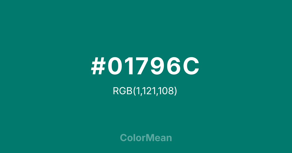
#01796C Color Information
#01796C RGB value is (1, 121, 108). The hex color red value is 1, green is 121, and blue is 108. Its HSL format shows a hue of 174°, saturation of 98 percent, and lightness of 24 percent. The CMYK process values are 99 percent, 0 percent, 11 percent, 53 percent.
#01796C Color Meaning
Color #01796C embodies deep forest stillness, timeless growth, and solemn tranquility. #01796C dark, greenish-blue is the color of pine trees at twilight, deep forest ponds, and winter evergreens, suggesting resilience, quiet majesty, and a connection to ancient natural cycles. Psychologically, color #01796C is profoundly stabilizing and contemplative, promoting feelings of endurance, inner peace, and a grounded, earthy wisdom. #01796C soothes the mind with its association to unchanging, perennial life. #01796C color feels both nourishing and respectfully distant. Symbolically, color #01796C represents eternal life, steadfastness through seasons, and the deep, quiet knowledge held within old woods. #01796C is the color of silence and chlorophyll-rich shadow. Culturally, #01796C is linked to national parks, winter holidays, and environmentalism, symbolizing natural heritage, resilience, and serene retreat. Color #01796C provides a rich, dark anchor that connects any design to concepts of stability, nature, and dignified, enduring calm.
Color Conversion
Convert #01796C across different color models and formats. These conversions help designers work seamlessly between digital and print media, ensuring this color maintains its intended appearance across RGB screens, CMYK printers, and HSL color manipulations.
RGB Values & CMYK Values
RGB Values
CMYK Values
Color Variations
#01796C harmonies come to life through carefully balanced shades, tints, and tones, giving this color depth and flexibility across light and dark variations. Shades add richness, tints bring an airy softness, and tones soften intensity, making it easy to pair in clean, modern palettes.
Color Harmonies
#01796C harmonies create beautiful relationships with other colors based on their position on the color wheel. Each harmony type offers unique design possibilities, enabling cohesive and visually appealing color schemes.
Analogous
Colors adjacent on the color wheel (30° apart)
Complementary
Colors opposite on the color wheel (180° apart)
Split Complementary
Three colors using one base hue and the two hues beside its opposite
Triadic
Three colors evenly spaced (120° apart)
Tetradic
Four colors forming a rectangle on the wheel
Square
Four colors evenly spaced (90° apart)
Double Split
Four colors formed from two base hues and the colors next to their opposites
Monochromatic
Variations of a single hue
Contrast Checker
(WCAG 2.1) Test #01796C for accessibility compliance against white and black backgrounds. Proper contrast ensures this color remains readable and usable for all audiences, meeting WCAG 2.1 standards for both normal and large text applications.
Sample Text
This is how your text will look with these colors.
Large Text (18pt+)
Normal Text
UI Components
Color Blindness Simulator
See how #01796C appears to people with different types of color vision deficiencies. These simulations help create more inclusive designs that consider how this color is perceived across various visual abilities.
Normal Vision
protanopia
Note: These simulations are approximations. Actual color vision deficiency varies by individual.
CSS Examples
Background Color
Text Color
Sample Text
Border Color
Box Shadow
Text Shadow
Sample Text
Gradient
#01796C Color FAQs
Frequently asked questions about #01796C color meaning, symbolism, and applications. Click on any question to expand detailed answers.
