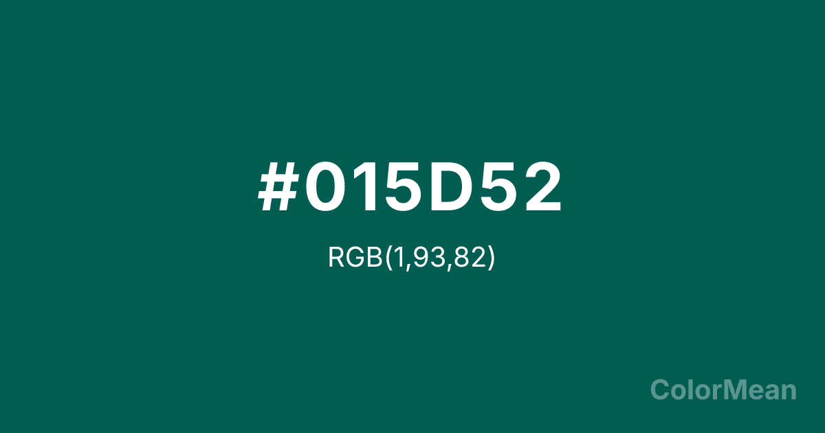
Opal Green (#015D52) Color Information
Opal Green (#015D52) RGB value is (1, 93, 82). The hex color red value is 1, green is 93, and blue is 82. Its HSL format shows a hue of 173°, saturation of 98 percent, and lightness of 18 percent. The CMYK process values are 99 percent, 0 percent, 12 percent, 64 percent.
Opal Green (#015D52) Color Meaning
Opal Green (#015D52) fuses aquatic depth with mineral clarity. This dark teal-green draws from sea glass and gemstone interiors—cool, dense, and quietly luminous. Opal Green (#015D52) suggests refinement through pressure, not display. It’s the color of underwater silence and polished expertise. Color science identifies this narrow band of green-blue as highly effective in healthcare and financial interfaces, where it conveys trust without sterility. Its low brightness reduces glare, while its chromatic richness prevents monotony. Opal Green (#015D52) calms through complexity, not simplicity. Culturally, it ties to apothecary traditions, deep-sea exploration, and artisan glasswork. Modern luxury brands use Opal Green (#015D52) to signal discernment—appealing to buyers who value rarity over flash. Paired with cream or brushed gold, Opal Green (#015D52) creates palettes that feel both archival and contemporary.
Color Conversion
Convert Opal Green (#015D52) across different color models and formats. These conversions help designers work seamlessly between digital and print media, ensuring this color maintains its intended appearance across RGB screens, CMYK printers, and HSL color manipulations.
RGB Values & CMYK Values
RGB Values
CMYK Values
Color Variations
Opal Green (#015D52) harmonies come to life through carefully balanced shades, tints, and tones, giving this color depth and flexibility across light and dark variations. Shades add richness, tints bring an airy softness, and tones soften intensity, making it easy to pair in clean, modern palettes.
Color Harmonies
Opal Green (#015D52) harmonies create beautiful relationships with other colors based on their position on the color wheel. Each harmony type offers unique design possibilities, enabling cohesive and visually appealing color schemes.
Analogous
Colors adjacent on the color wheel (30° apart)
Complementary
Colors opposite on the color wheel (180° apart)
Split Complementary
Three colors using one base hue and the two hues beside its opposite
Triadic
Three colors evenly spaced (120° apart)
Tetradic
Four colors forming a rectangle on the wheel
Square
Four colors evenly spaced (90° apart)
Double Split
Four colors formed from two base hues and the colors next to their opposites
Monochromatic
Variations of a single hue
Contrast Checker
(WCAG 2.1) Test Opal Green (#015D52) for accessibility compliance against white and black backgrounds. Proper contrast ensures this color remains readable and usable for all audiences, meeting WCAG 2.1 standards for both normal and large text applications.
Sample Text
This is how your text will look with these colors.
Large Text (18pt+)
Normal Text
UI Components
Color Blindness Simulator
See how #015D52 appears to people with different types of color vision deficiencies. These simulations help create more inclusive designs that consider how this color is perceived across various visual abilities.
Normal Vision
protanopia
Note: These simulations are approximations. Actual color vision deficiency varies by individual.
CSS Examples
Background Color
Text Color
Sample Text
Border Color
Box Shadow
Text Shadow
Sample Text
Gradient
Opal Green (#015D52) Color FAQs
Frequently asked questions about Opal Green (#015D52) color meaning, symbolism, and applications. Click on any question to expand detailed answers.
