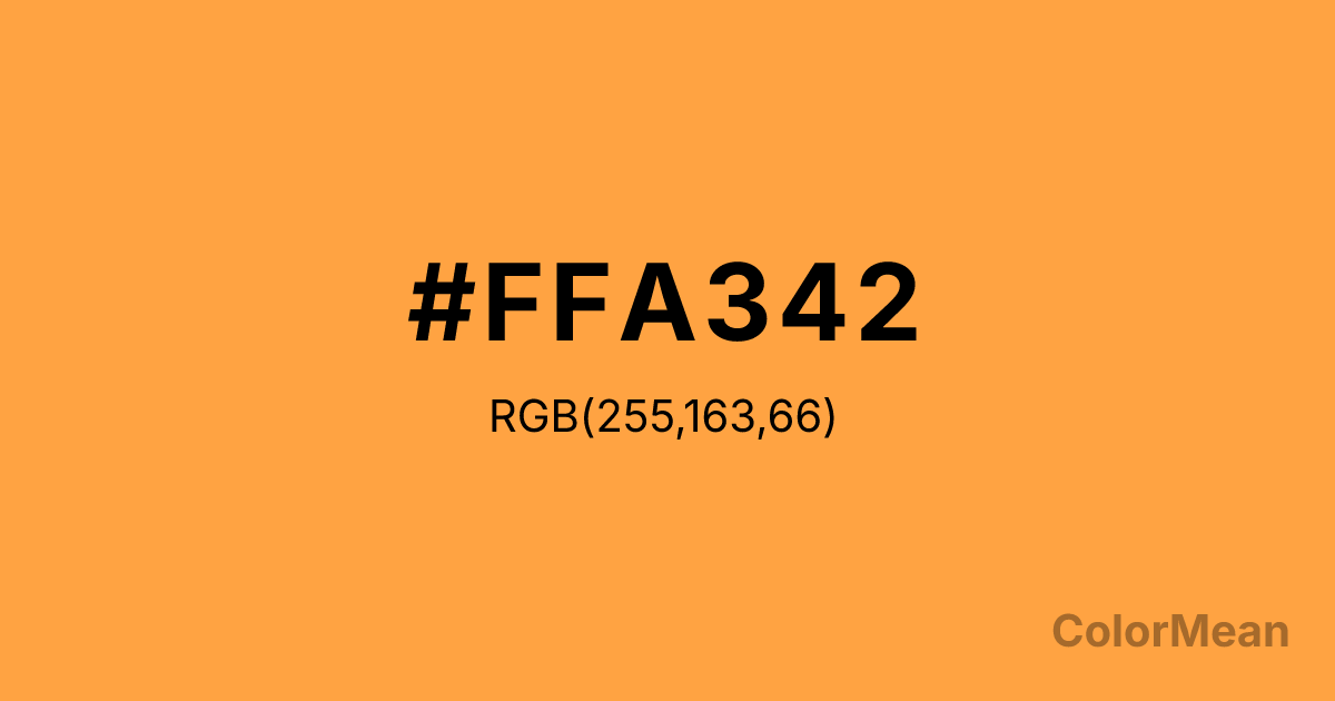
#FFA342 Color Information
#FFA342 RGB value is (255, 163, 66). The hex color red value is 255, green is 163, and blue is 66. Its HSL format shows a hue of 31°, saturation of 100 percent, and lightness of 63 percent. The CMYK process values are 0 percent, 36 percent, 74 percent, 0 percent.
#FFA342 Color Meaning
Color #FFA342 pulses with kinetic energy, playful urgency, and vitamin-rich vibrancy. Color #FFA342 sits between safety orange and tropical sunset—a hue engineered for visibility but softened by warmth. #FFA342’s not a natural carrot color; #FFA342’s the amplified version, optimized for screens, sportswear, and digital alerts that demand attention without aggression. From a perceptual angle, color #FFA342 triggers rapid recognition. Orange wavelengths are among the first the human eye detects, especially against blue backgrounds (a principle used in life vests and road signs). But #FFA342 specific tone avoids the harshness of construction orange by leaning into red-yellow balance—making #FFA342 feel energetic, not alarming. In youth and wellness branding, color #FFA342 conveys vitality without artificiality. #FFA342 references beta-carotene, immune health, and outdoor play—linking nutrition with joy. Apps for fitness, education, or mental health use #FFA342 to signal “active care”: not passive relaxation, but engaged well-being. #FFA342’s encouragement in chromatic form. Symbolically, color #FFA342 stands for accessible energy. #FFA342’s not elite athleticism—#FFA342’s the everyday bounce of a playground, the spark of a new idea. In UI design, #FFA342 works as a high-contrast action color that feels human, not robotic. #FFA342 says “go” without shouting.
Color Conversion
Convert #FFA342 across different color models and formats. These conversions help designers work seamlessly between digital and print media, ensuring this color maintains its intended appearance across RGB screens, CMYK printers, and HSL color manipulations.
RGB Values & CMYK Values
RGB Values
CMYK Values
Color Variations
#FFA342 harmonies come to life through carefully balanced shades, tints, and tones, giving this color depth and flexibility across light and dark variations. Shades add richness, tints bring an airy softness, and tones soften intensity, making it easy to pair in clean, modern palettes.
Color Harmonies
#FFA342 harmonies create beautiful relationships with other colors based on their position on the color wheel. Each harmony type offers unique design possibilities, enabling cohesive and visually appealing color schemes.
Analogous
Colors adjacent on the color wheel (30° apart)
Complementary
Colors opposite on the color wheel (180° apart)
Split Complementary
Three colors using one base hue and the two hues beside its opposite
Triadic
Three colors evenly spaced (120° apart)
Tetradic
Four colors forming a rectangle on the wheel
Square
Four colors evenly spaced (90° apart)
Double Split
Four colors formed from two base hues and the colors next to their opposites
Monochromatic
Variations of a single hue
Contrast Checker
(WCAG 2.1) Test #FFA342 for accessibility compliance against white and black backgrounds. Proper contrast ensures this color remains readable and usable for all audiences, meeting WCAG 2.1 standards for both normal and large text applications.
Sample Text
This is how your text will look with these colors.
Large Text (18pt+)
Normal Text
UI Components
Color Blindness Simulator
See how #FFA342 appears to people with different types of color vision deficiencies. These simulations help create more inclusive designs that consider how this color is perceived across various visual abilities.
Normal Vision
protanopia
Note: These simulations are approximations. Actual color vision deficiency varies by individual.
CSS Examples
Background Color
Text Color
Sample Text
Border Color
Box Shadow
Text Shadow
Sample Text
Gradient
#FFA342 Color FAQs
Frequently asked questions about #FFA342 color meaning, symbolism, and applications. Click on any question to expand detailed answers.
