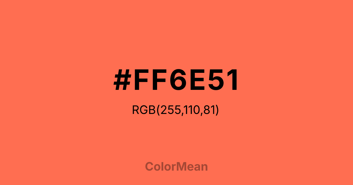
#FF6E51 Color Information
#FF6E51 RGB value is (255, 110, 81). The hex color red value is 255, green is 110, and blue is 81. Its HSL format shows a hue of 10°, saturation of 100 percent, and lightness of 66 percent. The CMYK process values are 0 percent, 57 percent, 68 percent, 0 percent.
#FF6E51 Color Meaning
Color #FF6E51 offers luminous warmth, approachable energy, and digital-friendly vibrancy. Color #FF6E51 is a bright orange-pink from the X11 color palette—slightly more saturated than standard coral, optimized for screen clarity. #FF6E51 avoids the artificiality of neon while retaining enough voltage to command attention. In gaming, social media, and e-commerce interfaces, #FF6E51 hue increases user engagement by signaling interactivity without alarm. Psychological studies show #FF6E51 triggers approach behavior faster than cooler reds in digital contexts. In branding, color #FF6E51 signals modern joy—common in youth-focused products, summer campaigns, and wellness tech. Digital contrast is strong against deep greys and navy, and #FF6E51 meets accessibility standards for large text. Print use requires coated stock for fidelity, but #FF6E51 shines in digital-first applications. A/B tests reveal higher emotional engagement when color #FF6E51 replaces standard coral in mobile CTAs. Symbolically, color #FF6E51 represents energy that connects. #FF6E51 appears in virtual communities, live-streaming, and interactive art as a symbol of presence that pulses. Spiritually, #FF6E51 aligns with the sacral chakra’s expressive mode: desire shared in real time. Designers choose color #FF6E51 when they want to signal vibrancy with warmth. Its brightness is inviting, not blinding.
Color Conversion
Convert #FF6E51 across different color models and formats. These conversions help designers work seamlessly between digital and print media, ensuring this color maintains its intended appearance across RGB screens, CMYK printers, and HSL color manipulations.
RGB Values & CMYK Values
RGB Values
CMYK Values
Color Variations
#FF6E51 harmonies come to life through carefully balanced shades, tints, and tones, giving this color depth and flexibility across light and dark variations. Shades add richness, tints bring an airy softness, and tones soften intensity, making it easy to pair in clean, modern palettes.
Color Harmonies
#FF6E51 harmonies create beautiful relationships with other colors based on their position on the color wheel. Each harmony type offers unique design possibilities, enabling cohesive and visually appealing color schemes.
Analogous
Colors adjacent on the color wheel (30° apart)
Complementary
Colors opposite on the color wheel (180° apart)
Split Complementary
Three colors using one base hue and the two hues beside its opposite
Triadic
Three colors evenly spaced (120° apart)
Tetradic
Four colors forming a rectangle on the wheel
Square
Four colors evenly spaced (90° apart)
Double Split
Four colors formed from two base hues and the colors next to their opposites
Monochromatic
Variations of a single hue
Contrast Checker
(WCAG 2.1) Test #FF6E51 for accessibility compliance against white and black backgrounds. Proper contrast ensures this color remains readable and usable for all audiences, meeting WCAG 2.1 standards for both normal and large text applications.
Sample Text
This is how your text will look with these colors.
Large Text (18pt+)
Normal Text
UI Components
Color Blindness Simulator
See how #FF6E51 appears to people with different types of color vision deficiencies. These simulations help create more inclusive designs that consider how this color is perceived across various visual abilities.
Normal Vision
protanopia
Note: These simulations are approximations. Actual color vision deficiency varies by individual.
CSS Examples
Background Color
Text Color
Sample Text
Border Color
Box Shadow
Text Shadow
Sample Text
Gradient
#FF6E51 Color FAQs
Frequently asked questions about #FF6E51 color meaning, symbolism, and applications. Click on any question to expand detailed answers.

