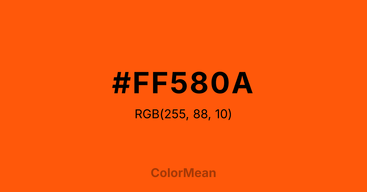
#FF580A Color Information
#FF580A RGB value is (255, 88, 10). The hex color red value is 255, green is 88, and blue is 10. Its HSL format shows a hue of 19°, saturation of 100 percent, and lightness of 52 percent. The CMYK process values are 0 percent, 65 percent, 96 percent, 0 percent.
#FF580A Color Meaning
Color #FF580A(Pantone) (#FF580A) commands with precision. #FF580A high-chroma, red-leaning orange was standardized for print fidelity—ensuring consistency across global packaging, fashion, and branding. Orange (Pantone) (#FF580A) doesn’t approximate energy; #FF580A quantifies #FF580A. Orange (Pantone) (#FF580A) is the color of engineered impact. In consumer behavior research, #FF580A exact hue increases perceived product intensity—especially in beverages, snacks, and energy supplements—because its spectral dominance triggers rapid taste anticipation. Orange (Pantone) (#FF580A) feels urgent but not alarming; #FF580A’s the visual equivalent of a firm handshake. Designers specify Orange (Pantone) (#FF580A) when consistency across media is non-negotiable. Unlike screen-optimized oranges, Orange (Pantone) (#FF580A) originates in material science—ink, dye, textile. #FF580A appears in luxury streetwear, tech packaging, and automotive accents where vibrancy must hold under direct light. Paired with matte black or cool gray, Orange (Pantone) (#FF580A) creates tension that feels intentional, not chaotic. #FF580A’s not loud—#FF580A’s calibrated.
Color Conversion
Convert #FF580A across different color models and formats. These conversions help designers work seamlessly between digital and print media, ensuring this color maintains its intended appearance across RGB screens, CMYK printers, and HSL color manipulations.
RGB Values & CMYK Values
RGB Values
CMYK Values
Color Variations
#FF580A harmonies come to life through carefully balanced shades, tints, and tones, giving this color depth and flexibility across light and dark variations. Shades add richness, tints bring an airy softness, and tones soften intensity, making it easy to pair in clean, modern palettes.
Color Harmonies
#FF580A harmonies create beautiful relationships with other colors based on their position on the color wheel. Each harmony type offers unique design possibilities, enabling cohesive and visually appealing color schemes.
Analogous
Colors adjacent on the color wheel (30° apart)
Complementary
Colors opposite on the color wheel (180° apart)
Split Complementary
Three colors using one base hue and the two hues beside its opposite
Triadic
Three colors evenly spaced (120° apart)
Tetradic
Four colors forming a rectangle on the wheel
Square
Four colors evenly spaced (90° apart)
Double Split
Four colors formed from two base hues and the colors next to their opposites
Monochromatic
Variations of a single hue
Contrast Checker
(WCAG 2.1) Test #FF580A for accessibility compliance against white and black backgrounds. Proper contrast ensures this color remains readable and usable for all audiences, meeting WCAG 2.1 standards for both normal and large text applications.
Sample Text
This is how your text will look with these colors.
Large Text (18pt+)
Normal Text
UI Components
Color Blindness Simulator
See how #FF580A appears to people with different types of color vision deficiencies. These simulations help create more inclusive designs that consider how this color is perceived across various visual abilities.
Normal Vision
protanopia
Note: These simulations are approximations. Actual color vision deficiency varies by individual.
CSS Examples
Background Color
Text Color
Sample Text
Border Color
Box Shadow
Text Shadow
Sample Text
Gradient
#FF580A Color FAQs
Frequently asked questions about #FF580A color meaning, symbolism, and applications. Click on any question to expand detailed answers.

