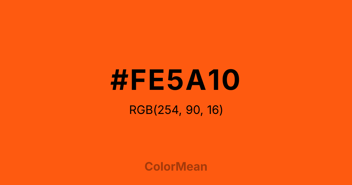
#FE5A10 Color Information
#FE5A10 RGB value is (254, 90, 16). The hex color red value is 254, green is 90, and blue is 16. Its HSL format shows a hue of 19°, saturation of 99 percent, and lightness of 53 percent. The CMYK process values are 0 percent, 65 percent, 94 percent, 0 percent.
#FE5A10 Color Meaning
Color #FE5A10 bursts with athletic intensity and natural vibrancy. Named after the vivid plumage of the Baltimore oriole, #FE5A10 high-chroma orange-red channels biological signaling—how nature uses color to claim space, attract mates, and warn rivals. Color #FE5A10 doesn’t blend in; #FE5A10 stakes a claim. Color #FE5A10 is identity made visible. Biological research shows that birds and humans alike perceive #FE5A10 specific wavelength as maximally conspicuous against green foliage—a trait exploited in both wildlife and safety design. In branding, color #FE5A10 conveys bold identity, local pride, and unapologetic presence. #FE5A10’s rarely used passively; #FE5A10’s a declaration. Unlike generic oranges, its red bias adds warmth without sweetness. #FE5A10 reads as fiery, not friendly. Sports teams and urban startups leverage color #FE5A10 to project tenacity and community spirit—rooted in real places, not abstract ideals. On screens, #FE5A10 maintains saturation without bleeding, making #FE5A10 ideal for dynamic digital identities. Color #FE5A10 doesn’t follow—#FE5A10 leads.
Color Conversion
Convert #FE5A10 across different color models and formats. These conversions help designers work seamlessly between digital and print media, ensuring this color maintains its intended appearance across RGB screens, CMYK printers, and HSL color manipulations.
RGB Values & CMYK Values
RGB Values
CMYK Values
Color Variations
#FE5A10 harmonies come to life through carefully balanced shades, tints, and tones, giving this color depth and flexibility across light and dark variations. Shades add richness, tints bring an airy softness, and tones soften intensity, making it easy to pair in clean, modern palettes.
Color Harmonies
#FE5A10 harmonies create beautiful relationships with other colors based on their position on the color wheel. Each harmony type offers unique design possibilities, enabling cohesive and visually appealing color schemes.
Analogous
Colors adjacent on the color wheel (30° apart)
Complementary
Colors opposite on the color wheel (180° apart)
Split Complementary
Three colors using one base hue and the two hues beside its opposite
Triadic
Three colors evenly spaced (120° apart)
Tetradic
Four colors forming a rectangle on the wheel
Square
Four colors evenly spaced (90° apart)
Double Split
Four colors formed from two base hues and the colors next to their opposites
Monochromatic
Variations of a single hue
Contrast Checker
(WCAG 2.1) Test #FE5A10 for accessibility compliance against white and black backgrounds. Proper contrast ensures this color remains readable and usable for all audiences, meeting WCAG 2.1 standards for both normal and large text applications.
Sample Text
This is how your text will look with these colors.
Large Text (18pt+)
Normal Text
UI Components
Color Blindness Simulator
See how #FE5A10 appears to people with different types of color vision deficiencies. These simulations help create more inclusive designs that consider how this color is perceived across various visual abilities.
Normal Vision
protanopia
Note: These simulations are approximations. Actual color vision deficiency varies by individual.
CSS Examples
Background Color
Text Color
Sample Text
Border Color
Box Shadow
Text Shadow
Sample Text
Gradient
#FE5A10 Color FAQs
Frequently asked questions about #FE5A10 color meaning, symbolism, and applications. Click on any question to expand detailed answers.
