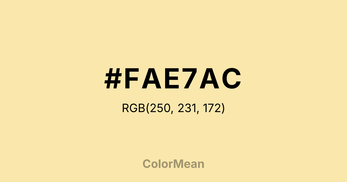
#FAE7AC Color Information
#FAE7AC RGB value is (250, 231, 172). The hex color red value is 250, green is 231, and blue is 172. Its HSL format shows a hue of 45°, saturation of 89 percent, and lightness of 83 percent. The CMYK process values are 0 percent, 8 percent, 31 percent, 2 percent.
#FAE7AC Color Meaning
Color #FAE7AC signifies warmth, subtle sweetness, and understated calm. #FAE7AC pale, creamy yellow shade evokes soft sunlight and natural simplicity, promoting a sense of ease and gentle optimism. In color psychology, color #FAE7AC encourages mental clarity, reduces tension, and fosters a nurturing, approachable atmosphere. Culturally, color #FAE7AC is often associated with comfort, domesticity, and hospitality. In Western traditions, #FAE7AC represents refinement and minimalism, while in Eastern symbolism, #FAE7AC can connect with purity and peaceful energy. Fengshui views #FAE7AC as a balancing color that enhances harmony in living spaces, particularly in areas meant for relaxation and social interaction. Spiritually, color #FAE7AC resonates with the Solar Plexus chakra, encouraging confidence and personal empowerment. Its light yellow undertones symbolize intellect, cheerfulness, and inspiration. Designers and artists use #FAE7AC to create soft contrasts, light backgrounds, or calm, welcoming palettes that feel natural and organic.
Color Conversion
Convert #FAE7AC across different color models and formats. These conversions help designers work seamlessly between digital and print media, ensuring this color maintains its intended appearance across RGB screens, CMYK printers, and HSL color manipulations.
RGB Values & CMYK Values
RGB Values
CMYK Values
Color Variations
#FAE7AC harmonies come to life through carefully balanced shades, tints, and tones, giving this color depth and flexibility across light and dark variations. Shades add richness, tints bring an airy softness, and tones soften intensity, making it easy to pair in clean, modern palettes.
Color Harmonies
#FAE7AC harmonies create beautiful relationships with other colors based on their position on the color wheel. Each harmony type offers unique design possibilities, enabling cohesive and visually appealing color schemes.
Analogous
Colors adjacent on the color wheel (30° apart)
Complementary
Colors opposite on the color wheel (180° apart)
Split Complementary
Three colors using one base hue and the two hues beside its opposite
Triadic
Three colors evenly spaced (120° apart)
Tetradic
Four colors forming a rectangle on the wheel
Square
Four colors evenly spaced (90° apart)
Double Split
Four colors formed from two base hues and the colors next to their opposites
Monochromatic
Variations of a single hue
Contrast Checker
(WCAG 2.1) Test #FAE7AC for accessibility compliance against white and black backgrounds. Proper contrast ensures this color remains readable and usable for all audiences, meeting WCAG 2.1 standards for both normal and large text applications.
Sample Text
This is how your text will look with these colors.
Large Text (18pt+)
Normal Text
UI Components
Color Blindness Simulator
See how #FAE7AC appears to people with different types of color vision deficiencies. These simulations help create more inclusive designs that consider how this color is perceived across various visual abilities.
Normal Vision
protanopia
Note: These simulations are approximations. Actual color vision deficiency varies by individual.
CSS Examples
Background Color
Text Color
Sample Text
Border Color
Box Shadow
Text Shadow
Sample Text
Gradient
#FAE7AC Color FAQs
Frequently asked questions about #FAE7AC color meaning, symbolism, and applications. Click on any question to expand detailed answers.
