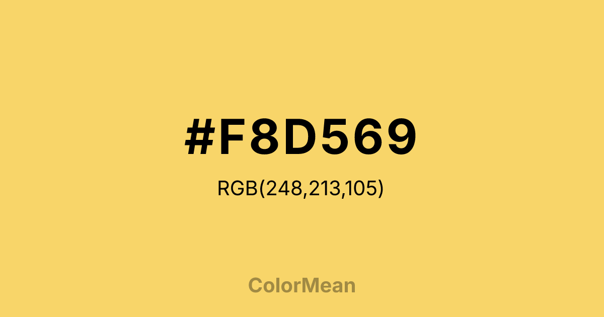
#F8D569 Color Information
#F8D569 RGB value is (248, 213, 105). The hex color red value is 248, green is 213, and blue is 105. Its HSL format shows a hue of 45°, saturation of 91 percent, and lightness of 69 percent. The CMYK process values are 0 percent, 14 percent, 58 percent, 3 percent.
#F8D569 Color Meaning
Color #F8D569 captures solar generosity. #F8D569 buttery, high-luminance hue sits at the edge of golden hour—bright enough to energize, warm enough to comfort. Color #F8D569 avoids the sharpness of lemon and the heaviness of amber, offering instead a tone of open-handed abundance. Color #F8D569 feels celebratory without excess. In daylight simulation studies, color #F8D569 enhances mood and circadian alignment better than pure yellow because its orange bias mimics natural sunset/sunrise spectra. Color #F8D569 is increasingly used in wellness apps, morning routines, and vitamin branding to signal natural energy. Culturally, #F8D569 ties to harvest festivals, Mediterranean kitchens, and sun-dried textiles. In UI design, color #F8D569 improves icon recognition in low-vision users due to its high contrast against dark backgrounds. Paired with indigo or olive, color #F8D569 creates palettes that feel both joyful and rooted. #F8D569’s the color of light shared, not hoarded.
Color Conversion
Convert #F8D569 across different color models and formats. These conversions help designers work seamlessly between digital and print media, ensuring this color maintains its intended appearance across RGB screens, CMYK printers, and HSL color manipulations.
RGB Values & CMYK Values
RGB Values
CMYK Values
Color Variations
#F8D569 harmonies come to life through carefully balanced shades, tints, and tones, giving this color depth and flexibility across light and dark variations. Shades add richness, tints bring an airy softness, and tones soften intensity, making it easy to pair in clean, modern palettes.
Color Harmonies
#F8D569 harmonies create beautiful relationships with other colors based on their position on the color wheel. Each harmony type offers unique design possibilities, enabling cohesive and visually appealing color schemes.
Analogous
Colors adjacent on the color wheel (30° apart)
Complementary
Colors opposite on the color wheel (180° apart)
Split Complementary
Three colors using one base hue and the two hues beside its opposite
Triadic
Three colors evenly spaced (120° apart)
Tetradic
Four colors forming a rectangle on the wheel
Square
Four colors evenly spaced (90° apart)
Double Split
Four colors formed from two base hues and the colors next to their opposites
Monochromatic
Variations of a single hue
Contrast Checker
(WCAG 2.1) Test #F8D569 for accessibility compliance against white and black backgrounds. Proper contrast ensures this color remains readable and usable for all audiences, meeting WCAG 2.1 standards for both normal and large text applications.
Sample Text
This is how your text will look with these colors.
Large Text (18pt+)
Normal Text
UI Components
Color Blindness Simulator
See how #F8D569 appears to people with different types of color vision deficiencies. These simulations help create more inclusive designs that consider how this color is perceived across various visual abilities.
Normal Vision
protanopia
Note: These simulations are approximations. Actual color vision deficiency varies by individual.
CSS Examples
Background Color
Text Color
Sample Text
Border Color
Box Shadow
Text Shadow
Sample Text
Gradient
#F8D569 Color FAQs
Frequently asked questions about #F8D569 color meaning, symbolism, and applications. Click on any question to expand detailed answers.

