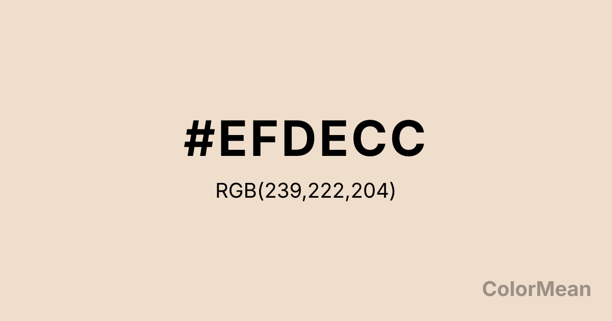
#EFDECC Color Information
#EFDECC RGB value is (239, 222, 204). The hex color red value is 239, green is 222, and blue is 204. Its HSL format shows a hue of 31°, saturation of 52 percent, and lightness of 87 percent. The CMYK process values are 0 percent, 7 percent, 15 percent, 6 percent.
#EFDECC Color Meaning
Color #EFDECC expresses soft neutrality, tactile comfort, and understated elegance. #EFDECC warm off-white mimics the inner shell of the #EFDECC nut—creamy, slightly beige, and gently organic. Psychologically, color #EFDECC reduces visual tension in interiors and interfaces by diffusing light without stark contrast. #EFDECC feels more intentional than pure white and more calming than beige, making #EFDECC ideal for wellness spaces, editorial design, and inclusive digital products that prioritize readability over flair. In fashion and packaging, #EFDECC communicates quiet luxury—think unbleached linen, ceramic tableware, or clean beauty. Culturally, #EFDECC aligns with “quiet consumerism,” where value lies in subtlety and sustainability rather than loud branding. Spiritually, #EFDECC suggests nourishment without excess: gentle care for self and environment. Use color #EFDECC as a foundational tone when you need warmth without color dominance—especially in minimalist, accessible, or aging-friendly design systems.
Color Conversion
Convert #EFDECC across different color models and formats. These conversions help designers work seamlessly between digital and print media, ensuring this color maintains its intended appearance across RGB screens, CMYK printers, and HSL color manipulations.
RGB Values & CMYK Values
RGB Values
CMYK Values
Color Variations
#EFDECC harmonies come to life through carefully balanced shades, tints, and tones, giving this color depth and flexibility across light and dark variations. Shades add richness, tints bring an airy softness, and tones soften intensity, making it easy to pair in clean, modern palettes.
Color Harmonies
#EFDECC harmonies create beautiful relationships with other colors based on their position on the color wheel. Each harmony type offers unique design possibilities, enabling cohesive and visually appealing color schemes.
Analogous
Colors adjacent on the color wheel (30° apart)
Complementary
Colors opposite on the color wheel (180° apart)
Split Complementary
Three colors using one base hue and the two hues beside its opposite
Triadic
Three colors evenly spaced (120° apart)
Tetradic
Four colors forming a rectangle on the wheel
Square
Four colors evenly spaced (90° apart)
Double Split
Four colors formed from two base hues and the colors next to their opposites
Monochromatic
Variations of a single hue
Contrast Checker
(WCAG 2.1) Test #EFDECC for accessibility compliance against white and black backgrounds. Proper contrast ensures this color remains readable and usable for all audiences, meeting WCAG 2.1 standards for both normal and large text applications.
Sample Text
This is how your text will look with these colors.
Large Text (18pt+)
Normal Text
UI Components
Color Blindness Simulator
See how #EFDECC appears to people with different types of color vision deficiencies. These simulations help create more inclusive designs that consider how this color is perceived across various visual abilities.
Normal Vision
protanopia
Note: These simulations are approximations. Actual color vision deficiency varies by individual.
CSS Examples
Background Color
Text Color
Sample Text
Border Color
Box Shadow
Text Shadow
Sample Text
Gradient
#EFDECC Color FAQs
Frequently asked questions about #EFDECC color meaning, symbolism, and applications. Click on any question to expand detailed answers.
