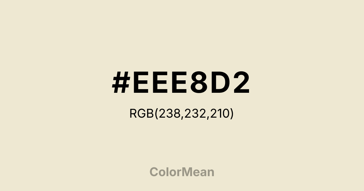
#EEE8D2 Color Information
#EEE8D2 RGB value is (238, 232, 210). The hex color red value is 238, green is 232, and blue is 210. Its HSL format shows a hue of 47°, saturation of 45 percent, and lightness of 88 percent. The CMYK process values are 0 percent, 3 percent, 12 percent, 7 percent.
#EEE8D2 Color Meaning
Color #EEE8D2 conveys a cooler, brighter variant of pearlescence, suggesting pristine surfaces, modern purity, and ethereal light. #EEE8D2 pale, yellowish-white is closer to ivory or eggshell, evoking bridal satin, fresh linen, or polished marble. Psychologically, color #EEE8D2 creates a sense of spacious, clean calm and orderly tranquility. #EEE8D2 feels more sterile and less organic than its warmer counterpart, promoting clarity, hygiene, and a serene, minimalist mindset. #EEE8D2 color is luxury defined by absence of flaw. Symbolically, color #EEE8D2 represents achieved perfection, blank slates, and ideal beginnings. #EEE8D2 is the color of a pristine canvas or a sophisticated, neutral foundation. Culturally, #EEE8D2 is prevalent in wedding aesthetics, modern art galleries, and luxury skincare branding, where #EEE8D2 conveys an aspirational sense of flawless beauty and serene order. #EEE8D2 alternate color #EEE8D2 offers a more contemporary, less narrative-driven interpretation of preciousness, focusing on light and space over story and texture.
Color Conversion
Convert #EEE8D2 across different color models and formats. These conversions help designers work seamlessly between digital and print media, ensuring this color maintains its intended appearance across RGB screens, CMYK printers, and HSL color manipulations.
RGB Values & CMYK Values
RGB Values
CMYK Values
Color Variations
#EEE8D2 harmonies come to life through carefully balanced shades, tints, and tones, giving this color depth and flexibility across light and dark variations. Shades add richness, tints bring an airy softness, and tones soften intensity, making it easy to pair in clean, modern palettes.
Color Harmonies
#EEE8D2 harmonies create beautiful relationships with other colors based on their position on the color wheel. Each harmony type offers unique design possibilities, enabling cohesive and visually appealing color schemes.
Analogous
Colors adjacent on the color wheel (30° apart)
Complementary
Colors opposite on the color wheel (180° apart)
Split Complementary
Three colors using one base hue and the two hues beside its opposite
Triadic
Three colors evenly spaced (120° apart)
Tetradic
Four colors forming a rectangle on the wheel
Square
Four colors evenly spaced (90° apart)
Double Split
Four colors formed from two base hues and the colors next to their opposites
Monochromatic
Variations of a single hue
Contrast Checker
(WCAG 2.1) Test #EEE8D2 for accessibility compliance against white and black backgrounds. Proper contrast ensures this color remains readable and usable for all audiences, meeting WCAG 2.1 standards for both normal and large text applications.
Sample Text
This is how your text will look with these colors.
Large Text (18pt+)
Normal Text
UI Components
Color Blindness Simulator
See how #EEE8D2 appears to people with different types of color vision deficiencies. These simulations help create more inclusive designs that consider how this color is perceived across various visual abilities.
Normal Vision
protanopia
Note: These simulations are approximations. Actual color vision deficiency varies by individual.
CSS Examples
Background Color
Text Color
Sample Text
Border Color
Box Shadow
Text Shadow
Sample Text
Gradient
#EEE8D2 Color FAQs
Frequently asked questions about #EEE8D2 color meaning, symbolism, and applications. Click on any question to expand detailed answers.

