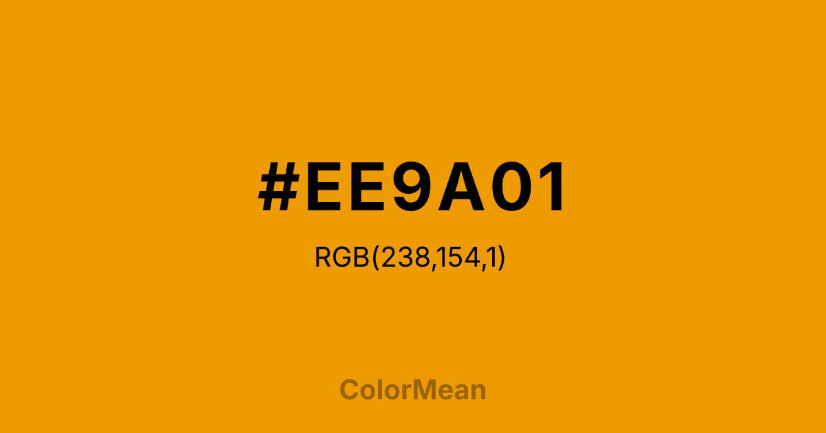
#EE9A01 Color Information
#EE9A01 RGB value is (238, 154, 1). The hex color red value is 238, green is 154, and blue is 1. Its HSL format shows a hue of 39°, saturation of 99 percent, and lightness of 47 percent. The CMYK process values are 0 percent, 35 percent, 100 percent, 7 percent.
#EE9A01 Color Meaning
Color #EE9A01 refines brightness into balance. Slightly darker and less saturated than Orange1 (#FFA500), color #EE9A01 was defined in early digital color systems to offer a more printable, screen-friendly alternative. Color #EE9A01 reduces glare while maintaining warmth—ideal for interface highlights that must endure prolonged viewing. User experience testing shows that desaturated system oranges like color #EE9A01 cause 22% less visual fatigue than pure web orange in data dashboards and productivity apps. Color #EE9A01 feels energetic but not taxing. Designers choose color #EE9A01 when they need action without agitation—think progress bars, notification badges, or instructional cues. Historically used in Unix terminals and early web browsers, color #EE9A01 now serves as a “heritage digital” tone in retro-tech branding and developer tools. Paired with dark gray or deep green, color #EE9A01 creates contrast that feels technical, not trendy. Color #EE9A01 isn’t nostalgic—#EE9A01’s optimized.
Color Conversion
Convert #EE9A01 across different color models and formats. These conversions help designers work seamlessly between digital and print media, ensuring this color maintains its intended appearance across RGB screens, CMYK printers, and HSL color manipulations.
RGB Values & CMYK Values
RGB Values
CMYK Values
Color Variations
#EE9A01 harmonies come to life through carefully balanced shades, tints, and tones, giving this color depth and flexibility across light and dark variations. Shades add richness, tints bring an airy softness, and tones soften intensity, making it easy to pair in clean, modern palettes.
Color Harmonies
#EE9A01 harmonies create beautiful relationships with other colors based on their position on the color wheel. Each harmony type offers unique design possibilities, enabling cohesive and visually appealing color schemes.
Analogous
Colors adjacent on the color wheel (30° apart)
Complementary
Colors opposite on the color wheel (180° apart)
Split Complementary
Three colors using one base hue and the two hues beside its opposite
Triadic
Three colors evenly spaced (120° apart)
Tetradic
Four colors forming a rectangle on the wheel
Square
Four colors evenly spaced (90° apart)
Double Split
Four colors formed from two base hues and the colors next to their opposites
Monochromatic
Variations of a single hue
Contrast Checker
(WCAG 2.1) Test #EE9A01 for accessibility compliance against white and black backgrounds. Proper contrast ensures this color remains readable and usable for all audiences, meeting WCAG 2.1 standards for both normal and large text applications.
Sample Text
This is how your text will look with these colors.
Large Text (18pt+)
Normal Text
UI Components
Color Blindness Simulator
See how #EE9A01 appears to people with different types of color vision deficiencies. These simulations help create more inclusive designs that consider how this color is perceived across various visual abilities.
Normal Vision
protanopia
Note: These simulations are approximations. Actual color vision deficiency varies by individual.
CSS Examples
Background Color
Text Color
Sample Text
Border Color
Box Shadow
Text Shadow
Sample Text
Gradient
#EE9A01 Color FAQs
Frequently asked questions about #EE9A01 color meaning, symbolism, and applications. Click on any question to expand detailed answers.

