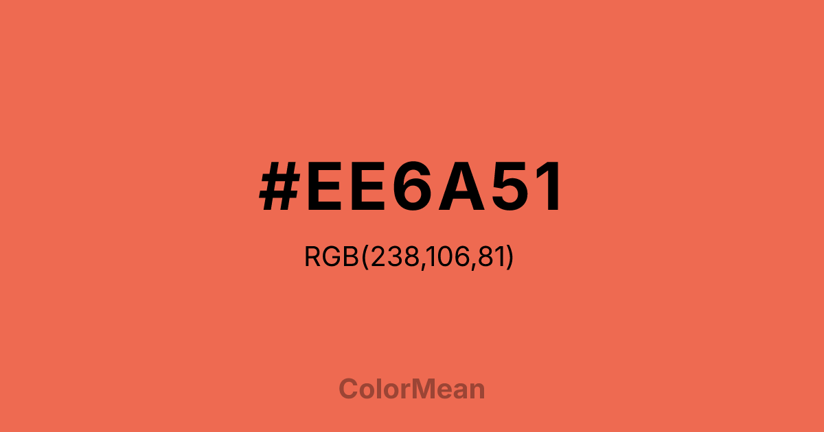
#EE6A51 Color Information
#EE6A51 RGB value is (238, 106, 81). The hex color red value is 238, green is 106, and blue is 81. Its HSL format shows a hue of 10°, saturation of 82 percent, and lightness of 63 percent. The CMYK process values are 0 percent, 55 percent, 66 percent, 7 percent.
#EE6A51 Color Meaning
Color #EE6A51 conveys balanced warmth, functional brightness, and tactile optimism. Color #EE6A51 is a slightly desaturated variant—retaining coral’s friendliness while adding maturity. #EE6A51 mirrors spiced peaches, sunset clay, and hand-dyed fabric. In lifestyle and food branding, #EE6A51 hue signals approachability with realism, especially in organic, seasonal, and artisanal contexts. Consumer psychology shows #EE6A51 increases perceived naturalness more effectively than brighter corals, likely due to its plausible earthiness. Functionally, color #EE6A51 bridges digital and print applications. #EE6A51 offers strong contrast against cream and slate, meeting accessibility standards for headlines and icons. Print reproduction is excellent on uncoated stocks, enhancing its use in packaging and editorial design. Consumer testing reveals higher trust in brands using color #EE6A51 versus neon alternatives—ideal for wellness and community platforms. Culturally, color #EE6A51 reflects joy that’s grounded. #EE6A51 appears in farmers’ markets, ceramic studios, and slow fashion as a symbol of celebration with roots. Spiritually, #EE6A51 aligns with the heart and sacral chakras in balance: love that moves gently. Designers use color #EE6A51 when they want to signal warmth with wisdom. Its energy is measured, not manic.
Color Conversion
Convert #EE6A51 across different color models and formats. These conversions help designers work seamlessly between digital and print media, ensuring this color maintains its intended appearance across RGB screens, CMYK printers, and HSL color manipulations.
RGB Values & CMYK Values
RGB Values
CMYK Values
Color Variations
#EE6A51 harmonies come to life through carefully balanced shades, tints, and tones, giving this color depth and flexibility across light and dark variations. Shades add richness, tints bring an airy softness, and tones soften intensity, making it easy to pair in clean, modern palettes.
Color Harmonies
#EE6A51 harmonies create beautiful relationships with other colors based on their position on the color wheel. Each harmony type offers unique design possibilities, enabling cohesive and visually appealing color schemes.
Analogous
Colors adjacent on the color wheel (30° apart)
Complementary
Colors opposite on the color wheel (180° apart)
Split Complementary
Three colors using one base hue and the two hues beside its opposite
Triadic
Three colors evenly spaced (120° apart)
Tetradic
Four colors forming a rectangle on the wheel
Square
Four colors evenly spaced (90° apart)
Double Split
Four colors formed from two base hues and the colors next to their opposites
Monochromatic
Variations of a single hue
Contrast Checker
(WCAG 2.1) Test #EE6A51 for accessibility compliance against white and black backgrounds. Proper contrast ensures this color remains readable and usable for all audiences, meeting WCAG 2.1 standards for both normal and large text applications.
Sample Text
This is how your text will look with these colors.
Large Text (18pt+)
Normal Text
UI Components
Color Blindness Simulator
See how #EE6A51 appears to people with different types of color vision deficiencies. These simulations help create more inclusive designs that consider how this color is perceived across various visual abilities.
Normal Vision
protanopia
Note: These simulations are approximations. Actual color vision deficiency varies by individual.
CSS Examples
Background Color
Text Color
Sample Text
Border Color
Box Shadow
Text Shadow
Sample Text
Gradient
#EE6A51 Color FAQs
Frequently asked questions about #EE6A51 color meaning, symbolism, and applications. Click on any question to expand detailed answers.

