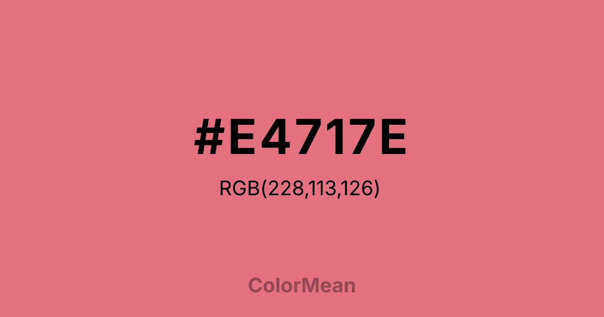
#E4717E Color Information
#E4717E RGB value is (228, 113, 126). The hex color red value is 228, green is 113, and blue is 126. Its HSL format shows a hue of 353°, saturation of 68 percent, and lightness of 67 percent. The CMYK process values are 0 percent, 50 percent, 45 percent, 11 percent.
#E4717E Color Meaning
Color #E4717E reflects romantic energy, emotional vibrancy, and expressive charm. #E4717E soft yet vivid pink hue promotes warmth, affection, and approachable intensity. Color #E4717E psychologically encourages emotional openness, connection, and positive interactions. Culturally, color #E4717E is tied to femininity, elegance, and playful sophistication in Western contexts, while in Eastern symbolism #E4717E often conveys gentle affection, love, and celebration. Fengshui sees #E4717E as promoting harmonious relationships and stimulating compassionate energy in shared spaces. Spiritually, color #E4717E resonates with the Heart Chakra, enhancing empathy, emotional healing, and loving interaction. Designers and artists use #E4717E soft vivid shade in fashion, interiors, and graphics where warmth, emotional engagement, and visual appeal are desired. Its bright, gentle character combines energy with soothing presence.
Color Conversion
Convert #E4717E across different color models and formats. These conversions help designers work seamlessly between digital and print media, ensuring this color maintains its intended appearance across RGB screens, CMYK printers, and HSL color manipulations.
RGB Values & CMYK Values
RGB Values
CMYK Values
Color Variations
#E4717E harmonies come to life through carefully balanced shades, tints, and tones, giving this color depth and flexibility across light and dark variations. Shades add richness, tints bring an airy softness, and tones soften intensity, making it easy to pair in clean, modern palettes.
Color Harmonies
#E4717E harmonies create beautiful relationships with other colors based on their position on the color wheel. Each harmony type offers unique design possibilities, enabling cohesive and visually appealing color schemes.
Analogous
Colors adjacent on the color wheel (30° apart)
Complementary
Colors opposite on the color wheel (180° apart)
Split Complementary
Three colors using one base hue and the two hues beside its opposite
Triadic
Three colors evenly spaced (120° apart)
Tetradic
Four colors forming a rectangle on the wheel
Square
Four colors evenly spaced (90° apart)
Double Split
Four colors formed from two base hues and the colors next to their opposites
Monochromatic
Variations of a single hue
Contrast Checker
(WCAG 2.1) Test #E4717E for accessibility compliance against white and black backgrounds. Proper contrast ensures this color remains readable and usable for all audiences, meeting WCAG 2.1 standards for both normal and large text applications.
Sample Text
This is how your text will look with these colors.
Large Text (18pt+)
Normal Text
UI Components
Color Blindness Simulator
See how #E4717E appears to people with different types of color vision deficiencies. These simulations help create more inclusive designs that consider how this color is perceived across various visual abilities.
Normal Vision
protanopia
Note: These simulations are approximations. Actual color vision deficiency varies by individual.
CSS Examples
Background Color
Text Color
Sample Text
Border Color
Box Shadow
Text Shadow
Sample Text
Gradient
#E4717E Color FAQs
Frequently asked questions about #E4717E color meaning, symbolism, and applications. Click on any question to expand detailed answers.

