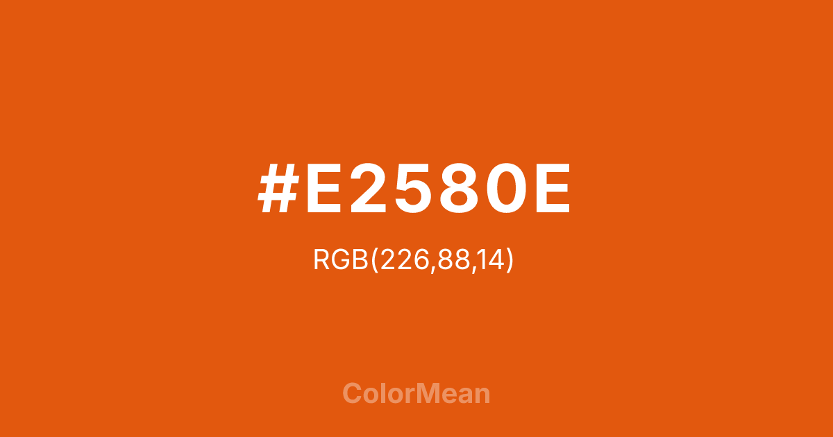
#E2580E Color Information
#E2580E RGB value is (226, 88, 14). The hex color red value is 226, green is 88, and blue is 14. Its HSL format shows a hue of 21°, saturation of 88 percent, and lightness of 47 percent. The CMYK process values are 0 percent, 61 percent, 94 percent, 11 percent.
#E2580E Color Meaning
Color #E2580E projects vibrant urgency, autumnal zest, and friendly warning. #E2580E bright, reddish-orange is the color of the ripe fruit, evoking harvest time, sunset alerts, and tangy sweetness. Psychologically, color #E2580E is energizing and attention-grabbing, stimulating appetite, activity, and immediate awareness. #E2580E sits between the friendly warmth of orange and the urgent signal of red, making #E2580E effective for calls to action that need to feel both positive and imperative. #E2580E color is inherently lively and impossible to ignore. Culturally, color #E2580E is associated with fall festivals, sports teams, and safety equipment, symbolizing visibility, ripe readiness, and high-energy fun. Symbolically, #E2580E represents a peak moment, a signal to act now, and energy that is both natural and intensely focused. Therefore, color #E2580E acts as a visual catalyst, cutting through visual clutter with its juicy, electric warmth to prompt engagement, caution, or celebration.
Color Conversion
Convert #E2580E across different color models and formats. These conversions help designers work seamlessly between digital and print media, ensuring this color maintains its intended appearance across RGB screens, CMYK printers, and HSL color manipulations.
RGB Values & CMYK Values
RGB Values
CMYK Values
Color Variations
#E2580E harmonies come to life through carefully balanced shades, tints, and tones, giving this color depth and flexibility across light and dark variations. Shades add richness, tints bring an airy softness, and tones soften intensity, making it easy to pair in clean, modern palettes.
Color Harmonies
#E2580E harmonies create beautiful relationships with other colors based on their position on the color wheel. Each harmony type offers unique design possibilities, enabling cohesive and visually appealing color schemes.
Analogous
Colors adjacent on the color wheel (30° apart)
Complementary
Colors opposite on the color wheel (180° apart)
Split Complementary
Three colors using one base hue and the two hues beside its opposite
Triadic
Three colors evenly spaced (120° apart)
Tetradic
Four colors forming a rectangle on the wheel
Square
Four colors evenly spaced (90° apart)
Double Split
Four colors formed from two base hues and the colors next to their opposites
Monochromatic
Variations of a single hue
Contrast Checker
(WCAG 2.1) Test #E2580E for accessibility compliance against white and black backgrounds. Proper contrast ensures this color remains readable and usable for all audiences, meeting WCAG 2.1 standards for both normal and large text applications.
Sample Text
This is how your text will look with these colors.
Large Text (18pt+)
Normal Text
UI Components
Color Blindness Simulator
See how #E2580E appears to people with different types of color vision deficiencies. These simulations help create more inclusive designs that consider how this color is perceived across various visual abilities.
Normal Vision
protanopia
Note: These simulations are approximations. Actual color vision deficiency varies by individual.
CSS Examples
Background Color
Text Color
Sample Text
Border Color
Box Shadow
Text Shadow
Sample Text
Gradient
#E2580E Color FAQs
Frequently asked questions about #E2580E color meaning, symbolism, and applications. Click on any question to expand detailed answers.

