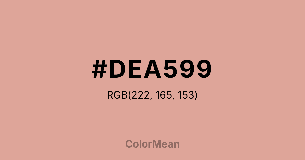
#DEA599 Color Information
#DEA599 RGB value is (222, 165, 153). The hex color red value is 222, green is 165, and blue is 153. Its HSL format shows a hue of 10°, saturation of 51 percent, and lightness of 74 percent. The CMYK process values are 0 percent, 26 percent, 31 percent, 13 percent.
#DEA599 Color Meaning
Color #DEA599 conveys delicate sentiment, faded beauty, and quiet nostalgia. #DEA599 muted, dusty pink resembles faded roses, vintage lace, or powdered blush, suggesting tenderness that has been softened by time. Psychologically, color #DEA599 is calming and subtly romantic, promoting feelings of affectionate memory, gentle care, and respectful admiration. #DEA599 soothes emotional agitation with its vintage warmth, offering a sense of sentimental comfort and timeless grace. #DEA599 color feels both elegant and fragile, speaking of beauty that is appreciated for its history. Symbolically, color #DEA599 represents enduring gentility, romantic memory preserved, and love that has mellowed into a quiet, constant presence. #DEA599 is the color of a cherished heirloom or a love letter kept for decades. Culturally, #DEA599 appears in shabby chic decor, historical romance aesthetics, and branding that aims for a classic, trustworthy femininity. Color #DEA599 embodies a sophisticated, non-threatening form of romance that values tradition and subtlety over boldness.
Color Conversion
Convert #DEA599 across different color models and formats. These conversions help designers work seamlessly between digital and print media, ensuring this color maintains its intended appearance across RGB screens, CMYK printers, and HSL color manipulations.
RGB Values & CMYK Values
RGB Values
CMYK Values
Color Variations
#DEA599 harmonies come to life through carefully balanced shades, tints, and tones, giving this color depth and flexibility across light and dark variations. Shades add richness, tints bring an airy softness, and tones soften intensity, making it easy to pair in clean, modern palettes.
Color Harmonies
#DEA599 harmonies create beautiful relationships with other colors based on their position on the color wheel. Each harmony type offers unique design possibilities, enabling cohesive and visually appealing color schemes.
Analogous
Colors adjacent on the color wheel (30° apart)
Complementary
Colors opposite on the color wheel (180° apart)
Split Complementary
Three colors using one base hue and the two hues beside its opposite
Triadic
Three colors evenly spaced (120° apart)
Tetradic
Four colors forming a rectangle on the wheel
Square
Four colors evenly spaced (90° apart)
Double Split
Four colors formed from two base hues and the colors next to their opposites
Monochromatic
Variations of a single hue
Contrast Checker
(WCAG 2.1) Test #DEA599 for accessibility compliance against white and black backgrounds. Proper contrast ensures this color remains readable and usable for all audiences, meeting WCAG 2.1 standards for both normal and large text applications.
Sample Text
This is how your text will look with these colors.
Large Text (18pt+)
Normal Text
UI Components
Color Blindness Simulator
See how #DEA599 appears to people with different types of color vision deficiencies. These simulations help create more inclusive designs that consider how this color is perceived across various visual abilities.
Normal Vision
protanopia
Note: These simulations are approximations. Actual color vision deficiency varies by individual.
CSS Examples
Background Color
Text Color
Sample Text
Border Color
Box Shadow
Text Shadow
Sample Text
Gradient
#DEA599 Color FAQs
Frequently asked questions about #DEA599 color meaning, symbolism, and applications. Click on any question to expand detailed answers.

