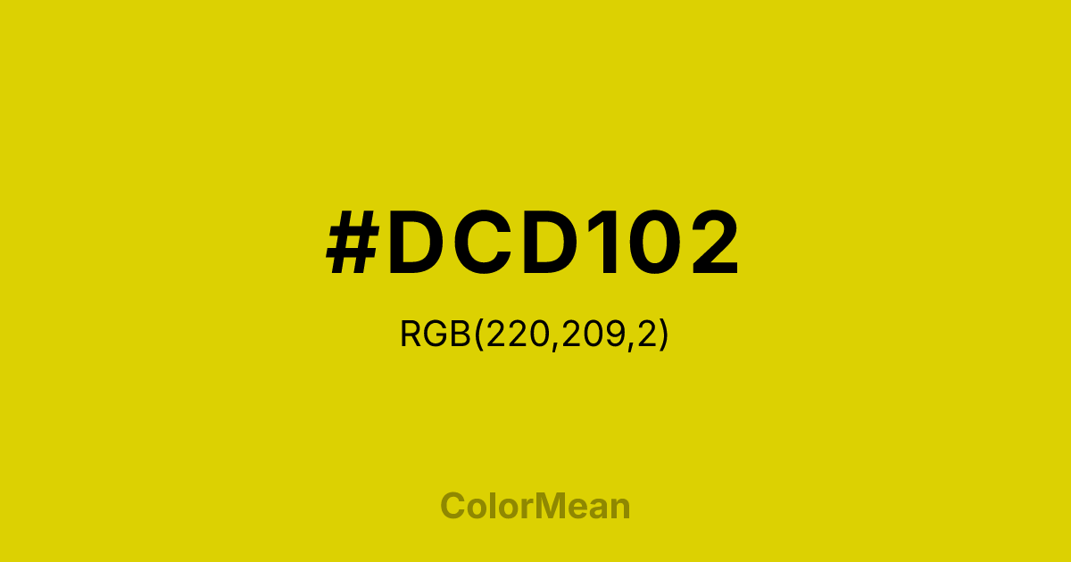
#DCD102 Color Information
#DCD102 RGB value is (220, 209, 2). The hex color red value is 220, green is 209, and blue is 2. Its HSL format shows a hue of 57°, saturation of 98 percent, and lightness of 44 percent. The CMYK process values are 0 percent, 5 percent, 99 percent, 14 percent.
#DCD102 Color Meaning
Color #DCD102 radiates solar clarity, intellectual optimism, and unclouded energy. Color #DCD102 is a vivid yellow with subtle green undertones—named after the quartz gemstone but defined by its crystalline brightness. Unlike lemon yellow, #DCD102 carries warmth; unlike chartreuse, #DCD102 avoids electric tension. In color psychology, #DCD102 hue stimulates mental clarity and openness, making #DCD102 ideal for educational tools, innovation labs, and wellness platforms focused on cognitive reset. Color #DCD102 doesn’t overwhelm—#DCD102 illuminates. Functionally, color #DCD102 works best as an accent in digital and print design. #DCD102’s common in highlight elements, interactive buttons, and editorial drop caps where immediate recognition matters. However, accessibility guidelines require careful pairing—#DCD102 fails contrast on white and must be used with deep charcoals or navies. Print reproduction benefits from bright white stock to preserve its luminance. When used sparingly, color #DCD102 enhances perceived freshness without sensory overload. Symbolically, color #DCD102 represents insight that shines. #DCD102 is the color of clear quartz, morning sun through glass, and uncluttered thought. In spiritual practice, #DCD102 aligns with the solar plexus chakra’s confident mode: self-worth expressed without doubt. Designers use color #DCD102 when they want to signal optimism with precision. Its clarity is its charm.
Color Conversion
Convert #DCD102 across different color models and formats. These conversions help designers work seamlessly between digital and print media, ensuring this color maintains its intended appearance across RGB screens, CMYK printers, and HSL color manipulations.
RGB Values & CMYK Values
RGB Values
CMYK Values
Color Variations
#DCD102 harmonies come to life through carefully balanced shades, tints, and tones, giving this color depth and flexibility across light and dark variations. Shades add richness, tints bring an airy softness, and tones soften intensity, making it easy to pair in clean, modern palettes.
Color Harmonies
#DCD102 harmonies create beautiful relationships with other colors based on their position on the color wheel. Each harmony type offers unique design possibilities, enabling cohesive and visually appealing color schemes.
Analogous
Colors adjacent on the color wheel (30° apart)
Complementary
Colors opposite on the color wheel (180° apart)
Split Complementary
Three colors using one base hue and the two hues beside its opposite
Triadic
Three colors evenly spaced (120° apart)
Tetradic
Four colors forming a rectangle on the wheel
Square
Four colors evenly spaced (90° apart)
Double Split
Four colors formed from two base hues and the colors next to their opposites
Monochromatic
Variations of a single hue
Contrast Checker
(WCAG 2.1) Test #DCD102 for accessibility compliance against white and black backgrounds. Proper contrast ensures this color remains readable and usable for all audiences, meeting WCAG 2.1 standards for both normal and large text applications.
Sample Text
This is how your text will look with these colors.
Large Text (18pt+)
Normal Text
UI Components
Color Blindness Simulator
See how #DCD102 appears to people with different types of color vision deficiencies. These simulations help create more inclusive designs that consider how this color is perceived across various visual abilities.
Normal Vision
protanopia
Note: These simulations are approximations. Actual color vision deficiency varies by individual.
CSS Examples
Background Color
Text Color
Sample Text
Border Color
Box Shadow
Text Shadow
Sample Text
Gradient
#DCD102 Color FAQs
Frequently asked questions about #DCD102 color meaning, symbolism, and applications. Click on any question to expand detailed answers.

