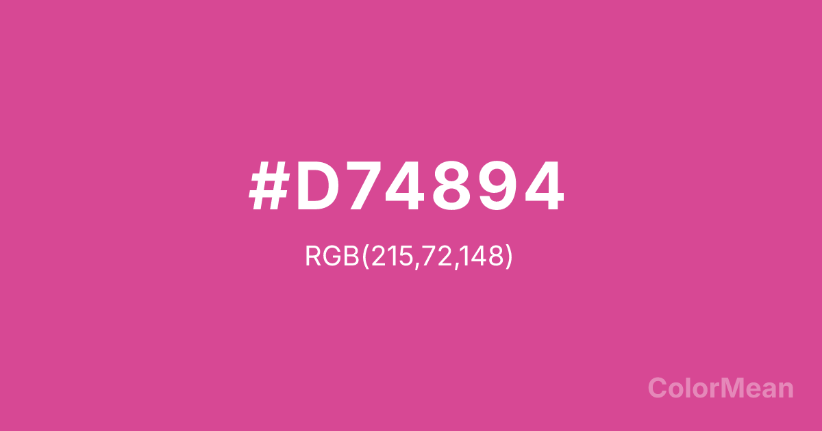
Pink (Pantone) (#D74894) Color Information
Pink (Pantone) (#D74894) RGB value is (215, 72, 148). The hex color red value is 215, green is 72, and blue is 148. Its HSL format shows a hue of 328°, saturation of 64 percent, and lightness of 56 percent. The CMYK process values are 0 percent, 67 percent, 31 percent, 16 percent.
Pink (Pantone) (#D74894) Color Meaning
Pink (Pantone) (#D74894) projects a more sophisticated and vibrant expression of femininity, blending energetic passion with modern confidence. This strong, purplish-pink is less innocent and more declarative than standard pink, suggesting boldness, contemporary flair, and unapologetic individuality. Psychologically, Pink (Pantone) (#D74894) is stimulating and self-assured, promoting feelings of energetic love, creative expression, and a vibrant, modern identity. It captures attention with its electric warmth and stylish depth. This color is tender but powerful. Culturally, as a specific Pantone formulation, Pink (Pantone) (#D74894) represents the professionalization and diversification of pink in design, fashion, and branding. Symbolically, it stands for empowered sentiment, passion with a clear voice, and femininity that is dynamic and complex. Pink (Pantone) (#D74894) is often used to signal a break from traditional pink stereotypes, offering a hue that is still recognizably feminine but carries connotations of strength, innovation, and contemporary sophistication.
Color Conversion
Convert Pink (Pantone) (#D74894) across different color models and formats. These conversions help designers work seamlessly between digital and print media, ensuring this color maintains its intended appearance across RGB screens, CMYK printers, and HSL color manipulations.
RGB Values & CMYK Values
RGB Values
CMYK Values
Color Variations
Pink (Pantone) (#D74894) harmonies come to life through carefully balanced shades, tints, and tones, giving this color depth and flexibility across light and dark variations. Shades add richness, tints bring an airy softness, and tones soften intensity, making it easy to pair in clean, modern palettes.
Color Harmonies
Pink (Pantone) (#D74894) harmonies create beautiful relationships with other colors based on their position on the color wheel. Each harmony type offers unique design possibilities, enabling cohesive and visually appealing color schemes.
Analogous
Colors adjacent on the color wheel (30° apart)
Complementary
Colors opposite on the color wheel (180° apart)
Split Complementary
Three colors using one base hue and the two hues beside its opposite
Triadic
Three colors evenly spaced (120° apart)
Tetradic
Four colors forming a rectangle on the wheel
Square
Four colors evenly spaced (90° apart)
Double Split
Four colors formed from two base hues and the colors next to their opposites
Monochromatic
Variations of a single hue
Contrast Checker
(WCAG 2.1) Test Pink (Pantone) (#D74894) for accessibility compliance against white and black backgrounds. Proper contrast ensures this color remains readable and usable for all audiences, meeting WCAG 2.1 standards for both normal and large text applications.
Sample Text
This is how your text will look with these colors.
Large Text (18pt+)
Normal Text
UI Components
Color Blindness Simulator
See how #D74894 appears to people with different types of color vision deficiencies. These simulations help create more inclusive designs that consider how this color is perceived across various visual abilities.
Normal Vision
protanopia
Note: These simulations are approximations. Actual color vision deficiency varies by individual.
CSS Examples
Background Color
Text Color
Sample Text
Border Color
Box Shadow
Text Shadow
Sample Text
Gradient
Pink (Pantone) (#D74894) Color FAQs
Frequently asked questions about Pink (Pantone) (#D74894) color meaning, symbolism, and applications. Click on any question to expand detailed answers.
