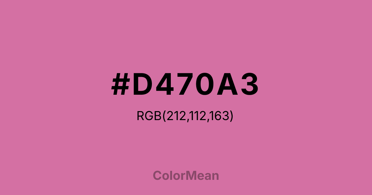
#D470A3 Color Information
#D470A3 RGB value is (212, 112, 163). The hex color red value is 212, green is 112, and blue is 163. Its HSL format shows a hue of 329°, saturation of 54 percent, and lightness of 64 percent. The CMYK process values are 0 percent, 47 percent, 23 percent, 17 percent.
#D470A3 Color Meaning
Color #D470A3 embodies creativity, romance, and expressive energy. #D470A3 vibrant pink-purple merges emotional warmth with spiritual curiosity. Psychologically, color #D470A3 stimulates imagination, emotional openness, and self-expression, offering boldness with sophistication. Culturally, color #D470A3 signifies luxury, passion, and individuality in Western traditions, while Eastern symbolism links #D470A3 to spiritual growth and transformative energy. Fengshui considers #D470A3 energizing, enhancing love, creativity, and dynamic flow in spaces. Spiritually, #D470A3 resonates with the heart and third-eye chakras, encouraging emotional insight, artistic inspiration, and connection to inner wisdom. In design and arts, color #D470A3 works as a statement accent or energetic focal point. Its vivid, medium-light shade pairs beautifully with muted neutrals or darker purples, appearing in fashion, digital media, and expressive artwork.
Color Conversion
Convert #D470A3 across different color models and formats. These conversions help designers work seamlessly between digital and print media, ensuring this color maintains its intended appearance across RGB screens, CMYK printers, and HSL color manipulations.
RGB Values & CMYK Values
RGB Values
CMYK Values
Color Variations
#D470A3 harmonies come to life through carefully balanced shades, tints, and tones, giving this color depth and flexibility across light and dark variations. Shades add richness, tints bring an airy softness, and tones soften intensity, making it easy to pair in clean, modern palettes.
Color Harmonies
#D470A3 harmonies create beautiful relationships with other colors based on their position on the color wheel. Each harmony type offers unique design possibilities, enabling cohesive and visually appealing color schemes.
Analogous
Colors adjacent on the color wheel (30° apart)
Complementary
Colors opposite on the color wheel (180° apart)
Split Complementary
Three colors using one base hue and the two hues beside its opposite
Triadic
Three colors evenly spaced (120° apart)
Tetradic
Four colors forming a rectangle on the wheel
Square
Four colors evenly spaced (90° apart)
Double Split
Four colors formed from two base hues and the colors next to their opposites
Monochromatic
Variations of a single hue
Contrast Checker
(WCAG 2.1) Test #D470A3 for accessibility compliance against white and black backgrounds. Proper contrast ensures this color remains readable and usable for all audiences, meeting WCAG 2.1 standards for both normal and large text applications.
Sample Text
This is how your text will look with these colors.
Large Text (18pt+)
Normal Text
UI Components
Color Blindness Simulator
See how #D470A3 appears to people with different types of color vision deficiencies. These simulations help create more inclusive designs that consider how this color is perceived across various visual abilities.
Normal Vision
protanopia
Note: These simulations are approximations. Actual color vision deficiency varies by individual.
CSS Examples
Background Color
Text Color
Sample Text
Border Color
Box Shadow
Text Shadow
Sample Text
Gradient
#D470A3 Color FAQs
Frequently asked questions about #D470A3 color meaning, symbolism, and applications. Click on any question to expand detailed answers.

