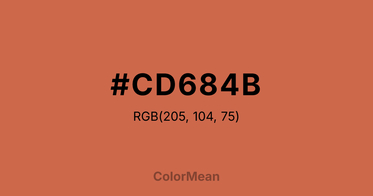
#CD684B Color Information
#CD684B RGB value is (205, 104, 75). The hex color red value is 205, green is 104, and blue is 75. Its HSL format shows a hue of 13°, saturation of 57 percent, and lightness of 55 percent. The CMYK process values are 0 percent, 49 percent, 63 percent, 20 percent.
#CD684B Color Meaning
Color #CD684B radiates warm energy, assertive earthiness, and functional vibrancy. Color #CD684B is a vivid orange-red that mirrors heated metal or spiced clay—luminous, grounded, and slightly gritty. Unlike fire-engine red, #CD684B carries earth; unlike terracotta, #CD684B commands attention. In food and craft branding, #CD684B hue signals potency and immediacy, especially in spice blends, ceramic studios, and artisanal goods. Cognitive studies show #CD684B increases perceived freshness and energy in product claims more effectively than standard reds. Functionally, color #CD684B excels as a focal accent in digital and packaging design. #CD684B offers strong contrast against deep greens and blues, and meets accessibility standards for headlines. Print reproduction is excellent on coated stocks, enhancing its use in limited-edition labels and event branding. A/B tests confirm higher conversion when color #CD684B replaces standard orange in food and wellness contexts. Culturally, color #CD684B reflects fire that creates—kilns, stovetops, forges. #CD684B appears in maker culture, culinary innovation, and community kitchens as a symbol of energy that nourishes. Spiritually, #CD684B aligns with the sacral and root chakras combined: vitality rooted in action. Designers use color #CD684B when they want to signal warmth with willpower. Its energy is purposeful.
Color Conversion
Convert #CD684B across different color models and formats. These conversions help designers work seamlessly between digital and print media, ensuring this color maintains its intended appearance across RGB screens, CMYK printers, and HSL color manipulations.
RGB Values & CMYK Values
RGB Values
CMYK Values
Color Variations
#CD684B harmonies come to life through carefully balanced shades, tints, and tones, giving this color depth and flexibility across light and dark variations. Shades add richness, tints bring an airy softness, and tones soften intensity, making it easy to pair in clean, modern palettes.
Color Harmonies
#CD684B harmonies create beautiful relationships with other colors based on their position on the color wheel. Each harmony type offers unique design possibilities, enabling cohesive and visually appealing color schemes.
Analogous
Colors adjacent on the color wheel (30° apart)
Complementary
Colors opposite on the color wheel (180° apart)
Split Complementary
Three colors using one base hue and the two hues beside its opposite
Triadic
Three colors evenly spaced (120° apart)
Tetradic
Four colors forming a rectangle on the wheel
Square
Four colors evenly spaced (90° apart)
Double Split
Four colors formed from two base hues and the colors next to their opposites
Monochromatic
Variations of a single hue
Contrast Checker
(WCAG 2.1) Test #CD684B for accessibility compliance against white and black backgrounds. Proper contrast ensures this color remains readable and usable for all audiences, meeting WCAG 2.1 standards for both normal and large text applications.
Sample Text
This is how your text will look with these colors.
Large Text (18pt+)
Normal Text
UI Components
Color Blindness Simulator
See how #CD684B appears to people with different types of color vision deficiencies. These simulations help create more inclusive designs that consider how this color is perceived across various visual abilities.
Normal Vision
protanopia
Note: These simulations are approximations. Actual color vision deficiency varies by individual.
CSS Examples
Background Color
Text Color
Sample Text
Border Color
Box Shadow
Text Shadow
Sample Text
Gradient
#CD684B Color FAQs
Frequently asked questions about #CD684B color meaning, symbolism, and applications. Click on any question to expand detailed answers.
