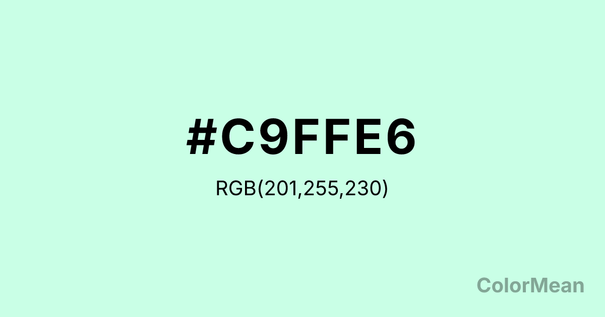
#C9FFE6 Color Information
#C9FFE6 RGB value is (201, 255, 230). The hex color red value is 201, green is 255, and blue is 230. Its HSL format shows a hue of 152°, saturation of 100 percent, and lightness of 89 percent. The CMYK process values are 21 percent, 0 percent, 10 percent, 0 percent.
#C9FFE6 Color Meaning
Color #C9FFE6 radiates gentle renewal, digital serenity, and post-industrial calm. As a pale cyan-tinted white, #C9FFE6 mimics the glow of well-lit screens or filtered daylight through airplane windows. Psychologically, color #C9FFE6 soothes without inducing drowsiness, making #C9FFE6 ideal for wellness apps, recovery spaces, and minimalist design systems. Its low saturation prevents visual fatigue, while its cool undertone maintains mental alertness. Unlike stark whites, #C9FFE6 softens digital harshness without sacrificing clarity. In environmental design, color #C9FFE6 suggests purified air and water—often used in spas, dental offices, and sustainable packaging. Culturally, #C9FFE6 reflects a shift toward “clean tech” aesthetics: sterile but humane, efficient but peaceful. Spiritually, #C9FFE6 represents clarity after confusion, like morning mist burning off to reveal a clear day. Because #C9FFE6 resists strong emotional associations, color #C9FFE6 acts as a neutral yet intentional canvas for user interaction, emotional regulation, and mindful consumption.
Color Conversion
Convert #C9FFE6 across different color models and formats. These conversions help designers work seamlessly between digital and print media, ensuring this color maintains its intended appearance across RGB screens, CMYK printers, and HSL color manipulations.
RGB Values & CMYK Values
RGB Values
CMYK Values
Color Variations
#C9FFE6 harmonies come to life through carefully balanced shades, tints, and tones, giving this color depth and flexibility across light and dark variations. Shades add richness, tints bring an airy softness, and tones soften intensity, making it easy to pair in clean, modern palettes.
Color Harmonies
#C9FFE6 harmonies create beautiful relationships with other colors based on their position on the color wheel. Each harmony type offers unique design possibilities, enabling cohesive and visually appealing color schemes.
Analogous
Colors adjacent on the color wheel (30° apart)
Complementary
Colors opposite on the color wheel (180° apart)
Split Complementary
Three colors using one base hue and the two hues beside its opposite
Triadic
Three colors evenly spaced (120° apart)
Tetradic
Four colors forming a rectangle on the wheel
Square
Four colors evenly spaced (90° apart)
Double Split
Four colors formed from two base hues and the colors next to their opposites
Monochromatic
Variations of a single hue
Contrast Checker
(WCAG 2.1) Test #C9FFE6 for accessibility compliance against white and black backgrounds. Proper contrast ensures this color remains readable and usable for all audiences, meeting WCAG 2.1 standards for both normal and large text applications.
Sample Text
This is how your text will look with these colors.
Large Text (18pt+)
Normal Text
UI Components
Color Blindness Simulator
See how #C9FFE6 appears to people with different types of color vision deficiencies. These simulations help create more inclusive designs that consider how this color is perceived across various visual abilities.
Normal Vision
protanopia
Note: These simulations are approximations. Actual color vision deficiency varies by individual.
CSS Examples
Background Color
Text Color
Sample Text
Border Color
Box Shadow
Text Shadow
Sample Text
Gradient
#C9FFE6 Color FAQs
Frequently asked questions about #C9FFE6 color meaning, symbolism, and applications. Click on any question to expand detailed answers.
