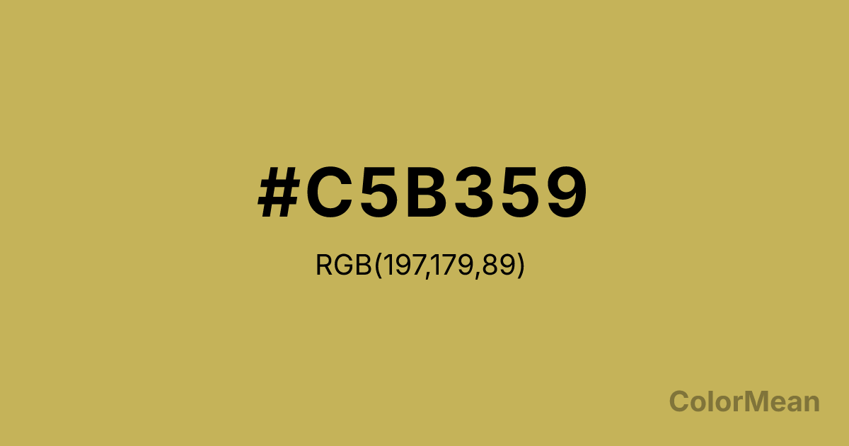
#C5B359 Color Information
#C5B359 RGB value is (197, 179, 89). The hex color red value is 197, green is 179, and blue is 89. Its HSL format shows a hue of 50°, saturation of 48 percent, and lightness of 56 percent. The CMYK process values are 0 percent, 9 percent, 55 percent, 23 percent.
#C5B359 Color Meaning
Color #C5B359 reflects prestige, optimism, and practical elegance. #C5B359 muted yellow gold suggests grounded wealth, creative inspiration, and moderate energy, avoiding the harshness of vivid metallic tones. Psychologically, color #C5B359 promotes confidence, intellectual stimulation, and subtle motivation. Culturally, color #C5B359 draws associations with success, prosperity, and ceremonial importance. In Western art and fashion, #C5B359 signifies classic luxury; in Eastern traditions, #C5B359 symbolizes abundance, growth, and sacred value. Fengshui interprets #C5B359 as a stabilizing element that enhances wealth and career energy when placed strategically in workspaces. Spiritually, color #C5B359 corresponds to the Solar Plexus chakra, reinforcing personal power, determination, and clear decision-making. #C5B359 is a medium-dark yellow shade, combining warmth and grounded energy. Designers and architects often use #C5B359 in interiors, branding, and artwork to convey subtle opulence without overwhelming visual senses.
Color Conversion
Convert #C5B359 across different color models and formats. These conversions help designers work seamlessly between digital and print media, ensuring this color maintains its intended appearance across RGB screens, CMYK printers, and HSL color manipulations.
RGB Values & CMYK Values
RGB Values
CMYK Values
Color Variations
#C5B359 harmonies come to life through carefully balanced shades, tints, and tones, giving this color depth and flexibility across light and dark variations. Shades add richness, tints bring an airy softness, and tones soften intensity, making it easy to pair in clean, modern palettes.
Color Harmonies
#C5B359 harmonies create beautiful relationships with other colors based on their position on the color wheel. Each harmony type offers unique design possibilities, enabling cohesive and visually appealing color schemes.
Analogous
Colors adjacent on the color wheel (30° apart)
Complementary
Colors opposite on the color wheel (180° apart)
Split Complementary
Three colors using one base hue and the two hues beside its opposite
Triadic
Three colors evenly spaced (120° apart)
Tetradic
Four colors forming a rectangle on the wheel
Square
Four colors evenly spaced (90° apart)
Double Split
Four colors formed from two base hues and the colors next to their opposites
Monochromatic
Variations of a single hue
Contrast Checker
(WCAG 2.1) Test #C5B359 for accessibility compliance against white and black backgrounds. Proper contrast ensures this color remains readable and usable for all audiences, meeting WCAG 2.1 standards for both normal and large text applications.
Sample Text
This is how your text will look with these colors.
Large Text (18pt+)
Normal Text
UI Components
Color Blindness Simulator
See how #C5B359 appears to people with different types of color vision deficiencies. These simulations help create more inclusive designs that consider how this color is perceived across various visual abilities.
Normal Vision
protanopia
Note: These simulations are approximations. Actual color vision deficiency varies by individual.
CSS Examples
Background Color
Text Color
Sample Text
Border Color
Box Shadow
Text Shadow
Sample Text
Gradient
#C5B359 Color FAQs
Frequently asked questions about #C5B359 color meaning, symbolism, and applications. Click on any question to expand detailed answers.
