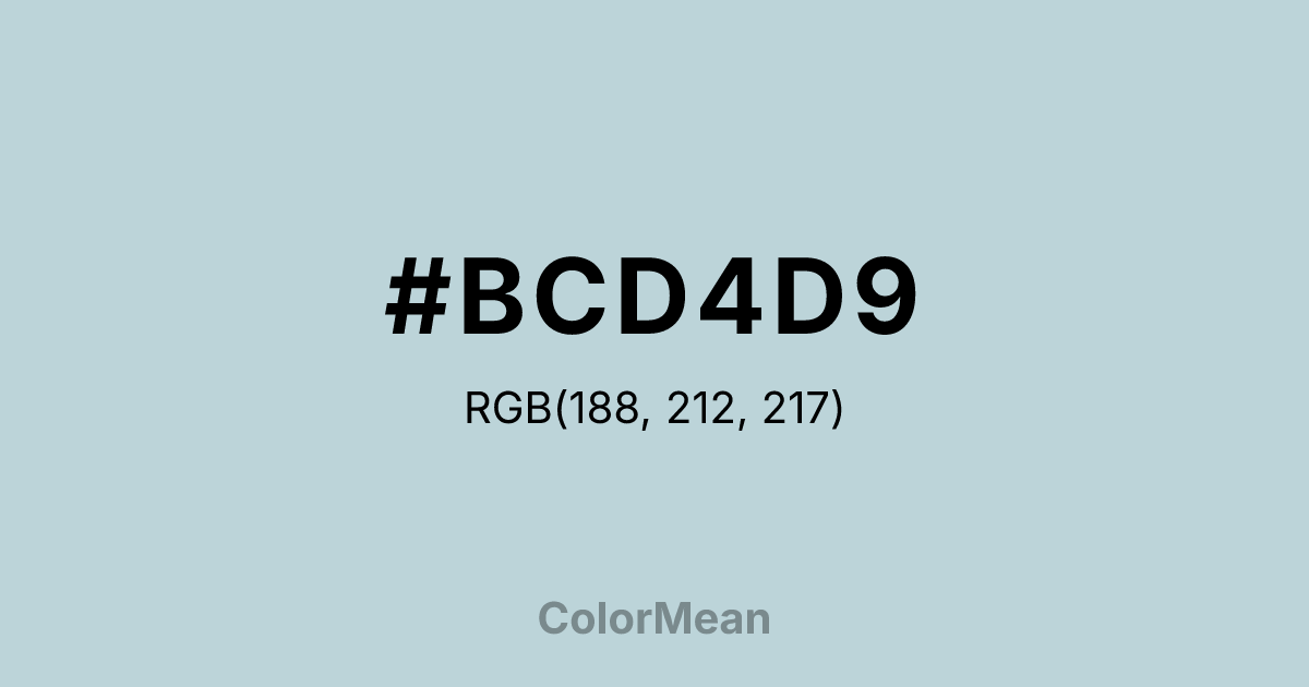
#BCD4D9 Color Information
#BCD4D9 RGB value is (188, 212, 217). The hex color red value is 188, green is 212, and blue is 217. Its HSL format shows a hue of 190°, saturation of 28 percent, and lightness of 79 percent. The CMYK process values are 13 percent, 2 percent, 0 percent, 15 percent.
#BCD4D9 Color Meaning
Color #BCD4D9 offers softened institutional calm, atmospheric neutrality, and gentle professionalism. #BCD4D9 lighter, greyer variant of color #BCD4D9 leans toward periwinkle—evoking overcast skies, institutional linens, and calm water. Unlike stark greys, #BCD4D9 carries emotional warmth through its blue base; unlike brighter blues, #BCD4D9 avoids dominance. In healthcare and education design, #BCD4D9 hue reduces anxiety in waiting areas and digital dashboards by offering a chromatic “buffer” that feels supportive without intrusion. In UI/UX systems, color #BCD4D9 functions as a calming background or card color. #BCD4D9 meets accessibility contrast standards when paired with deep charcoals or navy text, making #BCD4D9 viable for long-form content. Print reproduction is excellent on uncoated stocks, enhancing its use in editorial and academic publishing. Consumer testing reveals higher comfort ratings for interfaces using color #BCD4D9 versus standard light greys. Culturally, color #BCD4D9 reflects care that listens. #BCD4D9 appears in mental health platforms, senior services, and public broadcasting as a symbol of support without pressure. Spiritually, #BCD4D9 aligns with the throat chakra’s receptive mode: communication that holds space. Designers choose color #BCD4D9 when they want to signal neutrality with heart. Its calm is active, not passive.
Color Conversion
Convert #BCD4D9 across different color models and formats. These conversions help designers work seamlessly between digital and print media, ensuring this color maintains its intended appearance across RGB screens, CMYK printers, and HSL color manipulations.
RGB Values & CMYK Values
RGB Values
CMYK Values
Color Variations
#BCD4D9 harmonies come to life through carefully balanced shades, tints, and tones, giving this color depth and flexibility across light and dark variations. Shades add richness, tints bring an airy softness, and tones soften intensity, making it easy to pair in clean, modern palettes.
Color Harmonies
#BCD4D9 harmonies create beautiful relationships with other colors based on their position on the color wheel. Each harmony type offers unique design possibilities, enabling cohesive and visually appealing color schemes.
Analogous
Colors adjacent on the color wheel (30° apart)
Complementary
Colors opposite on the color wheel (180° apart)
Split Complementary
Three colors using one base hue and the two hues beside its opposite
Triadic
Three colors evenly spaced (120° apart)
Tetradic
Four colors forming a rectangle on the wheel
Square
Four colors evenly spaced (90° apart)
Double Split
Four colors formed from two base hues and the colors next to their opposites
Monochromatic
Variations of a single hue
Contrast Checker
(WCAG 2.1) Test #BCD4D9 for accessibility compliance against white and black backgrounds. Proper contrast ensures this color remains readable and usable for all audiences, meeting WCAG 2.1 standards for both normal and large text applications.
Sample Text
This is how your text will look with these colors.
Large Text (18pt+)
Normal Text
UI Components
Color Blindness Simulator
See how #BCD4D9 appears to people with different types of color vision deficiencies. These simulations help create more inclusive designs that consider how this color is perceived across various visual abilities.
Normal Vision
protanopia
Note: These simulations are approximations. Actual color vision deficiency varies by individual.
CSS Examples
Background Color
Text Color
Sample Text
Border Color
Box Shadow
Text Shadow
Sample Text
Gradient
#BCD4D9 Color FAQs
Frequently asked questions about #BCD4D9 color meaning, symbolism, and applications. Click on any question to expand detailed answers.
