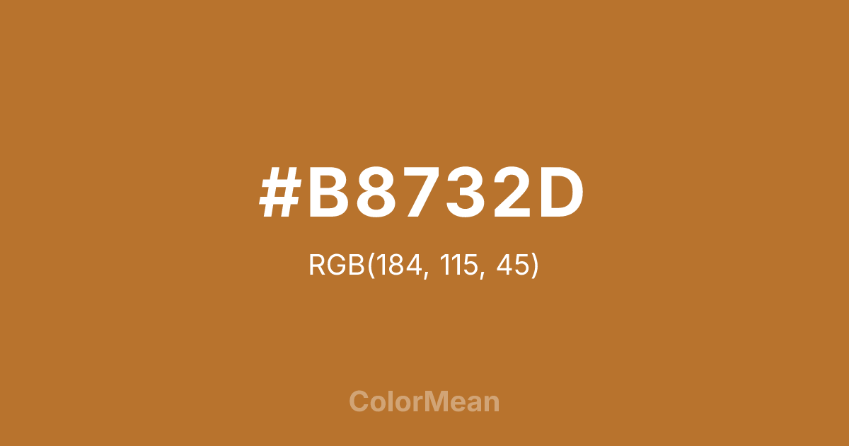
#B8732D Color Information
#B8732D RGB value is (184, 115, 45). The hex color red value is 184, green is 115, and blue is 45. Its HSL format shows a hue of 30°, saturation of 61 percent, and lightness of 45 percent. The CMYK process values are 0 percent, 38 percent, 76 percent, 28 percent.
#B8732D Color Meaning
Color #B8732D embodies metallic warmth, historical richness, and transformative energy. Color #B8732D is a deep orange-brown that mirrors the oxidized metal—warm, luminous, and slightly reddish. Unlike bronze or gold, #B8732D carries approachable richness; unlike rust, #B8732D feels refined. In interior and product design, #B8732D hue signals heritage with tactility: think cookware, architectural accents, and artisan jewelry. Psychological studies link such warm metallics to increased perceived value and craftsmanship, especially in luxury and craft contexts. Functionally, color #B8732D works beautifully as a primary or accent in branding and packaging. #B8732D pairs powerfully with navy, olive, and cream, creating palettes that feel both earthy and elevated. Digital contrast is strong against light backgrounds, and #B8732D meets accessibility standards for headlines. Print reproduction is excellent on matte and textured stocks, where its depth enhances artisanal credibility. Consumer research shows higher emotional resonance with products using color #B8732D in heritage and slow-design categories. Culturally, color #B8732D reflects transformation through time—metal that patinas, cookware that seasons, hands that shape. #B8732D appears in alchemical symbolism, sustainable design, and craft cooperatives as a symbol of change that enriches. Spiritually, #B8732D aligns with the sacral and solar plexus chakras combined: creativity that builds confidence. Designers choose color #B8732D when they want to signal warmth with history. Its luster is earned, not applied.
Color Conversion
Convert #B8732D across different color models and formats. These conversions help designers work seamlessly between digital and print media, ensuring this color maintains its intended appearance across RGB screens, CMYK printers, and HSL color manipulations.
RGB Values & CMYK Values
RGB Values
CMYK Values
Color Variations
#B8732D harmonies come to life through carefully balanced shades, tints, and tones, giving this color depth and flexibility across light and dark variations. Shades add richness, tints bring an airy softness, and tones soften intensity, making it easy to pair in clean, modern palettes.
Color Harmonies
#B8732D harmonies create beautiful relationships with other colors based on their position on the color wheel. Each harmony type offers unique design possibilities, enabling cohesive and visually appealing color schemes.
Analogous
Colors adjacent on the color wheel (30° apart)
Complementary
Colors opposite on the color wheel (180° apart)
Split Complementary
Three colors using one base hue and the two hues beside its opposite
Triadic
Three colors evenly spaced (120° apart)
Tetradic
Four colors forming a rectangle on the wheel
Square
Four colors evenly spaced (90° apart)
Double Split
Four colors formed from two base hues and the colors next to their opposites
Monochromatic
Variations of a single hue
Contrast Checker
(WCAG 2.1) Test #B8732D for accessibility compliance against white and black backgrounds. Proper contrast ensures this color remains readable and usable for all audiences, meeting WCAG 2.1 standards for both normal and large text applications.
Sample Text
This is how your text will look with these colors.
Large Text (18pt+)
Normal Text
UI Components
Color Blindness Simulator
See how #B8732D appears to people with different types of color vision deficiencies. These simulations help create more inclusive designs that consider how this color is perceived across various visual abilities.
Normal Vision
protanopia
Note: These simulations are approximations. Actual color vision deficiency varies by individual.
CSS Examples
Background Color
Text Color
Sample Text
Border Color
Box Shadow
Text Shadow
Sample Text
Gradient
#B8732D Color FAQs
Frequently asked questions about #B8732D color meaning, symbolism, and applications. Click on any question to expand detailed answers.
