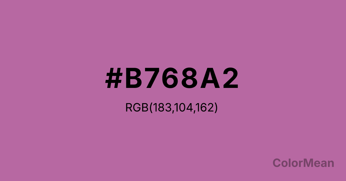
Pearly Purple (#B768A2) Color Information
Pearly Purple (#B768A2) RGB value is (183, 104, 162). The hex color red value is 183, green is 104, and blue is 162. Its HSL format shows a hue of 316°, saturation of 35 percent, and lightness of 56 percent. The CMYK process values are 0 percent, 43 percent, 11 percent, 28 percent.
Pearly Purple (#B768A2) Color Meaning
Pearly Purple (#B768A2) projects romantic whimsy, vintage charm, and gentle extravagance. This medium, reddish-purple is soft and dusty, reminiscent of Victorian greeting cards, powdered confections, and boudoir satin. Psychologically, Pearly Purple (#B768A2) encourages sentimental fantasy and affectionate nostalgia, blending the romance of purple with a playful, approachable sweetness. It stimulates imaginative daydreaming and a sense of personalized, old-fashioned luxury. This color feels both special and forgiving, not demanding reverence but inviting fondness. Culturally, Pearly Purple (#B768A2) is linked to vintage cosmetics, retro fashion, and branding for products that are feminine, decorative, and gently indulgent. Symbolically, it represents a curated memory, fantasy worn as an accessory, and individuality expressed through a lens of historical romance. Therefore, Pearly Purple (#B768A2) acts as a bridge between childlike delight and adult sophistication, offering a color that is fancy, friendly, and nostalgically self-aware.
Color Conversion
Convert Pearly Purple (#B768A2) across different color models and formats. These conversions help designers work seamlessly between digital and print media, ensuring this color maintains its intended appearance across RGB screens, CMYK printers, and HSL color manipulations.
RGB Values & CMYK Values
RGB Values
CMYK Values
Color Variations
Pearly Purple (#B768A2) harmonies come to life through carefully balanced shades, tints, and tones, giving this color depth and flexibility across light and dark variations. Shades add richness, tints bring an airy softness, and tones soften intensity, making it easy to pair in clean, modern palettes.
Color Harmonies
Pearly Purple (#B768A2) harmonies create beautiful relationships with other colors based on their position on the color wheel. Each harmony type offers unique design possibilities, enabling cohesive and visually appealing color schemes.
Analogous
Colors adjacent on the color wheel (30° apart)
Complementary
Colors opposite on the color wheel (180° apart)
Split Complementary
Three colors using one base hue and the two hues beside its opposite
Triadic
Three colors evenly spaced (120° apart)
Tetradic
Four colors forming a rectangle on the wheel
Square
Four colors evenly spaced (90° apart)
Double Split
Four colors formed from two base hues and the colors next to their opposites
Monochromatic
Variations of a single hue
Contrast Checker
(WCAG 2.1) Test Pearly Purple (#B768A2) for accessibility compliance against white and black backgrounds. Proper contrast ensures this color remains readable and usable for all audiences, meeting WCAG 2.1 standards for both normal and large text applications.
Sample Text
This is how your text will look with these colors.
Large Text (18pt+)
Normal Text
UI Components
Color Blindness Simulator
See how #B768A2 appears to people with different types of color vision deficiencies. These simulations help create more inclusive designs that consider how this color is perceived across various visual abilities.
Normal Vision
protanopia
Note: These simulations are approximations. Actual color vision deficiency varies by individual.
CSS Examples
Background Color
Text Color
Sample Text
Border Color
Box Shadow
Text Shadow
Sample Text
Gradient
Pearly Purple (#B768A2) Color FAQs
Frequently asked questions about Pearly Purple (#B768A2) color meaning, symbolism, and applications. Click on any question to expand detailed answers.
