#B2BEB4 Color Information
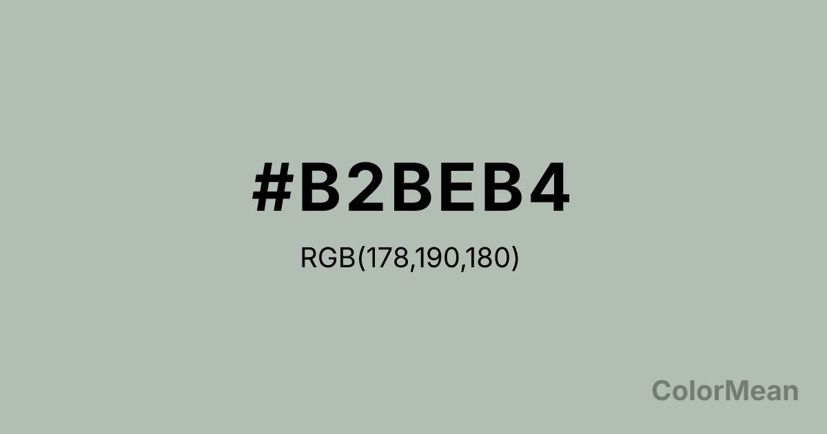
#B2BEB4 RGB value is (178, 190, 180). The hex color red value is 178, green is 190, and blue is 180. Its HSL format shows a hue of 130°, saturation of 8 percent, and lightness of 72 percent. The CMYK process values are 6 percent, 0 percent, 5 percent, 25 percent.
#B2BEB4 Color Meaning
Color #B2BEB4 expresses quiet neutrality, post-combustion calm, and mineral balance. #B2BEB4 green-tinged grey mimics cooled embers or weathered stone—neither warm nor cold, but resolved. Psychologically, color #B2BEB4 reduces visual tension in editorial layouts and professional interfaces by offering a midpoint between white and black. #B2BEB4 feels more organic than silver, less sterile than concrete. In Scandinavian and Japanese design, #B2BEB4 aligns with wabi-sabi and lagom philosophies—beauty in balance, not excess. Spiritually, #B2BEB4 represents peace after intensity: clarity that follows release. Use color #B2BEB4 as a structural tone when your content must feel considered, not chaotic, and your audience values calm over charisma.
Color Conversion
Convert #B2BEB4 across different color models and formats. These conversions help designers work seamlessly between digital and print media, ensuring this color maintains its intended appearance across RGB screens, CMYK printers, and HSL color manipulations.
RGB Values & CMYK Values
RGB Values
CMYK Values
Color Variations
#B2BEB4 harmonies come to life through carefully balanced shades, tints, and tones, giving this color depth and flexibility across light and dark variations. Shades add richness, tints bring an airy softness, and tones soften intensity, making it easy to pair in clean, modern palettes.
Color Harmonies
#B2BEB4 harmonies create beautiful relationships with other colors based on their position on the color wheel. Each harmony type offers unique design possibilities, enabling cohesive and visually appealing color schemes.
Analogous
Colors adjacent on the color wheel (30° apart)
Complementary
Colors opposite on the color wheel (180° apart)
Split Complementary
Three colors using one base hue and the two hues beside its opposite
Triadic
Three colors evenly spaced (120° apart)
Tetradic
Four colors forming a rectangle on the wheel
Square
Four colors evenly spaced (90° apart)
Double Split
Four colors formed from two base hues and the colors next to their opposites
Monochromatic
Variations of a single hue
Contrast Checker
(WCAG 2.1) Test #B2BEB4 for accessibility compliance against white and black backgrounds. Proper contrast ensures this color remains readable and usable for all audiences, meeting WCAG 2.1 standards for both normal and large text applications.
Sample Text
This is how your text will look with these colors.
Large Text (18pt+)
Normal Text
UI Components
Color Blindness Simulator
See how #B2BEB4 appears to people with different types of color vision deficiencies. These simulations help create more inclusive designs that consider how this color is perceived across various visual abilities.
Normal Vision
protanopia
Note: These simulations are approximations. Actual color vision deficiency varies by individual.
CSS Examples
Background Color
Text Color
Sample Text
Border Color
Box Shadow
Text Shadow
Sample Text
Gradient
#B2BEB4 Color FAQs
Frequently asked questions about #B2BEB4 color meaning, symbolism, and applications. Click on any question to expand detailed answers.
