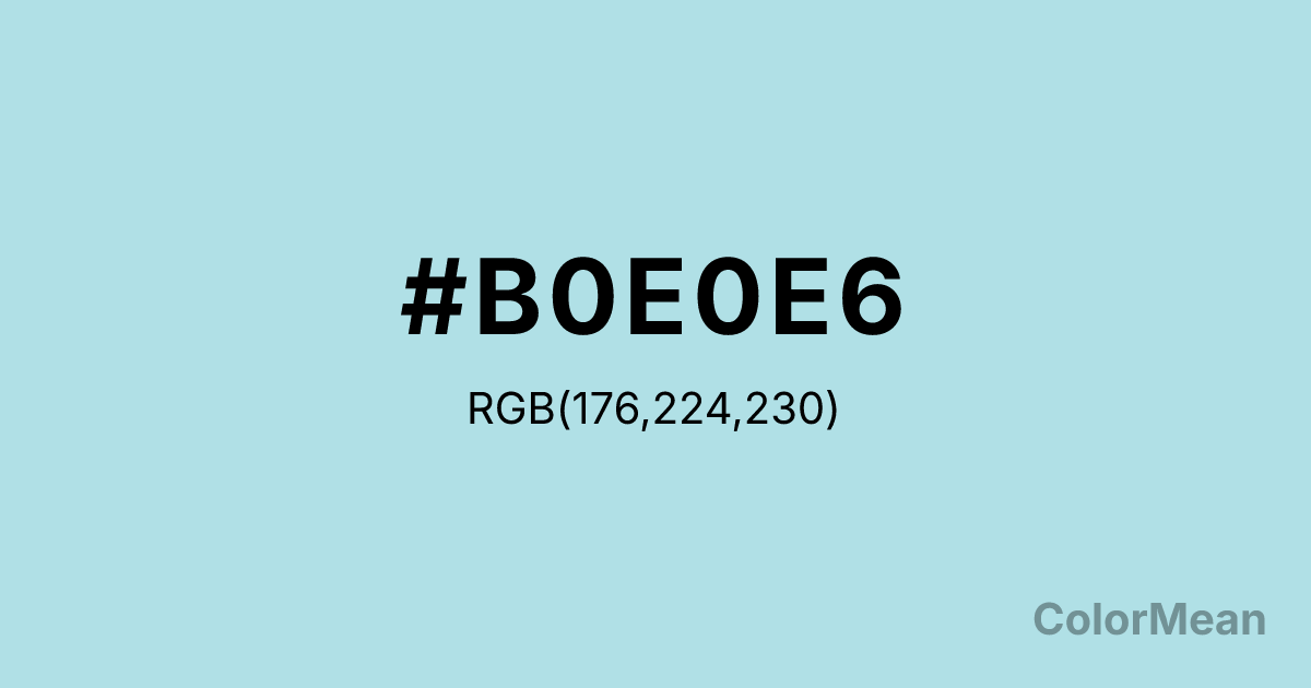
Powder Blue (#B0E0E6) Color Information
Powder Blue (#B0E0E6) RGB value is (176, 224, 230). The hex color red value is 176, green is 224, and blue is 230. Its HSL format shows a hue of 187°, saturation of 52 percent, and lightness of 80 percent. The CMYK process values are 23 percent, 3 percent, 0 percent, 10 percent.
Powder Blue (#B0E0E6) Color Meaning
Powder Blue (#B0E0E6) embodies ethereal calm, weightless serenity, and soft freshness. This pale, greenish-blue is reminiscent of morning mist, distant winter horizons, and the faintest tint of sky reflected in snow. Psychologically, Powder Blue (#B0E0E6) is profoundly cooling and quieting, reducing mental clutter and emotional intensity by evoking vast, quiet, and clean spaces. It promotes a sense of gentle detachment and peaceful clarity, making it ideal for creating restful, contemplative environments. This color is a visual sigh of relief. Culturally, Powder Blue (#B0E0E6) is a classic web color associated with baby boys, vintage nurseries, and a soft, traditional approach to tranquility. Symbolically, it represents innocence, gentle protection, and a calm so light it feels insubstantial. Powder Blue (#B0E0E6) offers a specific, historical digital tool for creating atmospheres of tender peace and uncomplicated coolness, often used to soften designs and evoke a sense of safe, gentle care.
Color Conversion
Convert Powder Blue (#B0E0E6) across different color models and formats. These conversions help designers work seamlessly between digital and print media, ensuring this color maintains its intended appearance across RGB screens, CMYK printers, and HSL color manipulations.
RGB Values & CMYK Values
RGB Values
CMYK Values
Color Variations
Powder Blue (#B0E0E6) harmonies come to life through carefully balanced shades, tints, and tones, giving this color depth and flexibility across light and dark variations. Shades add richness, tints bring an airy softness, and tones soften intensity, making it easy to pair in clean, modern palettes.
Color Harmonies
Powder Blue (#B0E0E6) harmonies create beautiful relationships with other colors based on their position on the color wheel. Each harmony type offers unique design possibilities, enabling cohesive and visually appealing color schemes.
Analogous
Colors adjacent on the color wheel (30° apart)
Complementary
Colors opposite on the color wheel (180° apart)
Split Complementary
Three colors using one base hue and the two hues beside its opposite
Triadic
Three colors evenly spaced (120° apart)
Tetradic
Four colors forming a rectangle on the wheel
Square
Four colors evenly spaced (90° apart)
Double Split
Four colors formed from two base hues and the colors next to their opposites
Monochromatic
Variations of a single hue
Contrast Checker
(WCAG 2.1) Test Powder Blue (#B0E0E6) for accessibility compliance against white and black backgrounds. Proper contrast ensures this color remains readable and usable for all audiences, meeting WCAG 2.1 standards for both normal and large text applications.
Sample Text
This is how your text will look with these colors.
Large Text (18pt+)
Normal Text
UI Components
Color Blindness Simulator
See how #B0E0E6 appears to people with different types of color vision deficiencies. These simulations help create more inclusive designs that consider how this color is perceived across various visual abilities.
Normal Vision
protanopia
Note: These simulations are approximations. Actual color vision deficiency varies by individual.
CSS Examples
Background Color
Text Color
Sample Text
Border Color
Box Shadow
Text Shadow
Sample Text
Gradient
Powder Blue (#B0E0E6) Color FAQs
Frequently asked questions about Powder Blue (#B0E0E6) color meaning, symbolism, and applications. Click on any question to expand detailed answers.
