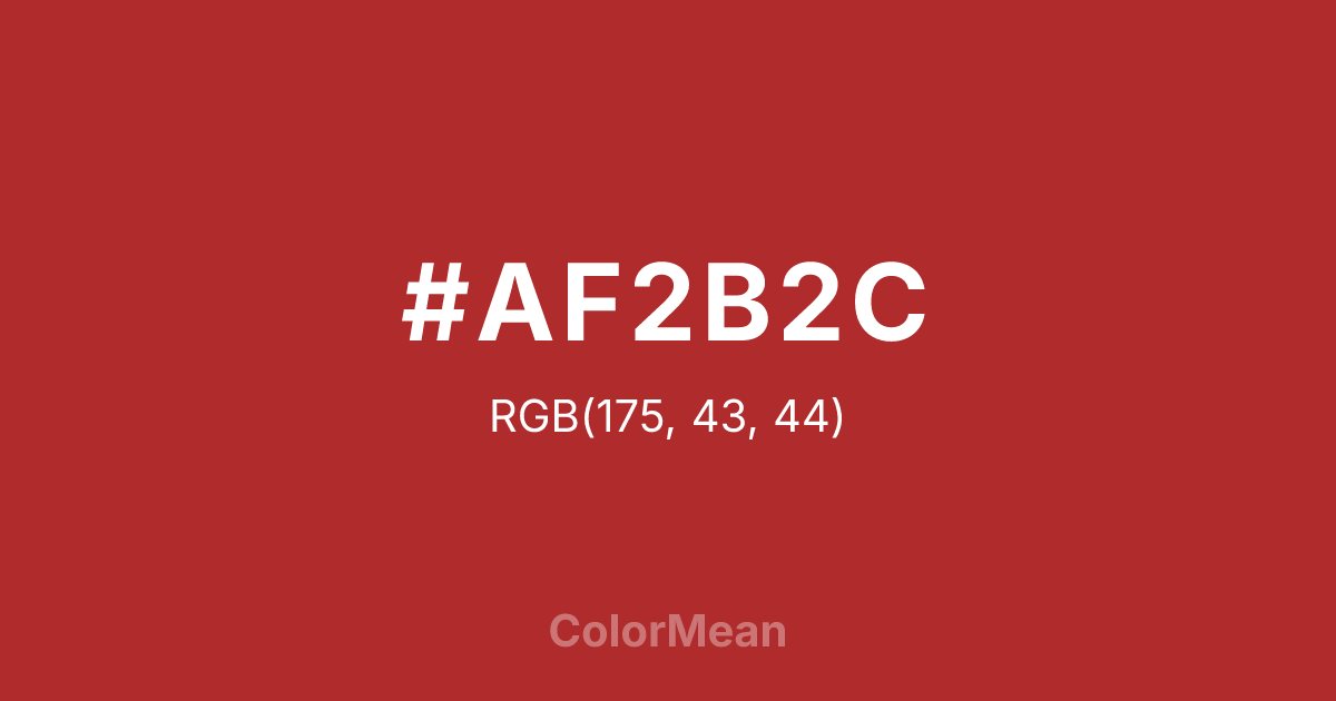
#AF2B2C Color Information
#AF2B2C RGB value is (175, 43, 44). The hex color red value is 175, green is 43, and blue is 44. Its HSL format shows a hue of 360°, saturation of 61 percent, and lightness of 43 percent. The CMYK process values are 0 percent, 75 percent, 75 percent, 31 percent.
#AF2B2C Color Meaning
Color #AF2B2C sharpens crimson into focus. #AF2B2C slightly desaturated, blue-leaning red avoids the warmth of tomato or the sterility of scarlet, landing instead in a zone of cultural precision. Color #AF2B2C references traditional lacquerware, imperial seals, and ceremonial banners—where red signifies authority, not just passion. Cross-cultural color studies show that color #AF2B2C is consistently associated with prosperity and protection in East Asian contexts, making #AF2B2C essential in global branding that respects regional symbolism. Color #AF2B2C doesn’t universalize—#AF2B2C localizes with intent. In modern design, #AF2B2C appears in luxury tea, cultural institutions, and high-end cosmetics where heritage matters. Paired with gold or deep black, color #AF2B2C creates contrast that feels ritualistic, not commercial. Color #AF2B2C isn’t loud—#AF2B2C’s deliberate.
Color Conversion
Convert #AF2B2C across different color models and formats. These conversions help designers work seamlessly between digital and print media, ensuring this color maintains its intended appearance across RGB screens, CMYK printers, and HSL color manipulations.
RGB Values & CMYK Values
RGB Values
CMYK Values
Color Variations
#AF2B2C harmonies come to life through carefully balanced shades, tints, and tones, giving this color depth and flexibility across light and dark variations. Shades add richness, tints bring an airy softness, and tones soften intensity, making it easy to pair in clean, modern palettes.
Color Harmonies
#AF2B2C harmonies create beautiful relationships with other colors based on their position on the color wheel. Each harmony type offers unique design possibilities, enabling cohesive and visually appealing color schemes.
Analogous
Colors adjacent on the color wheel (30° apart)
Complementary
Colors opposite on the color wheel (180° apart)
Split Complementary
Three colors using one base hue and the two hues beside its opposite
Triadic
Three colors evenly spaced (120° apart)
Tetradic
Four colors forming a rectangle on the wheel
Square
Four colors evenly spaced (90° apart)
Double Split
Four colors formed from two base hues and the colors next to their opposites
Monochromatic
Variations of a single hue
Contrast Checker
(WCAG 2.1) Test #AF2B2C for accessibility compliance against white and black backgrounds. Proper contrast ensures this color remains readable and usable for all audiences, meeting WCAG 2.1 standards for both normal and large text applications.
Sample Text
This is how your text will look with these colors.
Large Text (18pt+)
Normal Text
UI Components
Color Blindness Simulator
See how #AF2B2C appears to people with different types of color vision deficiencies. These simulations help create more inclusive designs that consider how this color is perceived across various visual abilities.
Normal Vision
protanopia
Note: These simulations are approximations. Actual color vision deficiency varies by individual.
CSS Examples
Background Color
Text Color
Sample Text
Border Color
Box Shadow
Text Shadow
Sample Text
Gradient
#AF2B2C Color FAQs
Frequently asked questions about #AF2B2C color meaning, symbolism, and applications. Click on any question to expand detailed answers.
