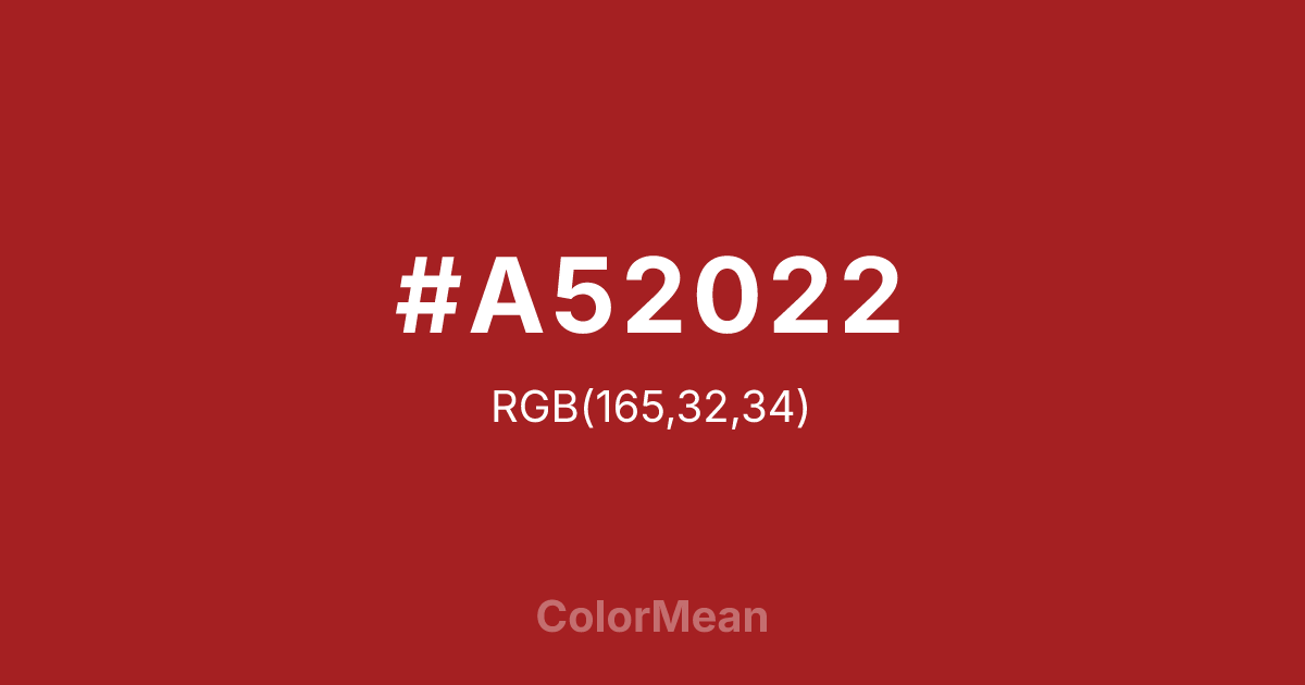
#A52022 Color Information
#A52022 RGB value is (165, 32, 34). The hex color red value is 165, green is 32, and blue is 34. Its HSL format shows a hue of 359°, saturation of 68 percent, and lightness of 39 percent. The CMYK process values are 0 percent, 81 percent, 79 percent, 35 percent.
#A52022 Color Meaning
Color #A52022 conveys grounded intensity, historical continuity, and restrained power. Color #A52022 is a deep, slightly brownish red that echoes dried blood, aged brick, and colonial textiles. Unlike vivid carmines, #A52022 carries weathering—time has softened its edge but not its presence. In architectural color palettes, #A52022 appears on historic buildings and artisanal facades where permanence matters. Psychological studies link such earthy reds to perceived stability and authenticity, especially in food and craft branding where “real” ingredients are emphasized. In design systems, color #A52022 serves as a durable primary or secondary hue. #A52022 provides excellent contrast in print and reduces eye strain in long-form digital reading compared to brighter reds. #A52022 pairs powerfully with cream, olive, or slate, creating palettes that feel rooted but not rustic. Consumer research shows products in color #A52022 are rated as more trustworthy in organic and heritage categories. Color #A52022 doesn’t shout—#A52022 endures. Symbolically, color #A52022 represents strength that weathers. #A52022 is the color of hearths, not fireworks. In spiritual practice, #A52022 connects to the root chakra’s protective mode: shelter as service. Designers choose color #A52022 when legacy must feel present, not past. Its power lies in its patience—deep, slow, and sure.
Color Conversion
Convert #A52022 across different color models and formats. These conversions help designers work seamlessly between digital and print media, ensuring this color maintains its intended appearance across RGB screens, CMYK printers, and HSL color manipulations.
RGB Values & CMYK Values
RGB Values
CMYK Values
Color Variations
#A52022 harmonies come to life through carefully balanced shades, tints, and tones, giving this color depth and flexibility across light and dark variations. Shades add richness, tints bring an airy softness, and tones soften intensity, making it easy to pair in clean, modern palettes.
Color Harmonies
#A52022 harmonies create beautiful relationships with other colors based on their position on the color wheel. Each harmony type offers unique design possibilities, enabling cohesive and visually appealing color schemes.
Analogous
Colors adjacent on the color wheel (30° apart)
Complementary
Colors opposite on the color wheel (180° apart)
Split Complementary
Three colors using one base hue and the two hues beside its opposite
Triadic
Three colors evenly spaced (120° apart)
Tetradic
Four colors forming a rectangle on the wheel
Square
Four colors evenly spaced (90° apart)
Double Split
Four colors formed from two base hues and the colors next to their opposites
Monochromatic
Variations of a single hue
Contrast Checker
(WCAG 2.1) Test #A52022 for accessibility compliance against white and black backgrounds. Proper contrast ensures this color remains readable and usable for all audiences, meeting WCAG 2.1 standards for both normal and large text applications.
Sample Text
This is how your text will look with these colors.
Large Text (18pt+)
Normal Text
UI Components
Color Blindness Simulator
See how #A52022 appears to people with different types of color vision deficiencies. These simulations help create more inclusive designs that consider how this color is perceived across various visual abilities.
Normal Vision
protanopia
Note: These simulations are approximations. Actual color vision deficiency varies by individual.
CSS Examples
Background Color
Text Color
Sample Text
Border Color
Box Shadow
Text Shadow
Sample Text
Gradient
#A52022 Color FAQs
Frequently asked questions about #A52022 color meaning, symbolism, and applications. Click on any question to expand detailed answers.

