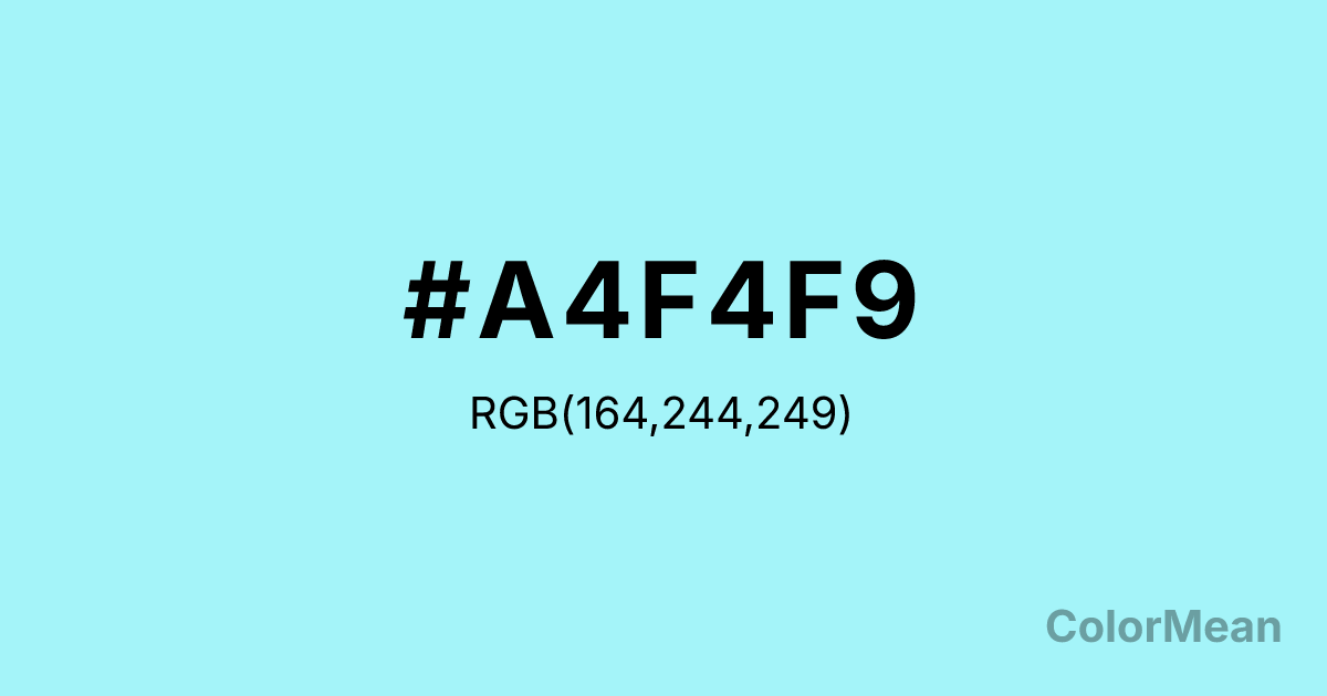
Waterspout (#A4F4F9) Color Information
Waterspout (#A4F4F9) RGB value is (164, 244, 249). The hex color red value is 164, green is 244, and blue is 249. Its HSL format shows a hue of 184°, saturation of 88 percent, and lightness of 81 percent. The CMYK process values are 34 percent, 2 percent, 0 percent, 2 percent.
Waterspout (#A4F4F9) Color Meaning
Waterspout (#A4F4F9) reflects lightness, calm, and renewal. This soft, pastel cyan conveys gentle tranquility and mental clarity. Psychologically, Waterspout (#A4F4F9) promotes relaxation, stress relief, and creative visualization, making it ideal for peaceful environments. Culturally, Waterspout (#A4F4F9) signals openness, serenity, and trust in Western symbolism, while Eastern traditions emphasize its water element for meditation and mental cleansing. Fengshui values this light cyan for enhancing calm, clarity, and harmonious flow in interiors. Chakra association aligns with the throat chakra, aiding gentle self-expression and reflective communication. In design and arts, Waterspout (#A4F4F9) is used as a soft backdrop or highlight to lift compositions without overwhelming other colors. Its light shade complements earth tones, whites, or muted blues, enhancing a sense of spaciousness, modernity, and airy calm.
Color Conversion
Convert Waterspout (#A4F4F9) across different color models and formats. These conversions help designers work seamlessly between digital and print media, ensuring this color maintains its intended appearance across RGB screens, CMYK printers, and HSL color manipulations.
RGB Values & CMYK Values
RGB Values
CMYK Values
Color Variations
Waterspout (#A4F4F9) harmonies come to life through carefully balanced shades, tints, and tones, giving this color depth and flexibility across light and dark variations. Shades add richness, tints bring an airy softness, and tones soften intensity, making it easy to pair in clean, modern palettes.
Color Harmonies
Waterspout (#A4F4F9) harmonies create beautiful relationships with other colors based on their position on the color wheel. Each harmony type offers unique design possibilities, enabling cohesive and visually appealing color schemes.
Analogous
Colors adjacent on the color wheel (30° apart)
Complementary
Colors opposite on the color wheel (180° apart)
Split Complementary
Three colors using one base hue and the two hues beside its opposite
Triadic
Three colors evenly spaced (120° apart)
Tetradic
Four colors forming a rectangle on the wheel
Square
Four colors evenly spaced (90° apart)
Double Split
Four colors formed from two base hues and the colors next to their opposites
Monochromatic
Variations of a single hue
Contrast Checker
(WCAG 2.1) Test Waterspout (#A4F4F9) for accessibility compliance against white and black backgrounds. Proper contrast ensures this color remains readable and usable for all audiences, meeting WCAG 2.1 standards for both normal and large text applications.
Sample Text
This is how your text will look with these colors.
Large Text (18pt+)
Normal Text
UI Components
Color Blindness Simulator
See how #A4F4F9 appears to people with different types of color vision deficiencies. These simulations help create more inclusive designs that consider how this color is perceived across various visual abilities.
Normal Vision
protanopia
Note: These simulations are approximations. Actual color vision deficiency varies by individual.
CSS Examples
Background Color
Text Color
Sample Text
Border Color
Box Shadow
Text Shadow
Sample Text
Gradient
Waterspout (#A4F4F9) Color FAQs
Frequently asked questions about Waterspout (#A4F4F9) color meaning, symbolism, and applications. Click on any question to expand detailed answers.
