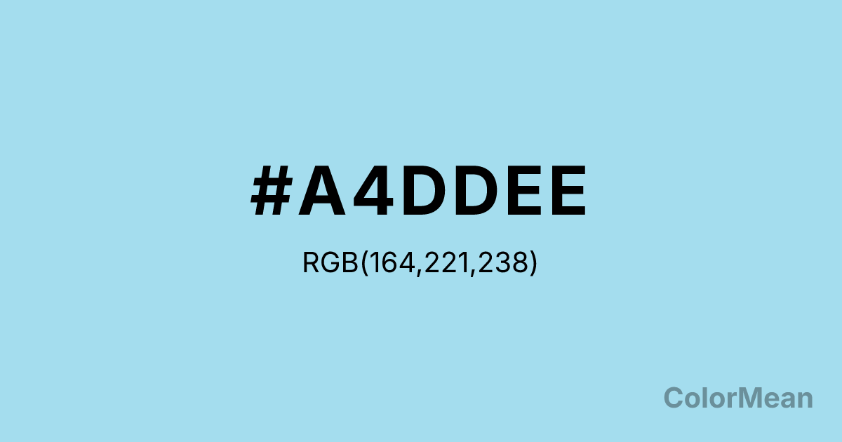
#A4DDEE Color Information
#A4DDEE RGB value is (164, 221, 238). The hex color red value is 164, green is 221, and blue is 238. Its HSL format shows a hue of 194°, saturation of 69 percent, and lightness of 79 percent. The CMYK process values are 31 percent, 7 percent, 0 percent, 7 percent.
#A4DDEE Color Meaning
Color #A4DDEE floats with technical utility, archival transparency, and soft clarity. Color #A4DDEE earned its name from pre-digital drafting, where #A4DDEE was used for notes that wouldn’t reproduce in photocopies or blueprints. Today, #A4DDEE symbolizes behind-the-scenes intelligence—guides, grids, and gentle prompts that support without dominating. Psychologically, color #A4DDEE reduces cognitive load through visual humility. Light blues in #A4DDEE range are shown to enhance reading comprehension when used for marginalia or UI hints. #A4DDEE’s not a focal point; #A4DDEE’s a scaffold. Designers use #A4DDEE for placeholder text, wireframes, and collaborative annotations because #A4DDEE recedes just enough to stay helpful. Historically, #A4DDEE cyan-leaning blue was a pragmatic innovation in engineering and publishing. Its specific wavelength fell outside the sensitivity range of early photocopiers—making #A4DDEE invisible in reproduction. That functional origin now translates into digital metaphors: the “invisible hand” of good design, the quiet infrastructure of collaboration. Symbolically, color #A4DDEE stands for humble utility. #A4DDEE is the color of process, not product—of sketches before launch, of notes before final copy. In educational or software contexts, #A4DDEE signals scaffolding: temporary support that empowers independence. #A4DDEE doesn’t seek credit; #A4DDEE enables clarity.
Color Conversion
Convert #A4DDEE across different color models and formats. These conversions help designers work seamlessly between digital and print media, ensuring this color maintains its intended appearance across RGB screens, CMYK printers, and HSL color manipulations.
RGB Values & CMYK Values
RGB Values
CMYK Values
Color Variations
#A4DDEE harmonies come to life through carefully balanced shades, tints, and tones, giving this color depth and flexibility across light and dark variations. Shades add richness, tints bring an airy softness, and tones soften intensity, making it easy to pair in clean, modern palettes.
Color Harmonies
#A4DDEE harmonies create beautiful relationships with other colors based on their position on the color wheel. Each harmony type offers unique design possibilities, enabling cohesive and visually appealing color schemes.
Analogous
Colors adjacent on the color wheel (30° apart)
Complementary
Colors opposite on the color wheel (180° apart)
Split Complementary
Three colors using one base hue and the two hues beside its opposite
Triadic
Three colors evenly spaced (120° apart)
Tetradic
Four colors forming a rectangle on the wheel
Square
Four colors evenly spaced (90° apart)
Double Split
Four colors formed from two base hues and the colors next to their opposites
Monochromatic
Variations of a single hue
Contrast Checker
(WCAG 2.1) Test #A4DDEE for accessibility compliance against white and black backgrounds. Proper contrast ensures this color remains readable and usable for all audiences, meeting WCAG 2.1 standards for both normal and large text applications.
Sample Text
This is how your text will look with these colors.
Large Text (18pt+)
Normal Text
UI Components
Color Blindness Simulator
See how #A4DDEE appears to people with different types of color vision deficiencies. These simulations help create more inclusive designs that consider how this color is perceived across various visual abilities.
Normal Vision
protanopia
Note: These simulations are approximations. Actual color vision deficiency varies by individual.
CSS Examples
Background Color
Text Color
Sample Text
Border Color
Box Shadow
Text Shadow
Sample Text
Gradient
#A4DDEE Color FAQs
Frequently asked questions about #A4DDEE color meaning, symbolism, and applications. Click on any question to expand detailed answers.
