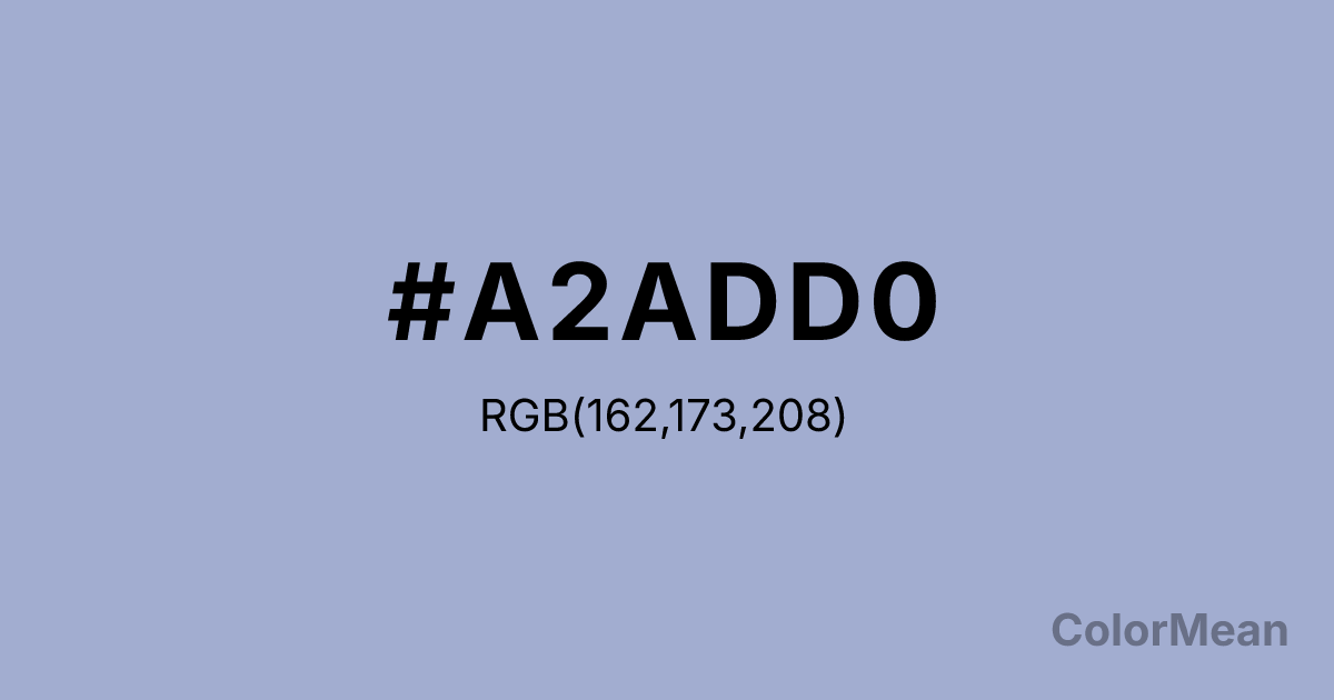
Wild Blue Yonder (#A2ADD0) Color Information
Wild Blue Yonder (#A2ADD0) RGB value is (162, 173, 208). The hex color red value is 162, green is 173, and blue is 208. Its HSL format shows a hue of 226°, saturation of 33 percent, and lightness of 73 percent. The CMYK process values are 22 percent, 17 percent, 0 percent, 18 percent.
Wild Blue Yonder (#A2ADD0) Color Meaning
Wild Blue Yonder (#A2ADD0) evokes calmness, imagination, and thoughtful introspection. This medium-light periwinkle blue blends blue’s tranquility with a hint of purple’s creativity. Psychologically, Wild Blue Yonder (#A2ADD0) encourages reflective thought, clarity, and gentle inspiration. Culturally, Wild Blue Yonder (#A2ADD0) represents exploration, intellect, and calm sophistication in Western symbolism. Eastern traditions link it to meditation, water energy, and mental clarity. Fengshui views it as promoting focus, clarity, and serenity in rooms or workspaces. Spiritually, it resonates with the throat and third-eye chakras, supporting expression and intuitive thought. In design and arts, Wild Blue Yonder (#A2ADD0) functions as a soothing accent or primary tone. Its medium-light, muted quality pairs with neutrals, whites, or deeper blues, making it suitable for contemplative spaces, branding, or artwork emphasizing calm sophistication.
Color Conversion
Convert Wild Blue Yonder (#A2ADD0) across different color models and formats. These conversions help designers work seamlessly between digital and print media, ensuring this color maintains its intended appearance across RGB screens, CMYK printers, and HSL color manipulations.
RGB Values & CMYK Values
RGB Values
CMYK Values
Color Variations
Wild Blue Yonder (#A2ADD0) harmonies come to life through carefully balanced shades, tints, and tones, giving this color depth and flexibility across light and dark variations. Shades add richness, tints bring an airy softness, and tones soften intensity, making it easy to pair in clean, modern palettes.
Color Harmonies
Wild Blue Yonder (#A2ADD0) harmonies create beautiful relationships with other colors based on their position on the color wheel. Each harmony type offers unique design possibilities, enabling cohesive and visually appealing color schemes.
Analogous
Colors adjacent on the color wheel (30° apart)
Complementary
Colors opposite on the color wheel (180° apart)
Split Complementary
Three colors using one base hue and the two hues beside its opposite
Triadic
Three colors evenly spaced (120° apart)
Tetradic
Four colors forming a rectangle on the wheel
Square
Four colors evenly spaced (90° apart)
Double Split
Four colors formed from two base hues and the colors next to their opposites
Monochromatic
Variations of a single hue
Contrast Checker
(WCAG 2.1) Test Wild Blue Yonder (#A2ADD0) for accessibility compliance against white and black backgrounds. Proper contrast ensures this color remains readable and usable for all audiences, meeting WCAG 2.1 standards for both normal and large text applications.
Sample Text
This is how your text will look with these colors.
Large Text (18pt+)
Normal Text
UI Components
Color Blindness Simulator
See how #A2ADD0 appears to people with different types of color vision deficiencies. These simulations help create more inclusive designs that consider how this color is perceived across various visual abilities.
Normal Vision
protanopia
Note: These simulations are approximations. Actual color vision deficiency varies by individual.
CSS Examples
Background Color
Text Color
Sample Text
Border Color
Box Shadow
Text Shadow
Sample Text
Gradient
Wild Blue Yonder (#A2ADD0) Color FAQs
Frequently asked questions about Wild Blue Yonder (#A2ADD0) color meaning, symbolism, and applications. Click on any question to expand detailed answers.
