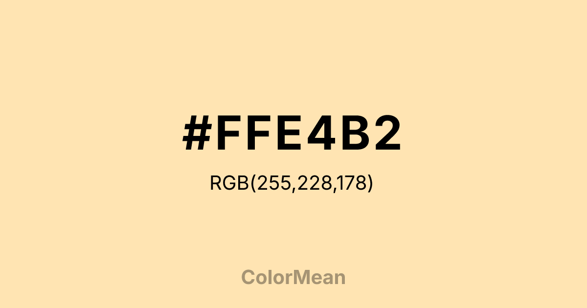
#FFE4B2 Color Information
#FFE4B2 RGB value is (255, 228, 178). The hex color red value is 255, green is 228, and blue is 178. Its HSL format shows a hue of 39°, saturation of 100 percent, and lightness of 85 percent. The CMYK process values are 0 percent, 11 percent, 30 percent, 0 percent.
#FFE4B2 Color Meaning
Color #FFE4B2 conveys a paler, creamier variant of warmth, evoking vanilla-infused cream, beach sand, and afternoon light. #FFE4B2 softer #FFE4B2 is closer to a neutral, offering a more subdued, elegant sense of comfort. Psychologically, color #FFE4B2 is calming and subtly uplifting, providing a background of serene optimism and tactile softness. #FFE4B2 feels clean, gentle, and quietly luxurious, often used to create spaces that are comforting yet refined. #FFE4B2 shade is less fruity and more textural than its brighter counterpart. Symbolically, color #FFE4B2 represents muted joy, refined comfort, and light that has been diffused and softened. #FFE4B2 is the color of peacefulness and understated delight. Culturally, #FFE4B2 appears in high-end interior design, wedding aesthetics, and beauty branding where a sense of pure, gentle luxury is key. #FFE4B2 alternate color #FFE4B2 provides a versatile, warm neutral that carries a hint of sweetness without overt femininity or childishness.
Color Conversion
Convert #FFE4B2 across different color models and formats. These conversions help designers work seamlessly between digital and print media, ensuring this color maintains its intended appearance across RGB screens, CMYK printers, and HSL color manipulations.
RGB Values & CMYK Values
RGB Values
CMYK Values
Color Variations
#FFE4B2 harmonies come to life through carefully balanced shades, tints, and tones, giving this color depth and flexibility across light and dark variations. Shades add richness, tints bring an airy softness, and tones soften intensity, making it easy to pair in clean, modern palettes.
Color Harmonies
#FFE4B2 harmonies create beautiful relationships with other colors based on their position on the color wheel. Each harmony type offers unique design possibilities, enabling cohesive and visually appealing color schemes.
Analogous
Colors adjacent on the color wheel (30° apart)
Complementary
Colors opposite on the color wheel (180° apart)
Split Complementary
Three colors using one base hue and the two hues beside its opposite
Triadic
Three colors evenly spaced (120° apart)
Tetradic
Four colors forming a rectangle on the wheel
Square
Four colors evenly spaced (90° apart)
Double Split
Four colors formed from two base hues and the colors next to their opposites
Monochromatic
Variations of a single hue
Contrast Checker
(WCAG 2.1) Test #FFE4B2 for accessibility compliance against white and black backgrounds. Proper contrast ensures this color remains readable and usable for all audiences, meeting WCAG 2.1 standards for both normal and large text applications.
Sample Text
This is how your text will look with these colors.
Large Text (18pt+)
Normal Text
UI Components
Color Blindness Simulator
See how #FFE4B2 appears to people with different types of color vision deficiencies. These simulations help create more inclusive designs that consider how this color is perceived across various visual abilities.
Normal Vision
protanopia
Note: These simulations are approximations. Actual color vision deficiency varies by individual.
CSS Examples
Background Color
Text Color
Sample Text
Border Color
Box Shadow
Text Shadow
Sample Text
Gradient
#FFE4B2 Color FAQs
Frequently asked questions about #FFE4B2 color meaning, symbolism, and applications. Click on any question to expand detailed answers.

