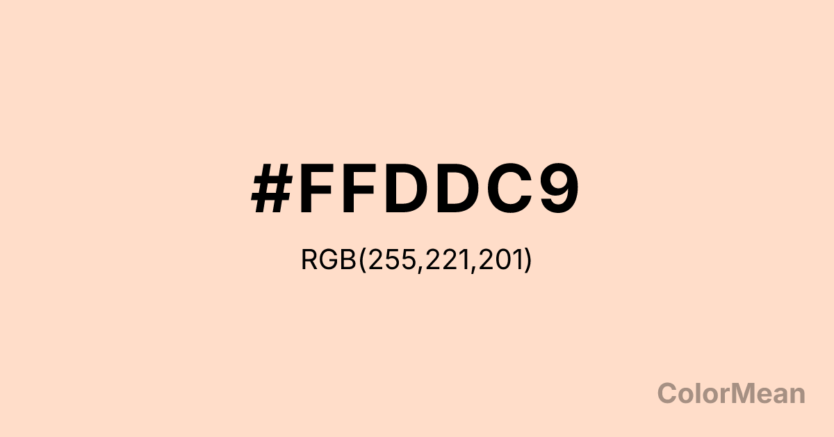
#FFDDC9 Color Information
#FFDDC9 RGB value is (255, 221, 201). The hex color red value is 255, green is 221, and blue is 201. Its HSL format shows a hue of 22°, saturation of 100 percent, and lightness of 89 percent. The CMYK process values are 0 percent, 13 percent, 21 percent, 0 percent.
#FFDDC9 Color Meaning
Color #FFDDC9 conveys softness, warmth, and approachable elegance. #FFDDC9 light, creamy peach-pink evokes calmness, gentleness, and nurturing energy. Psychologically, color #FFDDC9 promotes comfort, friendliness, and relaxation, enhancing welcoming spaces or supportive design elements. Culturally, soft peach tones like color #FFDDC9 symbolize warmth, care, and elegance in Western traditions, while Eastern symbolism associates #FFDDC9 with harmony, emotional balance, and calm. Feng Shui favors light, warm tones in relationship and family areas to foster connection, affection, and comfort. Spiritually, #FFDDC9 resonates with the heart chakra, supporting love, empathy, and compassionate expression. In design, color #FFDDC9 works as a base or accent color in interiors, packaging, and fashion, pairing beautifully with muted browns, golds, or soft greens. Artists use #FFDDC9 for highlights, flesh tones, and gentle shading, creating soothing compositions that feel welcoming and balanced.
Color Conversion
Convert #FFDDC9 across different color models and formats. These conversions help designers work seamlessly between digital and print media, ensuring this color maintains its intended appearance across RGB screens, CMYK printers, and HSL color manipulations.
RGB Values & CMYK Values
RGB Values
CMYK Values
Color Variations
#FFDDC9 harmonies come to life through carefully balanced shades, tints, and tones, giving this color depth and flexibility across light and dark variations. Shades add richness, tints bring an airy softness, and tones soften intensity, making it easy to pair in clean, modern palettes.
Color Harmonies
#FFDDC9 harmonies create beautiful relationships with other colors based on their position on the color wheel. Each harmony type offers unique design possibilities, enabling cohesive and visually appealing color schemes.
Analogous
Colors adjacent on the color wheel (30° apart)
Complementary
Colors opposite on the color wheel (180° apart)
Split Complementary
Three colors using one base hue and the two hues beside its opposite
Triadic
Three colors evenly spaced (120° apart)
Tetradic
Four colors forming a rectangle on the wheel
Square
Four colors evenly spaced (90° apart)
Double Split
Four colors formed from two base hues and the colors next to their opposites
Monochromatic
Variations of a single hue
Contrast Checker
(WCAG 2.1) Test #FFDDC9 for accessibility compliance against white and black backgrounds. Proper contrast ensures this color remains readable and usable for all audiences, meeting WCAG 2.1 standards for both normal and large text applications.
Sample Text
This is how your text will look with these colors.
Large Text (18pt+)
Normal Text
UI Components
Color Blindness Simulator
See how #FFDDC9 appears to people with different types of color vision deficiencies. These simulations help create more inclusive designs that consider how this color is perceived across various visual abilities.
Normal Vision
protanopia
Note: These simulations are approximations. Actual color vision deficiency varies by individual.
CSS Examples
Background Color
Text Color
Sample Text
Border Color
Box Shadow
Text Shadow
Sample Text
Gradient
#FFDDC9 Color FAQs
Frequently asked questions about #FFDDC9 color meaning, symbolism, and applications. Click on any question to expand detailed answers.
