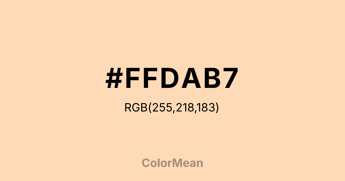
#FFDAB7 Color Information
#FFDAB7 RGB value is (255, 218, 183). The hex color red value is 255, green is 218, and blue is 183. Its HSL format shows a hue of 29°, saturation of 100 percent, and lightness of 86 percent. The CMYK process values are 0 percent, 15 percent, 28 percent, 0 percent.
#FFDAB7 Color Meaning
Color #FFDAB7 embodies a specific digital warmth, coded comfort, and nostalgic softness. As a standardized web color, color #FFDAB7 precisely replicates the cozy, powdered-sugar hue, ensuring consistent evocation of domestic ease across all screens. Psychologically, color #FFDAB7 provides reliable visual comfort, reducing digital harshness and fostering a sense of approachable, gentle interaction. #FFDAB7 color is a deliberate tool in user experience design to soften interfaces, make notifications feel less alarming, and create a perceived environment of user-friendly care. #FFDAB7 translates analogue comfort into a reproducible digital signal. Culturally, color #FFDAB7 is a legacy of the early web's effort to name colors with tangible, familiar poetry. Symbolically, #FFDAB7 represents the importation of hearth and home into the virtual realm, a buffer against the coldness of pure technology. In modern use, deploying color #FFDAB7 is a conscious choice to inject a specific, coded form of humanizing warmth into a system, making the digital space feel more nurtured and forgiving.
Color Conversion
Convert #FFDAB7 across different color models and formats. These conversions help designers work seamlessly between digital and print media, ensuring this color maintains its intended appearance across RGB screens, CMYK printers, and HSL color manipulations.
RGB Values & CMYK Values
RGB Values
CMYK Values
Color Variations
#FFDAB7 harmonies come to life through carefully balanced shades, tints, and tones, giving this color depth and flexibility across light and dark variations. Shades add richness, tints bring an airy softness, and tones soften intensity, making it easy to pair in clean, modern palettes.
Color Harmonies
#FFDAB7 harmonies create beautiful relationships with other colors based on their position on the color wheel. Each harmony type offers unique design possibilities, enabling cohesive and visually appealing color schemes.
Analogous
Colors adjacent on the color wheel (30° apart)
Complementary
Colors opposite on the color wheel (180° apart)
Split Complementary
Three colors using one base hue and the two hues beside its opposite
Triadic
Three colors evenly spaced (120° apart)
Tetradic
Four colors forming a rectangle on the wheel
Square
Four colors evenly spaced (90° apart)
Double Split
Four colors formed from two base hues and the colors next to their opposites
Monochromatic
Variations of a single hue
Contrast Checker
(WCAG 2.1) Test #FFDAB7 for accessibility compliance against white and black backgrounds. Proper contrast ensures this color remains readable and usable for all audiences, meeting WCAG 2.1 standards for both normal and large text applications.
Sample Text
This is how your text will look with these colors.
Large Text (18pt+)
Normal Text
UI Components
Color Blindness Simulator
See how #FFDAB7 appears to people with different types of color vision deficiencies. These simulations help create more inclusive designs that consider how this color is perceived across various visual abilities.
Normal Vision
protanopia
Note: These simulations are approximations. Actual color vision deficiency varies by individual.
CSS Examples
Background Color
Text Color
Sample Text
Border Color
Box Shadow
Text Shadow
Sample Text
Gradient
#FFDAB7 Color FAQs
Frequently asked questions about #FFDAB7 color meaning, symbolism, and applications. Click on any question to expand detailed answers.

