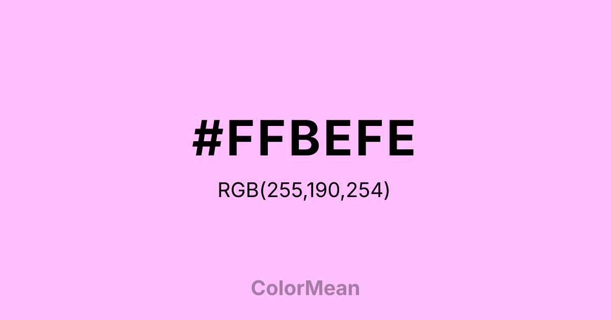
#FFBEFE Color Information
#FFBEFE RGB value is (255, 190, 254). The hex color red value is 255, green is 190, and blue is 254. Its HSL format shows a hue of 301°, saturation of 100 percent, and lightness of 87 percent. The CMYK process values are 0 percent, 25 percent, 0 percent, 0 percent.
#FFBEFE Color Meaning
Color #FFBEFE projects the brightest, most luminous highlight in the systematic plum gradient, representing electric whimsy and synthetic fantasy. #FFBEFE pale, magenta-tinged white is intensely bright, suggesting pixelated magic, cartoon sparkles, and the most intense highlight on a digital plum. Psychologically, color #FFBEFE is stimulating in a playful, fantastical way, promoting a sense of hyper-real joy, extreme softness, and ethereal highlight. #FFBEFE is the color of a maximum-strength magical effect or a selected item in a whimsical UI. #FFBEFE shade is fantasy at its most saturated digital form. Symbolically, within the X11 system, color #FFBEFE represents the point of maximum light emission in the plum spectrum, the apex of programmed playfulness. #FFBEFE is the "on" switch for digital enchantment. Culturally, #FFBEFE serves a specific technical function, providing the peak highlight that allows for the creation of luminous, otherworldly visual effects while maintaining a cohesive color family tied to the emotional core of "plum."
Color Conversion
Convert #FFBEFE across different color models and formats. These conversions help designers work seamlessly between digital and print media, ensuring this color maintains its intended appearance across RGB screens, CMYK printers, and HSL color manipulations.
RGB Values & CMYK Values
RGB Values
CMYK Values
Color Variations
#FFBEFE harmonies come to life through carefully balanced shades, tints, and tones, giving this color depth and flexibility across light and dark variations. Shades add richness, tints bring an airy softness, and tones soften intensity, making it easy to pair in clean, modern palettes.
Color Harmonies
#FFBEFE harmonies create beautiful relationships with other colors based on their position on the color wheel. Each harmony type offers unique design possibilities, enabling cohesive and visually appealing color schemes.
Analogous
Colors adjacent on the color wheel (30° apart)
Complementary
Colors opposite on the color wheel (180° apart)
Split Complementary
Three colors using one base hue and the two hues beside its opposite
Triadic
Three colors evenly spaced (120° apart)
Tetradic
Four colors forming a rectangle on the wheel
Square
Four colors evenly spaced (90° apart)
Double Split
Four colors formed from two base hues and the colors next to their opposites
Monochromatic
Variations of a single hue
Contrast Checker
(WCAG 2.1) Test #FFBEFE for accessibility compliance against white and black backgrounds. Proper contrast ensures this color remains readable and usable for all audiences, meeting WCAG 2.1 standards for both normal and large text applications.
Sample Text
This is how your text will look with these colors.
Large Text (18pt+)
Normal Text
UI Components
Color Blindness Simulator
See how #FFBEFE appears to people with different types of color vision deficiencies. These simulations help create more inclusive designs that consider how this color is perceived across various visual abilities.
Normal Vision
protanopia
Note: These simulations are approximations. Actual color vision deficiency varies by individual.
CSS Examples
Background Color
Text Color
Sample Text
Border Color
Box Shadow
Text Shadow
Sample Text
Gradient
#FFBEFE Color FAQs
Frequently asked questions about #FFBEFE color meaning, symbolism, and applications. Click on any question to expand detailed answers.

