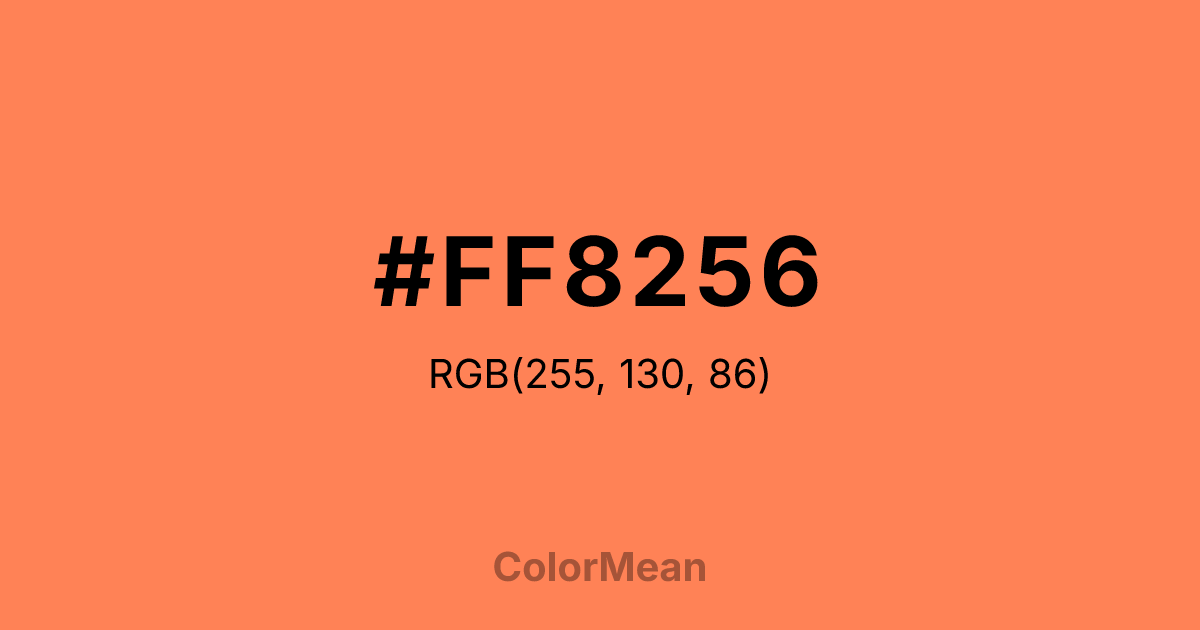
#FF8256 Color Information
#FF8256 RGB value is (255, 130, 86). The hex color red value is 255, green is 130, and blue is 86. Its HSL format shows a hue of 16°, saturation of 100 percent, and lightness of 67 percent. The CMYK process values are 0 percent, 49 percent, 66 percent, 0 percent.
#FF8256 Color Meaning
Color #FF8256 radiates warm approachability, social energy, and accessible vibrancy. Color #FF8256 is a balanced orange-pink that sits precisely between red and yellow—friendly without frivolity, bright without aggression. Named after ocean reefs, #FF8256 carries both biological life and social warmth. In consumer psychology, #FF8256 hue increases perceived approachability in service industries, especially hospitality, healthcare, and education. Studies show users engage more with interfaces using color #FF8256 than with pure orange or pink, likely because #FF8256 bridges emotional and energetic signals. Functionally, color #FF8256 excels as a primary or accent in digital and print design. #FF8256 offers strong contrast against deep blues and charcoals, meeting WCAG AA standards for headlines and icons. #FF8256’s widely used in call-to-action buttons, social platforms, and wellness apps where human connection is central. Print reproduction is excellent on coated stocks, and #FF8256 photographs vividly for social media consistency. A/B tests confirm higher conversion rates when color #FF8256 replaces standard red in female-targeted campaigns. Symbolically, color #FF8256 represents community that thrives. #FF8256 is not the color of isolation but of interdependence—reefs built by tiny polyps, shared meals, collaborative spaces. In spiritual contexts, #FF8256 aligns with the sacral and heart chakras in tandem: creativity that cares. Designers choose color #FF8256 when they want to signal energy with empathy. Its warmth invites without overwhelming.
Color Conversion
Convert #FF8256 across different color models and formats. These conversions help designers work seamlessly between digital and print media, ensuring this color maintains its intended appearance across RGB screens, CMYK printers, and HSL color manipulations.
RGB Values & CMYK Values
RGB Values
CMYK Values
Color Variations
#FF8256 harmonies come to life through carefully balanced shades, tints, and tones, giving this color depth and flexibility across light and dark variations. Shades add richness, tints bring an airy softness, and tones soften intensity, making it easy to pair in clean, modern palettes.
Color Harmonies
#FF8256 harmonies create beautiful relationships with other colors based on their position on the color wheel. Each harmony type offers unique design possibilities, enabling cohesive and visually appealing color schemes.
Analogous
Colors adjacent on the color wheel (30° apart)
Complementary
Colors opposite on the color wheel (180° apart)
Split Complementary
Three colors using one base hue and the two hues beside its opposite
Triadic
Three colors evenly spaced (120° apart)
Tetradic
Four colors forming a rectangle on the wheel
Square
Four colors evenly spaced (90° apart)
Double Split
Four colors formed from two base hues and the colors next to their opposites
Monochromatic
Variations of a single hue
Contrast Checker
(WCAG 2.1) Test #FF8256 for accessibility compliance against white and black backgrounds. Proper contrast ensures this color remains readable and usable for all audiences, meeting WCAG 2.1 standards for both normal and large text applications.
Sample Text
This is how your text will look with these colors.
Large Text (18pt+)
Normal Text
UI Components
Color Blindness Simulator
See how #FF8256 appears to people with different types of color vision deficiencies. These simulations help create more inclusive designs that consider how this color is perceived across various visual abilities.
Normal Vision
protanopia
Note: These simulations are approximations. Actual color vision deficiency varies by individual.
CSS Examples
Background Color
Text Color
Sample Text
Border Color
Box Shadow
Text Shadow
Sample Text
Gradient
#FF8256 Color FAQs
Frequently asked questions about #FF8256 color meaning, symbolism, and applications. Click on any question to expand detailed answers.
