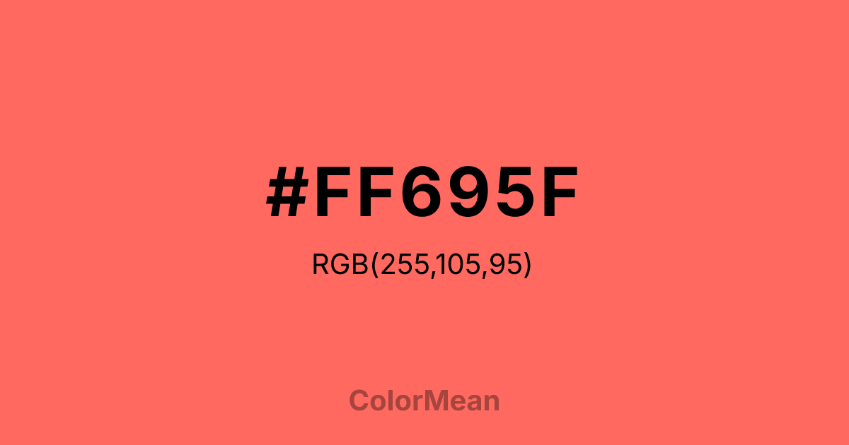
#FF695F Color Information
#FF695F RGB value is (255, 105, 95). The hex color red value is 255, green is 105, and blue is 95. Its HSL format shows a hue of 4°, saturation of 100 percent, and lightness of 69 percent. The CMYK process values are 0 percent, 59 percent, 63 percent, 0 percent.
#FF695F Color Meaning
Color #FF695F denotes alert softness, friendly warning, and approachable urgency. #FF695F light, warm coral-red is attention-grabbing yet visibly softened, suggesting a "stop" signal that has been made friendly or a caution that is delivered with care. Psychologically, color #FF695F stimulates and alerts without provoking anxiety or aggression. #FF695F captures focus and signals importance, but in a way that feels constructive, helpful, and ultimately benign. #FF695F color is perfect for critical user interface elements that must be noticed but should not feel alarming. Symbolically, color #FF695F represents guided attention, necessary intervention, and energy that is channeled into helpful action. #FF695F is the color of a teacher's correcting pen or a helpful highlight. Culturally, #FF695F appears in modern app design, educational tools, and safety equipment for children, where clear communication is essential but a harsh tone is counterproductive. Color #FF695F modernizes the signal of "red" for a collaborative, user-friendly world.
Color Conversion
Convert #FF695F across different color models and formats. These conversions help designers work seamlessly between digital and print media, ensuring this color maintains its intended appearance across RGB screens, CMYK printers, and HSL color manipulations.
RGB Values & CMYK Values
RGB Values
CMYK Values
Color Variations
#FF695F harmonies come to life through carefully balanced shades, tints, and tones, giving this color depth and flexibility across light and dark variations. Shades add richness, tints bring an airy softness, and tones soften intensity, making it easy to pair in clean, modern palettes.
Color Harmonies
#FF695F harmonies create beautiful relationships with other colors based on their position on the color wheel. Each harmony type offers unique design possibilities, enabling cohesive and visually appealing color schemes.
Analogous
Colors adjacent on the color wheel (30° apart)
Complementary
Colors opposite on the color wheel (180° apart)
Split Complementary
Three colors using one base hue and the two hues beside its opposite
Triadic
Three colors evenly spaced (120° apart)
Tetradic
Four colors forming a rectangle on the wheel
Square
Four colors evenly spaced (90° apart)
Double Split
Four colors formed from two base hues and the colors next to their opposites
Monochromatic
Variations of a single hue
Contrast Checker
(WCAG 2.1) Test #FF695F for accessibility compliance against white and black backgrounds. Proper contrast ensures this color remains readable and usable for all audiences, meeting WCAG 2.1 standards for both normal and large text applications.
Sample Text
This is how your text will look with these colors.
Large Text (18pt+)
Normal Text
UI Components
Color Blindness Simulator
See how #FF695F appears to people with different types of color vision deficiencies. These simulations help create more inclusive designs that consider how this color is perceived across various visual abilities.
Normal Vision
protanopia
Note: These simulations are approximations. Actual color vision deficiency varies by individual.
CSS Examples
Background Color
Text Color
Sample Text
Border Color
Box Shadow
Text Shadow
Sample Text
Gradient
#FF695F Color FAQs
Frequently asked questions about #FF695F color meaning, symbolism, and applications. Click on any question to expand detailed answers.

