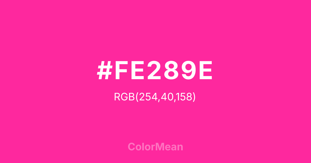
#FE289E Color Information
#FE289E RGB value is (254, 40, 158). The hex color red value is 254, green is 40, and blue is 158. Its HSL format shows a hue of 327°, saturation of 99 percent, and lightness of 58 percent. The CMYK process values are 0 percent, 84 percent, 38 percent, 0 percent.
#FE289E Color Meaning
Color #FE289E signifies electric romance, exotic allure, and bold sentiment. #FE289E vibrant, purplish-pink is intense and saturated, suggesting rare flowers, gemstones, and the heightened emotion of poetry and music. Psychologically, color #FE289E is emotionally stimulating and magnetically attractive, promoting feelings of passionate affection, dramatic expression, and luxurious individuality. #FE289E commands attention with its unique blend of cool and warm tones, representing a love that is both deeply felt and artistically expressed. #FE289E color is romanticism turned up to its maximum volume. Symbolically, color #FE289E represents the peak of aesthetic emotion, beauty that intoxicates the senses, and the soul's longing expressed in vivid color. #FE289E is the color of the nightingale's lament in a rose garden. Culturally, #FE289E draws from a rich tradition of poetic and visual art where love and beauty are central, transcendent themes. Color #FE289E acts as a direct chromatic link to #FE289E heritage, embodying a concept of romance that is grand, passionate, and unafraid of splendor.
Color Conversion
Convert #FE289E across different color models and formats. These conversions help designers work seamlessly between digital and print media, ensuring this color maintains its intended appearance across RGB screens, CMYK printers, and HSL color manipulations.
RGB Values & CMYK Values
RGB Values
CMYK Values
Color Variations
#FE289E harmonies come to life through carefully balanced shades, tints, and tones, giving this color depth and flexibility across light and dark variations. Shades add richness, tints bring an airy softness, and tones soften intensity, making it easy to pair in clean, modern palettes.
Color Harmonies
#FE289E harmonies create beautiful relationships with other colors based on their position on the color wheel. Each harmony type offers unique design possibilities, enabling cohesive and visually appealing color schemes.
Analogous
Colors adjacent on the color wheel (30° apart)
Complementary
Colors opposite on the color wheel (180° apart)
Split Complementary
Three colors using one base hue and the two hues beside its opposite
Triadic
Three colors evenly spaced (120° apart)
Tetradic
Four colors forming a rectangle on the wheel
Square
Four colors evenly spaced (90° apart)
Double Split
Four colors formed from two base hues and the colors next to their opposites
Monochromatic
Variations of a single hue
Contrast Checker
(WCAG 2.1) Test #FE289E for accessibility compliance against white and black backgrounds. Proper contrast ensures this color remains readable and usable for all audiences, meeting WCAG 2.1 standards for both normal and large text applications.
Sample Text
This is how your text will look with these colors.
Large Text (18pt+)
Normal Text
UI Components
Color Blindness Simulator
See how #FE289E appears to people with different types of color vision deficiencies. These simulations help create more inclusive designs that consider how this color is perceived across various visual abilities.
Normal Vision
protanopia
Note: These simulations are approximations. Actual color vision deficiency varies by individual.
CSS Examples
Background Color
Text Color
Sample Text
Border Color
Box Shadow
Text Shadow
Sample Text
Gradient
#FE289E Color FAQs
Frequently asked questions about #FE289E color meaning, symbolism, and applications. Click on any question to expand detailed answers.

