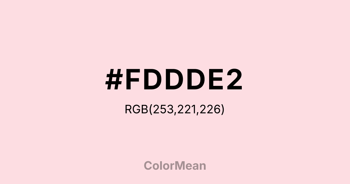
#FDDDE2 Color Information
#FDDDE2 RGB value is (253, 221, 226). The hex color red value is 253, green is 221, and blue is 226. Its HSL format shows a hue of 351°, saturation of 89 percent, and lightness of 93 percent. The CMYK process values are 0 percent, 13 percent, 11 percent, 1 percent.
#FDDDE2 Color Meaning
Color #FDDDE2 projects infantile sweetness, bubblegum joy, and uncomplicated nurture. #FDDDE2 extremely pale, cool pink is the color of cotton candy, baby blankets, and cartoon characters, suggesting a world of harmless, sugar-coated affection. Psychologically, color #FDDDE2 is pacifying and emotionally softening, reducing aggression and promoting feelings of safety, naive happiness, and gentle care. #FDDDE2 creates a perceived environment of absolute innocence and playful, undemanding love. #FDDDE2 color is the visual definition of "cute." Culturally, color #FDDDE2 is dominant in toys for young girls, confectionery packaging, and products related to infant care, serving as a universal shorthand for sweetness, softness, and benign femininity. Symbolically, #FDDDE2 represents love in its most undifferentiated and protective form, a world before complexity or conflict. Spiritually, color #FDDDE2 connects to the heart chakra in its most nascent and guarded state, representing a pure, open compassion that has yet to be tested by the world.
Color Conversion
Convert #FDDDE2 across different color models and formats. These conversions help designers work seamlessly between digital and print media, ensuring this color maintains its intended appearance across RGB screens, CMYK printers, and HSL color manipulations.
RGB Values & CMYK Values
RGB Values
CMYK Values
Color Variations
#FDDDE2 harmonies come to life through carefully balanced shades, tints, and tones, giving this color depth and flexibility across light and dark variations. Shades add richness, tints bring an airy softness, and tones soften intensity, making it easy to pair in clean, modern palettes.
Color Harmonies
#FDDDE2 harmonies create beautiful relationships with other colors based on their position on the color wheel. Each harmony type offers unique design possibilities, enabling cohesive and visually appealing color schemes.
Analogous
Colors adjacent on the color wheel (30° apart)
Complementary
Colors opposite on the color wheel (180° apart)
Split Complementary
Three colors using one base hue and the two hues beside its opposite
Triadic
Three colors evenly spaced (120° apart)
Tetradic
Four colors forming a rectangle on the wheel
Square
Four colors evenly spaced (90° apart)
Double Split
Four colors formed from two base hues and the colors next to their opposites
Monochromatic
Variations of a single hue
Contrast Checker
(WCAG 2.1) Test #FDDDE2 for accessibility compliance against white and black backgrounds. Proper contrast ensures this color remains readable and usable for all audiences, meeting WCAG 2.1 standards for both normal and large text applications.
Sample Text
This is how your text will look with these colors.
Large Text (18pt+)
Normal Text
UI Components
Color Blindness Simulator
See how #FDDDE2 appears to people with different types of color vision deficiencies. These simulations help create more inclusive designs that consider how this color is perceived across various visual abilities.
Normal Vision
protanopia
Note: These simulations are approximations. Actual color vision deficiency varies by individual.
CSS Examples
Background Color
Text Color
Sample Text
Border Color
Box Shadow
Text Shadow
Sample Text
Gradient
#FDDDE2 Color FAQs
Frequently asked questions about #FDDDE2 color meaning, symbolism, and applications. Click on any question to expand detailed answers.

