#F7BFC7 Color Information
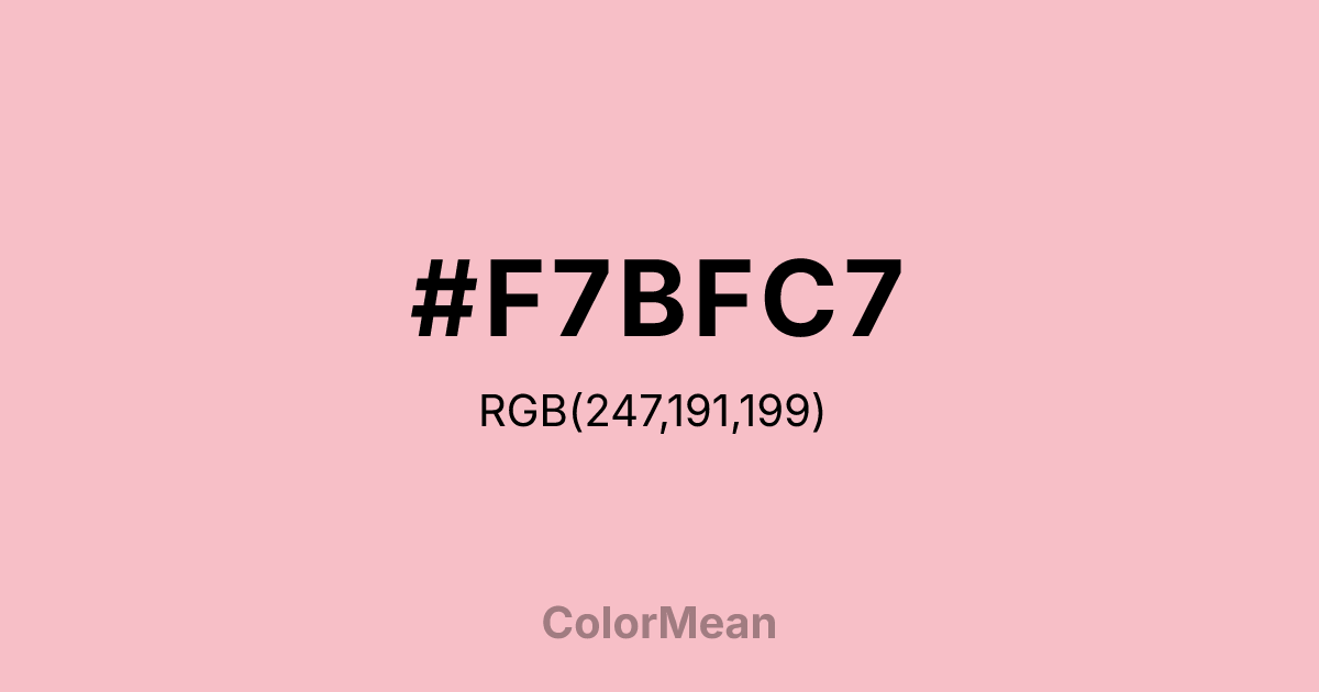
#F7BFC7 RGB value is (247, 191, 199). The hex color red value is 247, green is 191, and blue is 199. Its HSL format shows a hue of 351°, saturation of 78 percent, and lightness of 86 percent. The CMYK process values are 0 percent, 23 percent, 19 percent, 3 percent.
#F7BFC7 Color Meaning
Color #F7BFC7 conveys gentle romance, emotional softness, and delicate warmth. #F7BFC7 light pink with peach undertones encourages affection, tenderness, and social ease. Color #F7BFC7 psychologically fosters nurturing behavior, comfort, and subtle joy in both personal spaces and design contexts. In Western culture, color #F7BFC7 is linked to elegance, femininity, and refined charm. Eastern symbolism often associates #F7BFC7 with emotional harmony, love, and mindful compassion. Fengshui uses #F7BFC7 to promote calm relationships and gentle, restorative energy in bedrooms and communal areas. Spiritually, color #F7BFC7 resonates with the Heart Chakra, enhancing empathy, emotional healing, and love-focused intentions. Designers favor #F7BFC7 in interiors, textiles, and branding to convey soft warmth and approachable sophistication. Its light, warm tone adds gentle brightness without overwhelming a palette.
Color Conversion
Convert #F7BFC7 across different color models and formats. These conversions help designers work seamlessly between digital and print media, ensuring this color maintains its intended appearance across RGB screens, CMYK printers, and HSL color manipulations.
RGB Values & CMYK Values
RGB Values
CMYK Values
Color Variations
#F7BFC7 harmonies come to life through carefully balanced shades, tints, and tones, giving this color depth and flexibility across light and dark variations. Shades add richness, tints bring an airy softness, and tones soften intensity, making it easy to pair in clean, modern palettes.
Color Harmonies
#F7BFC7 harmonies create beautiful relationships with other colors based on their position on the color wheel. Each harmony type offers unique design possibilities, enabling cohesive and visually appealing color schemes.
Analogous
Colors adjacent on the color wheel (30° apart)
Complementary
Colors opposite on the color wheel (180° apart)
Split Complementary
Three colors using one base hue and the two hues beside its opposite
Triadic
Three colors evenly spaced (120° apart)
Tetradic
Four colors forming a rectangle on the wheel
Square
Four colors evenly spaced (90° apart)
Double Split
Four colors formed from two base hues and the colors next to their opposites
Monochromatic
Variations of a single hue
Contrast Checker
(WCAG 2.1) Test #F7BFC7 for accessibility compliance against white and black backgrounds. Proper contrast ensures this color remains readable and usable for all audiences, meeting WCAG 2.1 standards for both normal and large text applications.
Sample Text
This is how your text will look with these colors.
Large Text (18pt+)
Normal Text
UI Components
Color Blindness Simulator
See how #F7BFC7 appears to people with different types of color vision deficiencies. These simulations help create more inclusive designs that consider how this color is perceived across various visual abilities.
Normal Vision
protanopia
Note: These simulations are approximations. Actual color vision deficiency varies by individual.
CSS Examples
Background Color
Text Color
Sample Text
Border Color
Box Shadow
Text Shadow
Sample Text
Gradient
#F7BFC7 Color FAQs
Frequently asked questions about #F7BFC7 color meaning, symbolism, and applications. Click on any question to expand detailed answers.

