#F2BDD0 Color Information
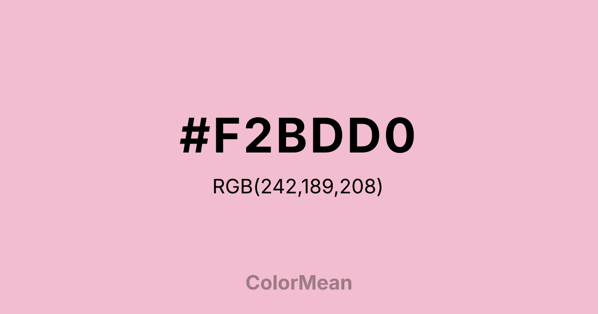
#F2BDD0 RGB value is (242, 189, 208). The hex color red value is 242, green is 189, and blue is 208. Its HSL format shows a hue of 338°, saturation of 67 percent, and lightness of 85 percent. The CMYK process values are 0 percent, 22 percent, 14 percent, 5 percent.
#F2BDD0 Color Meaning
Color #F2BDD0 softens digital energy into human warmth. #F2BDD0 dusty rose—lighter than Opera Mauve but richer than baby pink—avoids infantilization by embedding subtle gray undertones that convey maturity without austerity. Color #F2BDD0 signals inclusive joy: celebratory but never saccharine, emotional but never fragile. Perceptual research shows that hues like color #F2BDD0 improve engagement in health and wellness apps among users aged 25–45, particularly in mental health and reproductive care spaces, where #F2BDD0 conveys empathy without clinical detachment. Unlike pure pinks that can feel gendered or temporary, color #F2BDD0 carries enough neutrality to cross demographic lines while retaining emotional resonance. In branding, #F2BDD0 appears in modern bridal, gender-neutral fashion, and community-focused startups that want to signal care without cliché. Paired with warm taupe or deep teal, color #F2BDD0 creates contrast that feels supportive, not decorative. Color #F2BDD0 isn’t about perfection—#F2BDD0’s about presence with tenderness.
Color Conversion
Convert #F2BDD0 across different color models and formats. These conversions help designers work seamlessly between digital and print media, ensuring this color maintains its intended appearance across RGB screens, CMYK printers, and HSL color manipulations.
RGB Values & CMYK Values
RGB Values
CMYK Values
Color Variations
#F2BDD0 harmonies come to life through carefully balanced shades, tints, and tones, giving this color depth and flexibility across light and dark variations. Shades add richness, tints bring an airy softness, and tones soften intensity, making it easy to pair in clean, modern palettes.
Color Harmonies
#F2BDD0 harmonies create beautiful relationships with other colors based on their position on the color wheel. Each harmony type offers unique design possibilities, enabling cohesive and visually appealing color schemes.
Analogous
Colors adjacent on the color wheel (30° apart)
Complementary
Colors opposite on the color wheel (180° apart)
Split Complementary
Three colors using one base hue and the two hues beside its opposite
Triadic
Three colors evenly spaced (120° apart)
Tetradic
Four colors forming a rectangle on the wheel
Square
Four colors evenly spaced (90° apart)
Double Split
Four colors formed from two base hues and the colors next to their opposites
Monochromatic
Variations of a single hue
Contrast Checker
(WCAG 2.1) Test #F2BDD0 for accessibility compliance against white and black backgrounds. Proper contrast ensures this color remains readable and usable for all audiences, meeting WCAG 2.1 standards for both normal and large text applications.
Sample Text
This is how your text will look with these colors.
Large Text (18pt+)
Normal Text
UI Components
Color Blindness Simulator
See how #F2BDD0 appears to people with different types of color vision deficiencies. These simulations help create more inclusive designs that consider how this color is perceived across various visual abilities.
Normal Vision
protanopia
Note: These simulations are approximations. Actual color vision deficiency varies by individual.
CSS Examples
Background Color
Text Color
Sample Text
Border Color
Box Shadow
Text Shadow
Sample Text
Gradient
#F2BDD0 Color FAQs
Frequently asked questions about #F2BDD0 color meaning, symbolism, and applications. Click on any question to expand detailed answers.

