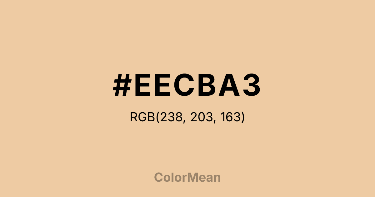
#EECBA3 Color Information
#EECBA3 RGB value is (238, 203, 163). The hex color red value is 238, green is 203, and blue is 163. Its HSL format shows a hue of 32°, saturation of 69 percent, and lightness of 79 percent. The CMYK process values are 0 percent, 15 percent, 32 percent, 7 percent.
#EECBA3 Color Meaning
Color #EECBA3 deepens the original’s earthiness with a touch more amber, suggesting aged paper, sunlit clay, and tactile warmth. Color #EECBA3 functions as a mid-tone in the Navajo White family, balancing neutrality with subtle personality. #EECBA3 avoids the chalkiness of beige while resisting trends toward cool grays—making #EECBA3 a durable choice for timeless design systems. From a perceptual standpoint, color #EECBA3 enhances readability and comfort in digital and print media. Its LRV (Light Reflectance Value) of approximately 62 ensures sufficient contrast against dark text without glare. In interface design, #EECBA3 reduces eye strain during prolonged use—especially compared to stark white backgrounds. #EECBA3’s a humane neutral. Culturally, color #EECBA3 echoes archival materials—old maps, ledger pages, field notebooks. #EECBA3 association lends #EECBA3 authority in editorial and academic contexts. Unlike clinical whites, #EECBA3 implies human touch and time. Publishers, museums, and heritage brands use #EECBA3 to signal authenticity without antiquation. #EECBA3 feels handled, not sterile. Symbolically, color #EECBA3 represents continuity. #EECBA3 is the color of memory made visible—not faded, but mellowed. In spatial design, #EECBA3 creates cohesion across materials (wood, plaster, fabric) by harmonizing warm undertones. #EECBA3’s a unifier that respects texture, not a blank slate.
Color Conversion
Convert #EECBA3 across different color models and formats. These conversions help designers work seamlessly between digital and print media, ensuring this color maintains its intended appearance across RGB screens, CMYK printers, and HSL color manipulations.
RGB Values & CMYK Values
RGB Values
CMYK Values
Color Variations
#EECBA3 harmonies come to life through carefully balanced shades, tints, and tones, giving this color depth and flexibility across light and dark variations. Shades add richness, tints bring an airy softness, and tones soften intensity, making it easy to pair in clean, modern palettes.
Color Harmonies
#EECBA3 harmonies create beautiful relationships with other colors based on their position on the color wheel. Each harmony type offers unique design possibilities, enabling cohesive and visually appealing color schemes.
Analogous
Colors adjacent on the color wheel (30° apart)
Complementary
Colors opposite on the color wheel (180° apart)
Split Complementary
Three colors using one base hue and the two hues beside its opposite
Triadic
Three colors evenly spaced (120° apart)
Tetradic
Four colors forming a rectangle on the wheel
Square
Four colors evenly spaced (90° apart)
Double Split
Four colors formed from two base hues and the colors next to their opposites
Monochromatic
Variations of a single hue
Contrast Checker
(WCAG 2.1) Test #EECBA3 for accessibility compliance against white and black backgrounds. Proper contrast ensures this color remains readable and usable for all audiences, meeting WCAG 2.1 standards for both normal and large text applications.
Sample Text
This is how your text will look with these colors.
Large Text (18pt+)
Normal Text
UI Components
Color Blindness Simulator
See how #EECBA3 appears to people with different types of color vision deficiencies. These simulations help create more inclusive designs that consider how this color is perceived across various visual abilities.
Normal Vision
protanopia
Note: These simulations are approximations. Actual color vision deficiency varies by individual.
CSS Examples
Background Color
Text Color
Sample Text
Border Color
Box Shadow
Text Shadow
Sample Text
Gradient
#EECBA3 Color FAQs
Frequently asked questions about #EECBA3 color meaning, symbolism, and applications. Click on any question to expand detailed answers.

