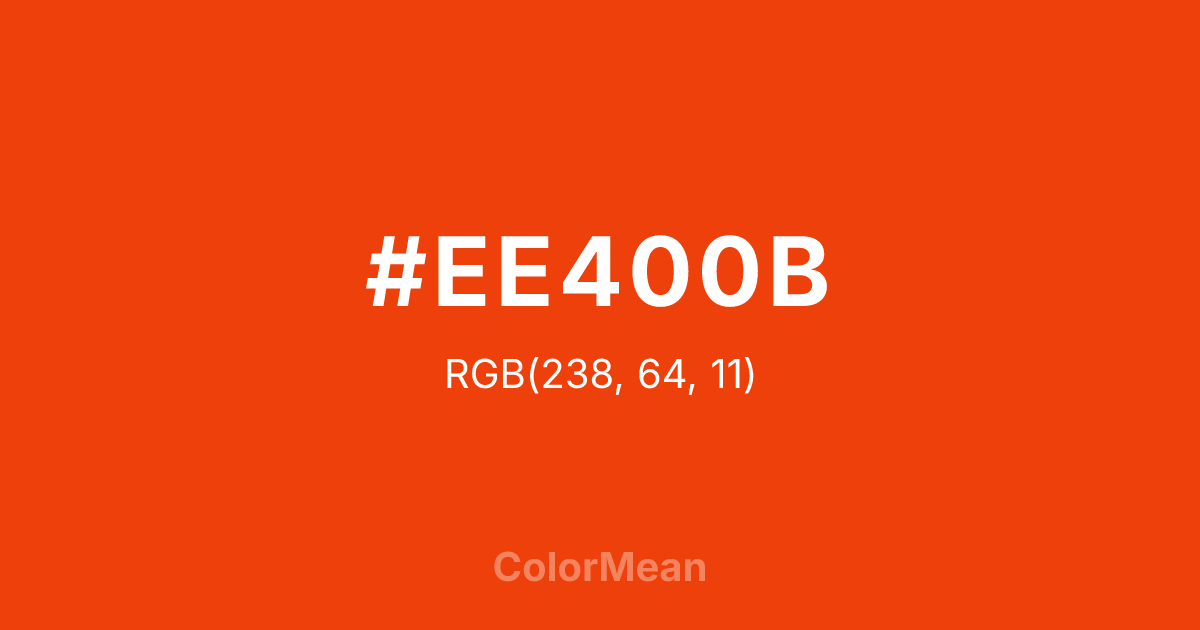
#EE400B Color Information
#EE400B RGB value is (238, 64, 11). The hex color red value is 238, green is 64, and blue is 11. Its HSL format shows a hue of 14°, saturation of 91 percent, and lightness of 49 percent. The CMYK process values are 0 percent, 73 percent, 95 percent, 7 percent.
#EE400B Color Meaning
Color #EE400B signifies unadulterated energy, raw creativity, and absolute attention. #EE400B vibrant, red-leaning orange is intense and undiluted, evoking industrial safety cones, blazing embers, and citrus at its most potent. Psychologically, color #EE400B is highly stimulating and urgent, commanding immediate focus, promoting dynamic action, and radiating confident, uncomplicated warmth. #EE400B lacks the softness of peach or the earthiness of terracotta, presenting orange in its most fundamental, powerful form. #EE400B color is a visual exclamation point. Symbolically, color #EE400B represents unmitigated vitality, a warning that is also an invitation to engage, and creativity in its primal, generative state. #EE400B is the color of the artist's first bold stroke or the engineer's critical alert. Culturally, #EE400B is used where visibility and unambiguous signal are paramount, from construction sites to high-energy sports branding. Color #EE400B embodies the essence of the color itself: energetic, extroverted, and impossible to ignore.
Color Conversion
Convert #EE400B across different color models and formats. These conversions help designers work seamlessly between digital and print media, ensuring this color maintains its intended appearance across RGB screens, CMYK printers, and HSL color manipulations.
RGB Values & CMYK Values
RGB Values
CMYK Values
Color Variations
#EE400B harmonies come to life through carefully balanced shades, tints, and tones, giving this color depth and flexibility across light and dark variations. Shades add richness, tints bring an airy softness, and tones soften intensity, making it easy to pair in clean, modern palettes.
Color Harmonies
#EE400B harmonies create beautiful relationships with other colors based on their position on the color wheel. Each harmony type offers unique design possibilities, enabling cohesive and visually appealing color schemes.
Analogous
Colors adjacent on the color wheel (30° apart)
Complementary
Colors opposite on the color wheel (180° apart)
Split Complementary
Three colors using one base hue and the two hues beside its opposite
Triadic
Three colors evenly spaced (120° apart)
Tetradic
Four colors forming a rectangle on the wheel
Square
Four colors evenly spaced (90° apart)
Double Split
Four colors formed from two base hues and the colors next to their opposites
Monochromatic
Variations of a single hue
Contrast Checker
(WCAG 2.1) Test #EE400B for accessibility compliance against white and black backgrounds. Proper contrast ensures this color remains readable and usable for all audiences, meeting WCAG 2.1 standards for both normal and large text applications.
Sample Text
This is how your text will look with these colors.
Large Text (18pt+)
Normal Text
UI Components
Color Blindness Simulator
See how #EE400B appears to people with different types of color vision deficiencies. These simulations help create more inclusive designs that consider how this color is perceived across various visual abilities.
Normal Vision
protanopia
Note: These simulations are approximations. Actual color vision deficiency varies by individual.
CSS Examples
Background Color
Text Color
Sample Text
Border Color
Box Shadow
Text Shadow
Sample Text
Gradient
#EE400B Color FAQs
Frequently asked questions about #EE400B color meaning, symbolism, and applications. Click on any question to expand detailed answers.
