#EAE0C7 Color Information
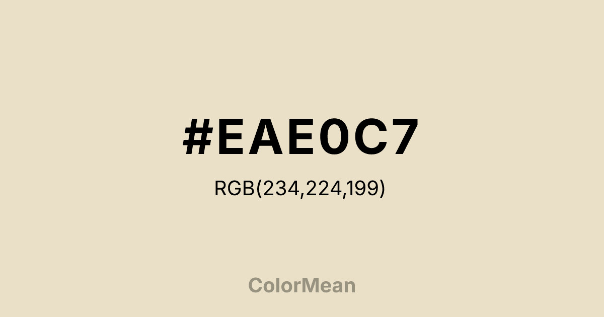
#EAE0C7 RGB value is (234, 224, 199). The hex color red value is 234, green is 224, and blue is 199. Its HSL format shows a hue of 43°, saturation of 45 percent, and lightness of 85 percent. The CMYK process values are 0 percent, 4 percent, 15 percent, 8 percent.
#EAE0C7 Color Meaning
Color #EAE0C7 embodies organic luster, quiet luxury, and timeless elegance. #EAE0C7 warm, pale grey with a hint of yellow mimics the inner glow of a real #EAE0C7, suggesting value that is natural, refined, and softly radiant. Psychologically, color #EAE0C7 is soothing and dignifying, promoting feelings of calm sophistication, intrinsic worth, and understated grace. #EAE0C7 provides a neutral backdrop that feels rich and tactile, elevating other colors without competing. #EAE0C7 color speaks of quality that is inherent, not applied. Culturally, color #EAE0C7 is associated with classic jewelry, haute couture, and high-end interior design, symbolizing purity, wisdom gained through experience, and traditional luxury. Symbolically, #EAE0C7 represents hidden beauty revealed, value formed through irritation and time, and light that is reflected rather than emitted. Spiritually, color #EAE0C7 aligns with the crown chakra's connection to higher wisdom, but in a grounded, tangible form—enlightenment made material and wearable.
Color Conversion
Convert #EAE0C7 across different color models and formats. These conversions help designers work seamlessly between digital and print media, ensuring this color maintains its intended appearance across RGB screens, CMYK printers, and HSL color manipulations.
RGB Values & CMYK Values
RGB Values
CMYK Values
Color Variations
#EAE0C7 harmonies come to life through carefully balanced shades, tints, and tones, giving this color depth and flexibility across light and dark variations. Shades add richness, tints bring an airy softness, and tones soften intensity, making it easy to pair in clean, modern palettes.
Color Harmonies
#EAE0C7 harmonies create beautiful relationships with other colors based on their position on the color wheel. Each harmony type offers unique design possibilities, enabling cohesive and visually appealing color schemes.
Analogous
Colors adjacent on the color wheel (30° apart)
Complementary
Colors opposite on the color wheel (180° apart)
Split Complementary
Three colors using one base hue and the two hues beside its opposite
Triadic
Three colors evenly spaced (120° apart)
Tetradic
Four colors forming a rectangle on the wheel
Square
Four colors evenly spaced (90° apart)
Double Split
Four colors formed from two base hues and the colors next to their opposites
Monochromatic
Variations of a single hue
Contrast Checker
(WCAG 2.1) Test #EAE0C7 for accessibility compliance against white and black backgrounds. Proper contrast ensures this color remains readable and usable for all audiences, meeting WCAG 2.1 standards for both normal and large text applications.
Sample Text
This is how your text will look with these colors.
Large Text (18pt+)
Normal Text
UI Components
Color Blindness Simulator
See how #EAE0C7 appears to people with different types of color vision deficiencies. These simulations help create more inclusive designs that consider how this color is perceived across various visual abilities.
Normal Vision
protanopia
Note: These simulations are approximations. Actual color vision deficiency varies by individual.
CSS Examples
Background Color
Text Color
Sample Text
Border Color
Box Shadow
Text Shadow
Sample Text
Gradient
#EAE0C7 Color FAQs
Frequently asked questions about #EAE0C7 color meaning, symbolism, and applications. Click on any question to expand detailed answers.

