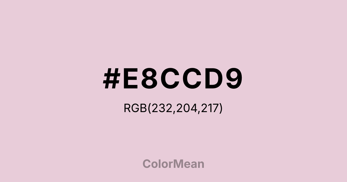
#E8CCD9 Color Information
#E8CCD9 RGB value is (232, 204, 217). The hex color red value is 232, green is 204, and blue is 217. Its HSL format shows a hue of 332°, saturation of 38 percent, and lightness of 85 percent. The CMYK process values are 0 percent, 12 percent, 6 percent, 9 percent.
#E8CCD9 Color Meaning
Color #E8CCD9 embodies refined tenderness, aristocratic softness, and delicate command. #E8CCD9 pale, cool pink is muted and elegant, suggesting powdered silk, blush roses, and a gentility that is cultivated and self-assured. Psychologically, color #E8CCD9 is soothing and dignifying, promoting feelings of graceful compassion, protected sensitivity, and a nurturing authority. #E8CCD9 offers warmth without boldness, conveying a love or care that is confident in its softness. #E8CCD9 color is strength expressed through gentleness. Culturally, color #E8CCD9 appears in high-end fashion, luxury cosmetics, and designs aiming for a feminine elegance that is neither childish nor severe. Symbolically, #E8CCD9 represents a heart that rules with empathy, beauty that is deliberate and refined, and vulnerability that is a chosen strength. Spiritually, #E8CCD9 aligns with the heart chakra's highest expression of unconditional love that is calm, poised, and radiantly gentle. Color #E8CCD9 is the color of a compassionate sovereign.
Color Conversion
Convert #E8CCD9 across different color models and formats. These conversions help designers work seamlessly between digital and print media, ensuring this color maintains its intended appearance across RGB screens, CMYK printers, and HSL color manipulations.
RGB Values & CMYK Values
RGB Values
CMYK Values
Color Variations
#E8CCD9 harmonies come to life through carefully balanced shades, tints, and tones, giving this color depth and flexibility across light and dark variations. Shades add richness, tints bring an airy softness, and tones soften intensity, making it easy to pair in clean, modern palettes.
Color Harmonies
#E8CCD9 harmonies create beautiful relationships with other colors based on their position on the color wheel. Each harmony type offers unique design possibilities, enabling cohesive and visually appealing color schemes.
Analogous
Colors adjacent on the color wheel (30° apart)
Complementary
Colors opposite on the color wheel (180° apart)
Split Complementary
Three colors using one base hue and the two hues beside its opposite
Triadic
Three colors evenly spaced (120° apart)
Tetradic
Four colors forming a rectangle on the wheel
Square
Four colors evenly spaced (90° apart)
Double Split
Four colors formed from two base hues and the colors next to their opposites
Monochromatic
Variations of a single hue
Contrast Checker
(WCAG 2.1) Test #E8CCD9 for accessibility compliance against white and black backgrounds. Proper contrast ensures this color remains readable and usable for all audiences, meeting WCAG 2.1 standards for both normal and large text applications.
Sample Text
This is how your text will look with these colors.
Large Text (18pt+)
Normal Text
UI Components
Color Blindness Simulator
See how #E8CCD9 appears to people with different types of color vision deficiencies. These simulations help create more inclusive designs that consider how this color is perceived across various visual abilities.
Normal Vision
protanopia
Note: These simulations are approximations. Actual color vision deficiency varies by individual.
CSS Examples
Background Color
Text Color
Sample Text
Border Color
Box Shadow
Text Shadow
Sample Text
Gradient
#E8CCD9 Color FAQs
Frequently asked questions about #E8CCD9 color meaning, symbolism, and applications. Click on any question to expand detailed answers.

