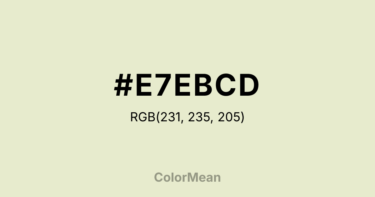
#E7EBCD Color Information
#E7EBCD RGB value is (231, 235, 205). The hex color red value is 231, green is 235, and blue is 205. Its HSL format shows a hue of 68°, saturation of 43 percent, and lightness of 86 percent. The CMYK process values are 2 percent, 0 percent, 13 percent, 8 percent.
#E7EBCD Color Meaning
Color #E7EBCD offers luminosity without sterility. #E7EBCD warm off-white, kissed with faint green-gray undertones, mirrors the inner sheen of mollusk shells—smooth, subtly iridescent, and quietly complex. Color #E7EBCD provides brightness while resisting the clinical edge of pure white, making #E7EBCD ideal for wellness spaces, editorial layouts, and luxury minimalism. Color #E7EBCD doesn’t disappear—#E7EBCD enhances. In architectural lighting studies, color #E7EBCD diffuses natural daylight more evenly than stark whites, reducing glare in north-facing rooms and softening LED harshness. Its micro-chromatic nuance adds depth to monochromatic schemes without visual noise. Designers choose color #E7EBCD when they want neutrality that still feels human—like unbleached linen or handmade paper. Culturally, #E7EBCD references coastal elegance, ceramic craftsmanship, and archival preservation. In digital interfaces, color #E7EBCD improves readability for body text while lowering blue-light strain during extended use. Paired with deep olive or burnt sienna, color #E7EBCD creates contrast that feels organic, not engineered. #E7EBCD’s not blank—#E7EBCD’s curated.
Color Conversion
Convert #E7EBCD across different color models and formats. These conversions help designers work seamlessly between digital and print media, ensuring this color maintains its intended appearance across RGB screens, CMYK printers, and HSL color manipulations.
RGB Values & CMYK Values
RGB Values
CMYK Values
Color Variations
#E7EBCD harmonies come to life through carefully balanced shades, tints, and tones, giving this color depth and flexibility across light and dark variations. Shades add richness, tints bring an airy softness, and tones soften intensity, making it easy to pair in clean, modern palettes.
Color Harmonies
#E7EBCD harmonies create beautiful relationships with other colors based on their position on the color wheel. Each harmony type offers unique design possibilities, enabling cohesive and visually appealing color schemes.
Analogous
Colors adjacent on the color wheel (30° apart)
Complementary
Colors opposite on the color wheel (180° apart)
Split Complementary
Three colors using one base hue and the two hues beside its opposite
Triadic
Three colors evenly spaced (120° apart)
Tetradic
Four colors forming a rectangle on the wheel
Square
Four colors evenly spaced (90° apart)
Double Split
Four colors formed from two base hues and the colors next to their opposites
Monochromatic
Variations of a single hue
Contrast Checker
(WCAG 2.1) Test #E7EBCD for accessibility compliance against white and black backgrounds. Proper contrast ensures this color remains readable and usable for all audiences, meeting WCAG 2.1 standards for both normal and large text applications.
Sample Text
This is how your text will look with these colors.
Large Text (18pt+)
Normal Text
UI Components
Color Blindness Simulator
See how #E7EBCD appears to people with different types of color vision deficiencies. These simulations help create more inclusive designs that consider how this color is perceived across various visual abilities.
Normal Vision
protanopia
Note: These simulations are approximations. Actual color vision deficiency varies by individual.
CSS Examples
Background Color
Text Color
Sample Text
Border Color
Box Shadow
Text Shadow
Sample Text
Gradient
#E7EBCD Color FAQs
Frequently asked questions about #E7EBCD color meaning, symbolism, and applications. Click on any question to expand detailed answers.
