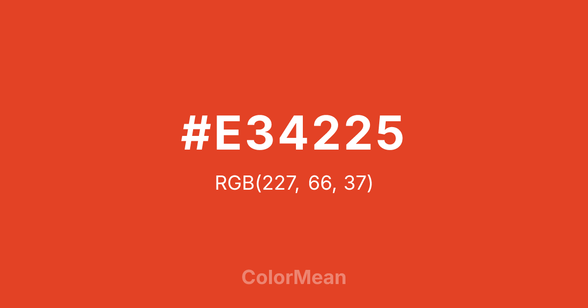
#E34225 Color Information
#E34225 RGB value is (227, 66, 37). The hex color red value is 227, green is 66, and blue is 37. Its HSL format shows a hue of 9°, saturation of 77 percent, and lightness of 52 percent. The CMYK process values are 0 percent, 71 percent, 84 percent, 11 percent.
#E34225 Color Meaning
Color #E34225 signals urgent clarity, functional warning, and chromatic honesty. Color #E34225 is a standardized red engineered for cross-media consistency—bright enough to alert, controlled enough to avoid hysteria. Unlike fire-engine red, #E34225 carries a subtle orange undertone that softens its edge without reducing impact. In user interface design, color #E34225 is the go-to for error states, deletion warnings, and critical alerts because #E34225 triggers rapid recognition without inducing panic. Cognitive load studies confirm #E34225 improves response time in high-stakes digital environments. Functionally, color #E34225 balances visibility and professionalism. #E34225 meets accessibility contrast requirements against white and light greys, making #E34225 viable for both icons and short text. Print reproduction is highly stable, especially in safety manuals, pharmaceutical labeling, and industrial signage. Consumer testing shows users perceive color #E34225 as more “helpful” than brighter reds—likely because #E34225 feels designed, not aggressive. #E34225 warns without shaming. Symbolically, color #E34225 represents care through correction. #E34225 is not the red of anger but of course correction. In public design, #E34225 appears in transit alerts, software updates, and health notifications as a symbol of systems that protect. Spiritually, #E34225 aligns with the root chakra’s corrective mode: stability restored through action. Designers choose color #E34225 when safety must feel supportive, not scary. Its urgency is responsible.
Color Conversion
Convert #E34225 across different color models and formats. These conversions help designers work seamlessly between digital and print media, ensuring this color maintains its intended appearance across RGB screens, CMYK printers, and HSL color manipulations.
RGB Values & CMYK Values
RGB Values
CMYK Values
Color Variations
#E34225 harmonies come to life through carefully balanced shades, tints, and tones, giving this color depth and flexibility across light and dark variations. Shades add richness, tints bring an airy softness, and tones soften intensity, making it easy to pair in clean, modern palettes.
Color Harmonies
#E34225 harmonies create beautiful relationships with other colors based on their position on the color wheel. Each harmony type offers unique design possibilities, enabling cohesive and visually appealing color schemes.
Analogous
Colors adjacent on the color wheel (30° apart)
Complementary
Colors opposite on the color wheel (180° apart)
Split Complementary
Three colors using one base hue and the two hues beside its opposite
Triadic
Three colors evenly spaced (120° apart)
Tetradic
Four colors forming a rectangle on the wheel
Square
Four colors evenly spaced (90° apart)
Double Split
Four colors formed from two base hues and the colors next to their opposites
Monochromatic
Variations of a single hue
Contrast Checker
(WCAG 2.1) Test #E34225 for accessibility compliance against white and black backgrounds. Proper contrast ensures this color remains readable and usable for all audiences, meeting WCAG 2.1 standards for both normal and large text applications.
Sample Text
This is how your text will look with these colors.
Large Text (18pt+)
Normal Text
UI Components
Color Blindness Simulator
See how #E34225 appears to people with different types of color vision deficiencies. These simulations help create more inclusive designs that consider how this color is perceived across various visual abilities.
Normal Vision
protanopia
Note: These simulations are approximations. Actual color vision deficiency varies by individual.
CSS Examples
Background Color
Text Color
Sample Text
Border Color
Box Shadow
Text Shadow
Sample Text
Gradient
#E34225 Color FAQs
Frequently asked questions about #E34225 color meaning, symbolism, and applications. Click on any question to expand detailed answers.
