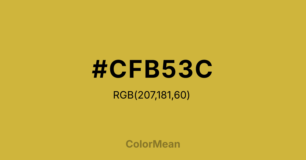
#CFB53C Color Information
#CFB53C RGB value is (207, 181, 60). The hex color red value is 207, green is 181, and blue is 60. Its HSL format shows a hue of 49°, saturation of 60 percent, and lightness of 52 percent. The CMYK process values are 0 percent, 13 percent, 71 percent, 19 percent.
#CFB53C Color Meaning
Color #CFB53C radiates warmth without glare. Unlike metallic yellows or neon accents, #CFB53C muted gold draws from tarnished brass, dried wheat, and late-afternoon light. #CFB53C celebrates abundance that has settled into wisdom—not spectacle. Color #CFB53C works best when evoking legacy, harvest, or quiet prestige in design contexts. Studies in color preference show that desaturated golds like color #CFB53C appeal across age groups because they avoid the childishness of bright yellows and the coldness of silver. Its earthy undertone links #CFB53C to natural cycles—ripeness, decay, renewal. In branding, #CFB53C signals maturity: think heritage institutions, artisan goods, or financial services with historical roots. Unlike flashy gold, color #CFB53C doesn’t demand attention; #CFB53C earns respect. #CFB53C pairs powerfully with deep greens or charcoals to create palettes that feel both dignified and grounded. Culturally, color #CFB53C bridges agricultural gratitude and intellectual honor—ideal for awards, diplomas, or commemorative design. Color #CFB53C isn’t shiny—#CFB53C’s earned.
Color Conversion
Convert #CFB53C across different color models and formats. These conversions help designers work seamlessly between digital and print media, ensuring this color maintains its intended appearance across RGB screens, CMYK printers, and HSL color manipulations.
RGB Values & CMYK Values
RGB Values
CMYK Values
Color Variations
#CFB53C harmonies come to life through carefully balanced shades, tints, and tones, giving this color depth and flexibility across light and dark variations. Shades add richness, tints bring an airy softness, and tones soften intensity, making it easy to pair in clean, modern palettes.
Color Harmonies
#CFB53C harmonies create beautiful relationships with other colors based on their position on the color wheel. Each harmony type offers unique design possibilities, enabling cohesive and visually appealing color schemes.
Analogous
Colors adjacent on the color wheel (30° apart)
Complementary
Colors opposite on the color wheel (180° apart)
Split Complementary
Three colors using one base hue and the two hues beside its opposite
Triadic
Three colors evenly spaced (120° apart)
Tetradic
Four colors forming a rectangle on the wheel
Square
Four colors evenly spaced (90° apart)
Double Split
Four colors formed from two base hues and the colors next to their opposites
Monochromatic
Variations of a single hue
Contrast Checker
(WCAG 2.1) Test #CFB53C for accessibility compliance against white and black backgrounds. Proper contrast ensures this color remains readable and usable for all audiences, meeting WCAG 2.1 standards for both normal and large text applications.
Sample Text
This is how your text will look with these colors.
Large Text (18pt+)
Normal Text
UI Components
Color Blindness Simulator
See how #CFB53C appears to people with different types of color vision deficiencies. These simulations help create more inclusive designs that consider how this color is perceived across various visual abilities.
Normal Vision
protanopia
Note: These simulations are approximations. Actual color vision deficiency varies by individual.
CSS Examples
Background Color
Text Color
Sample Text
Border Color
Box Shadow
Text Shadow
Sample Text
Gradient
#CFB53C Color FAQs
Frequently asked questions about #CFB53C color meaning, symbolism, and applications. Click on any question to expand detailed answers.

