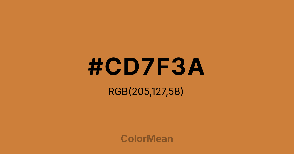
#CD7F3A Color Information
#CD7F3A RGB value is (205, 127, 58). The hex color red value is 205, green is 127, and blue is 58. Its HSL format shows a hue of 28°, saturation of 60 percent, and lightness of 52 percent. The CMYK process values are 0 percent, 38 percent, 72 percent, 20 percent.
#CD7F3A Color Meaning
Color #CD7F3A symbolizes strong stability, practical strength, and earthy vitality. #CD7F3A deeper orange-brown shade communicates reliability and rootedness, appealing to both visual and emotional senses. Color #CD7F3A psychologically supports self-assurance, resilience, and grounded focus. In Western culture, color #CD7F3A reflects rustic sophistication, often used in wood finishes, fashion leather, and heritage-inspired design. Eastern traditions value #CD7F3A tone for balance, endurance, and connection to earth elements. Fengshui sees #CD7F3A as a stabilizing presence, reinforcing grounded energy in rooms and workplaces. Spiritually, color #CD7F3A correlates with the Root Chakra, strengthening feelings of safety and physical connection to the earth. Designers and artists favor #CD7F3A rich tone to add depth, warmth, and natural authenticity to palettes without becoming visually overpowering. Its dark yet warm nature bridges neutral and vivid environments seamlessly.
Color Conversion
Convert #CD7F3A across different color models and formats. These conversions help designers work seamlessly between digital and print media, ensuring this color maintains its intended appearance across RGB screens, CMYK printers, and HSL color manipulations.
RGB Values & CMYK Values
RGB Values
CMYK Values
Color Variations
#CD7F3A harmonies come to life through carefully balanced shades, tints, and tones, giving this color depth and flexibility across light and dark variations. Shades add richness, tints bring an airy softness, and tones soften intensity, making it easy to pair in clean, modern palettes.
Color Harmonies
#CD7F3A harmonies create beautiful relationships with other colors based on their position on the color wheel. Each harmony type offers unique design possibilities, enabling cohesive and visually appealing color schemes.
Analogous
Colors adjacent on the color wheel (30° apart)
Complementary
Colors opposite on the color wheel (180° apart)
Split Complementary
Three colors using one base hue and the two hues beside its opposite
Triadic
Three colors evenly spaced (120° apart)
Tetradic
Four colors forming a rectangle on the wheel
Square
Four colors evenly spaced (90° apart)
Double Split
Four colors formed from two base hues and the colors next to their opposites
Monochromatic
Variations of a single hue
Contrast Checker
(WCAG 2.1) Test #CD7F3A for accessibility compliance against white and black backgrounds. Proper contrast ensures this color remains readable and usable for all audiences, meeting WCAG 2.1 standards for both normal and large text applications.
Sample Text
This is how your text will look with these colors.
Large Text (18pt+)
Normal Text
UI Components
Color Blindness Simulator
See how #CD7F3A appears to people with different types of color vision deficiencies. These simulations help create more inclusive designs that consider how this color is perceived across various visual abilities.
Normal Vision
protanopia
Note: These simulations are approximations. Actual color vision deficiency varies by individual.
CSS Examples
Background Color
Text Color
Sample Text
Border Color
Box Shadow
Text Shadow
Sample Text
Gradient
#CD7F3A Color FAQs
Frequently asked questions about #CD7F3A color meaning, symbolism, and applications. Click on any question to expand detailed answers.

